Hello! Please rate my first project from 0 to 10 and leave your opinion about my work. Write what I should pay attention to in order to improve my abilities; what I managed to do well and what badly
The icons have to be in the same style and size, the colors are kinda annoying, you should make a draft for the main and supported color
2 Likes
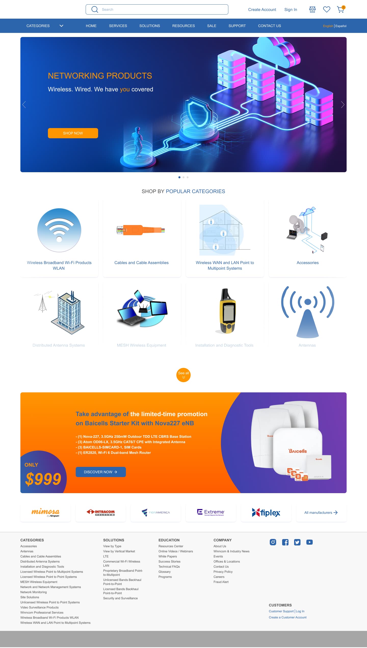
Is this associated with some company? There is no apparent branding on the page.
Do they have a target demographic? Did you hit it? We don’t know.
Do they have a color standards or brand guide (is it orange and purple or orange and blue?)
Category illustration style is all over the place. It looks like a bunch of random icons and a photo found on the web.
4 Likes
This is a student project, but you’ve provided no information about what the assignment is. Did your instructor provide you with a creative brief?
Graphic design is about far more than looks, yet you’ve supplied no information that would enable us to make meaningful comments beyond whether or not we like how it looks.
1 Like
0 being good and 10 being bad
or
0 being bad and 10 being good
1 Like
Hello! Thanks for the comment) I have no creative task or commission. I did this project on my own initiative to practice my skills. So please leave a comment on how it looks
Hello! 0 being bad and 10 being good
Hello! Thanks for the answer! And can you write in more detail what exactly is wrong with the colors?
I think the color complaint might be about the relatively inconsistent use of color.
1.The menu bar is a sort of washed-out navy blue.
2.The graphic directly below it is a very vibrant blue & neon blue/cyan paired with purples & neon pinks with a bright orange button to one side.
3.The graphic at the bottom is orange/orange-red & purple/magenta on the right side and purple/blue on the other corner. The button is the same washed out navy blue as the menu bar.
Attempt to balance the purple/blues and oranges for a more consistent, cohesive appearance.
1 Like
Thanks) looks like I really have problems with the combination and use of colors) I will work on it. If you can, please leave a rating from 0 to 10. I also want to understand how my project looks in general)
I suspect you might have a fundamental misunderstanding of graphic design. It isn’t art.
Good design isn’t synonymous with looks. Good design is not about making something pretty. Good design is about solving a problem. You’ve provided no parameters for the problem you’re trying to solve.
Attractiveness is usually part of the solution, but it’s never the starting point. You can’t solve a design problem without, first, carefully defining what you’re trying to accomplish.
Here’s an analogy.
What do you think of the number 5? Is 5 a good answer? Is it the right solution?
Well, 5 is a great number when the problem preceding it is 3 + 2, but it’s a poor number when the problem is 4 + 7.
As for your colors, some people find the combination of purple and orange unappealing. Others like the combination. I tend to avoid it for that very reason — it’s polarizing.
2 Likes
My studies are divided into 2 stages. First UI, later there will be lessons on UX. I am currently in the UI learning phase. That’s probably why I still don’t have a full understanding of UX
You don’t have any control over the curriculum. Thanks for pointing that out.
If I were in charge of the curriculum, I’d require an introduction to UX before UI. UX can be separated from UI (engineers do it all the time), but UI shouldn’t be separated from UX because a successful user interface is dependent upon designing the UI to help facilitate that user experience.
Just for the sake of answering your question, let’s assume you’ve satisfied all the UX concerns that would help determine the UI. Let’s also assume the information on the page and the hierarchy of the page is perfect to fit in with the rest of the website and is exactly what the end user would expect to be on the page.
If we assume that’s the case, I can give you feedback on the looks. Personally, I think it looks pretty good — especially for beginning student work. It’s conservative, but on an e-commerce site, conservative and what’s expected is usually good since it helps with the UX.
Often, a UI designer only has limited input on the color palette since that palette is often a matter of working within the already defined corporate colors. That said, I think there’s room for making the colors a little more compatible, but I don’t see it as a huge issue.
The icon-like illustrations were all drawn using a different style. Ideally, they should all match as though they were created as a coordinated set. Sometimes, in a real-world situation, deadlines and budgets make this kind of fine-tuning impractical — especially on seldom-visited pages. On an important, frequently visited page, you’d probably want to spend whatever time was needed to make them match. In addition, the “See all” button is awfully small given its importance. It could easily be overlooked.
Designing websites is a bit like designing magazines. It’s unwise to design them one page at a time since all the pages must work together to create a coordinated, uniform single design throughout.
1 Like
Thank you very much for such a detailed answer) I will definitely take into account all your comments)
The overall layout is pretty standard (menu, slider, buckets, special offer, etc.). It’s safe. Overall aesthetic is lacking for the reasons others have given you.
top slider/main visual is stock material used by competition
Seeing as this is a design for a website, you may want to consider making the slider at the top and the banner at the bottom ready for stacking or alternatively, to be replaced with other code. If you use the stack method, then consider making the main graphic look good at a max-width of 300pixels.
Watch your contrast.
I’m a huge contrast person. I noticed the orange text in the menu bar is hard to read, so perhaps it can be lighter, or make the background darker. Same thing goes for the CTA Call to action in the slider that says SHOP NOW.
Font weight hierarchy
I see you have a large size font in the banner and a medium for shop by popular categories and small text for the links but nothing is bold. For the largest and most important text, you can bold it. So the NETWORKING PRODUCTS could be bold. Also the text in the CTA Call To Action that says SHOP NOW can also be bold.
Consistency in design
The header slider has a certain look and feel. Shiny, tech, isometric-like. However, when you get to the product categories you don’t have the same feel. And the final banner at the bottom is also not of the same kin.
If the categories are meant to be clicked on, just make them viewable, don’t cover them with a white fade and ‘see more’, just have more buttons. They’ve already scrolled down “below the fold” (below the fold means, below the first screen where if you have to hit the page down key to see more or a down arrow or scroll.. then it’s below the fold)
Logo?
I see you have an empty white spot at the top left of the site, was a logo supposed to be there?
I hope my comments helps you out.
Line
I agree with you. Design is more than how it looks but is more what message it sends.
1 Like