
Attention to detail will help this a lot:
-
the data in the table columns/rows are not uniformly spaced within their respective cells. Use guides to help align things, or the alignment panel (if using illustrator/indesign/similar) to align to key-objects.
-
The white and black lines/strokes are a little messy and/or not aligned very well with each other.
-
The rounded corners at the bottom of each table do not match very well with the rounded corner of the white stroke. It looks like the radius is the same, but the white should be a smaller radius to visually ‘match’ the color shape’s corner radius.
-
the fonts used at the bottom are kinda all over the place:
a. the font used for “Are also available” just doesn’t seem to fit thematically at all, and being separated by the line above is weird when it seems pretty clear that it’s intended to read “electric bill payment and Cable subscription are also available”
b. the entire section looks like it was intended to be centered but it isn’t. Center all lines with “Valid for 30 Days”
c. the phone numbers look like they might be the same font, but are different sizes and not aligned vertically.
d. the yellow with hard black dropshadow seems out of place. Nothing else has a dropshadow. -
the photo is very low resolution, but I’m giving that a pass under the assumption that it may be a placeholder for something better to come later
This needs quite a bit of work.
There are a lot of design/production issues as @WheresMyCoffee has pointed out. In addition, you have marketing issues. Who is the client? What is the offer? What is the benefit to the customer? What action are you trying to get the customer to take? I’m sure at least some of the issue is with this being a non-U.S. ad, but I really have no idea what I’m looking at. It seems like some sort of data plan comparison, but what’s up with electric bill payment and why are bank details needed?
@WheresMyCoffee
Thanks allot for your clarification.
I’m student, and new to graphics design, if I understood you, the main problem with my design is alignment, then, fonts, and using colors.
I noticed the correction and I’ll correct, thanks allot
@Steve_O , I also noticed the correction.
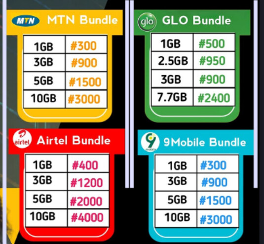
I designed for a client, it’s telecommunication business flyer, intending to advertise data subscription, and cable/electric subscription also.
And, the offer is the, the data and it’s price wrote in the row/columns, the flyer where designed to tell, customer the available data plans and it’s prices.
The reason for bank details is, if a person need data/cable subscription/ electric bill payment, he/she is going to send the money of required services to the mentioned account details.
I agree with @WheresMyCoffee, but the bigger problem, in my opinion, is similar to what Steve_O mentioned: I have little idea what this ad is advertising.
I assume it might be for some type of internet service, but I don’t know. Is it for mobile phones? Is Slamg Data an internet service provider, a mobile phone company, a cable company, or what? There’s no headline and nothing mentioning what is valid for 30 days. It reads as though electric bill payments are also available, but I doubt that’s what you meant.
I’m not asking you to answer these questions for me. I’m suggesting that you clarify what this ad is about to the intended audience.
As @Steve_O also mentioned, this ad seems intended for a different country from my own. Some of it might make sense if I were more familiar with your location. However, I suspect the ad will still confuse many people because it’s too ambiguous.
A lot of comments already
This stood out like a sore thumb
Too many fonts.
Drop shadow on Electric Bill Payment not needed
Surely they can call on the WhatsApp number? why two numbers?
Alignment is all over the place
Bank details on a flyer? Odd?
Overall it’s ok - just needs serious tidying up.
@Just-B, Thanks allot, SLAMG is an internet data service provider, and and data will last for 30 days, i.e it will become invalid in 30 days if not used.
I thought, it’s understandable in my area.
Thanks you so much
@Smurf2 , thanks you, I understood my main problem is alignment.
And the flyer is an internet data provider, if a person wish to buy data/cable/electric, he’s going to make payment to the mentioned account details.
I think your main problem is that the ad does not communicate. I want to give you the benefit of the doubt and say the communication problems are due to a language barrier, but I don’t think that’s the case. For example, there is no way I read the “valid for 30 days” and thought to myself that the data will not roll over (or only lasts for 30 days). I would have thought that the prices were a special offer and only available for 30 days. Your job as a graphic designer is to communicate a message and make people respond. This fails on all levels. I’m not trying to be overly harsh or say you can’t do it, but this clearly is not the solution.
If the would-be customer needs these extra informations to figure out what this is all about, clearly the flyer is not doing its job.
I think a lot of this is a misunderstanding in that we are not in that demographic.
I could be wrong but I know in much of Africa pretty much all business is handled through cell phones, and whats app. People pay their bills that way and I think if that is correct, this audience is very used to buying data for monthly use and directly paying the bank and providing them that information.
Once again, that is just my cursory understanding. But if that is the case, nothing would be odd about the whats app number or the banking info, or the mention of paying your utilities or cable through the service.