Instagram: ofekshakked
For more Instagram: ofekshakked
A couple of comments:
– With no background information and not speaking whatever language that project is in, I can only offer a cursory opinion.
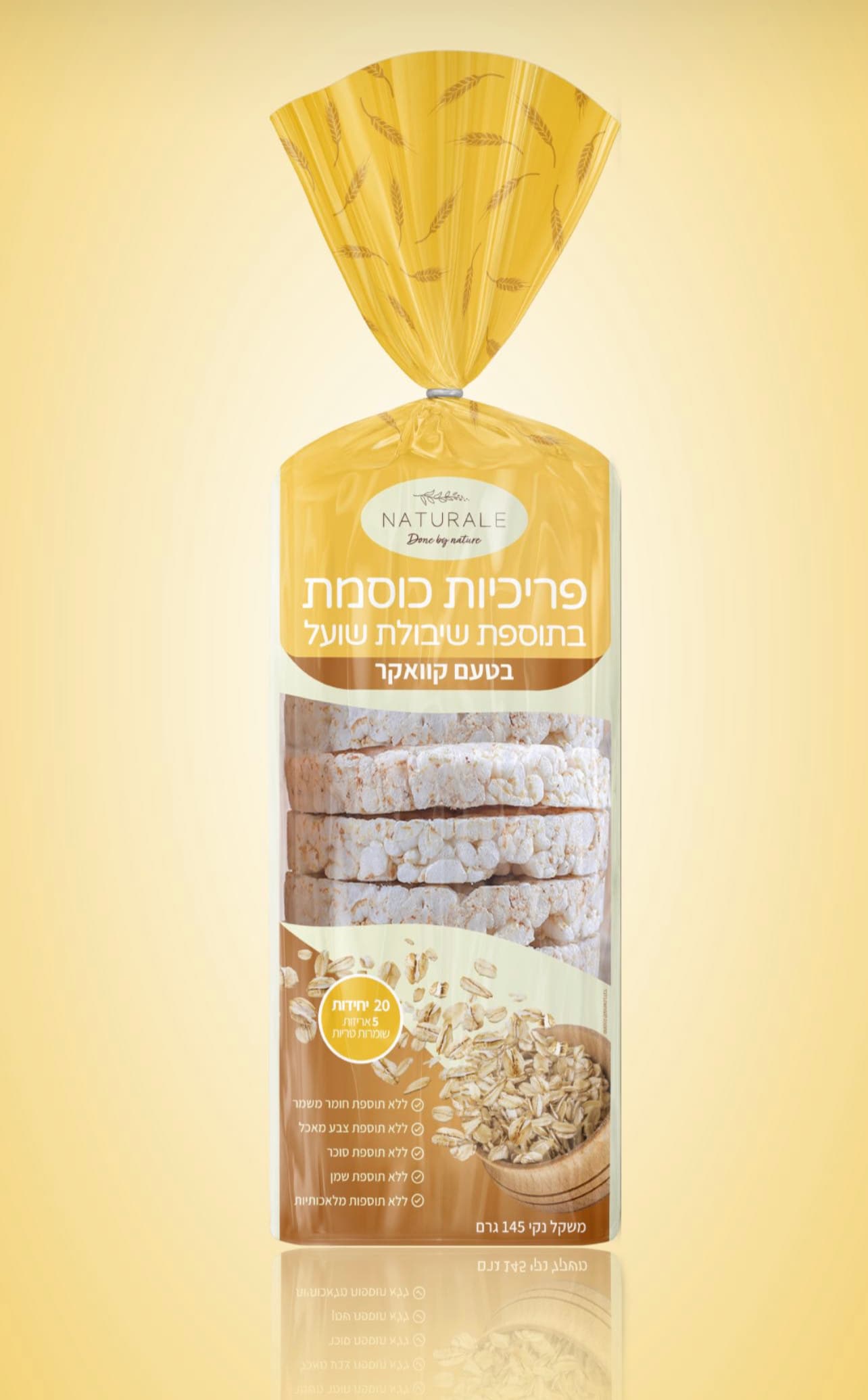
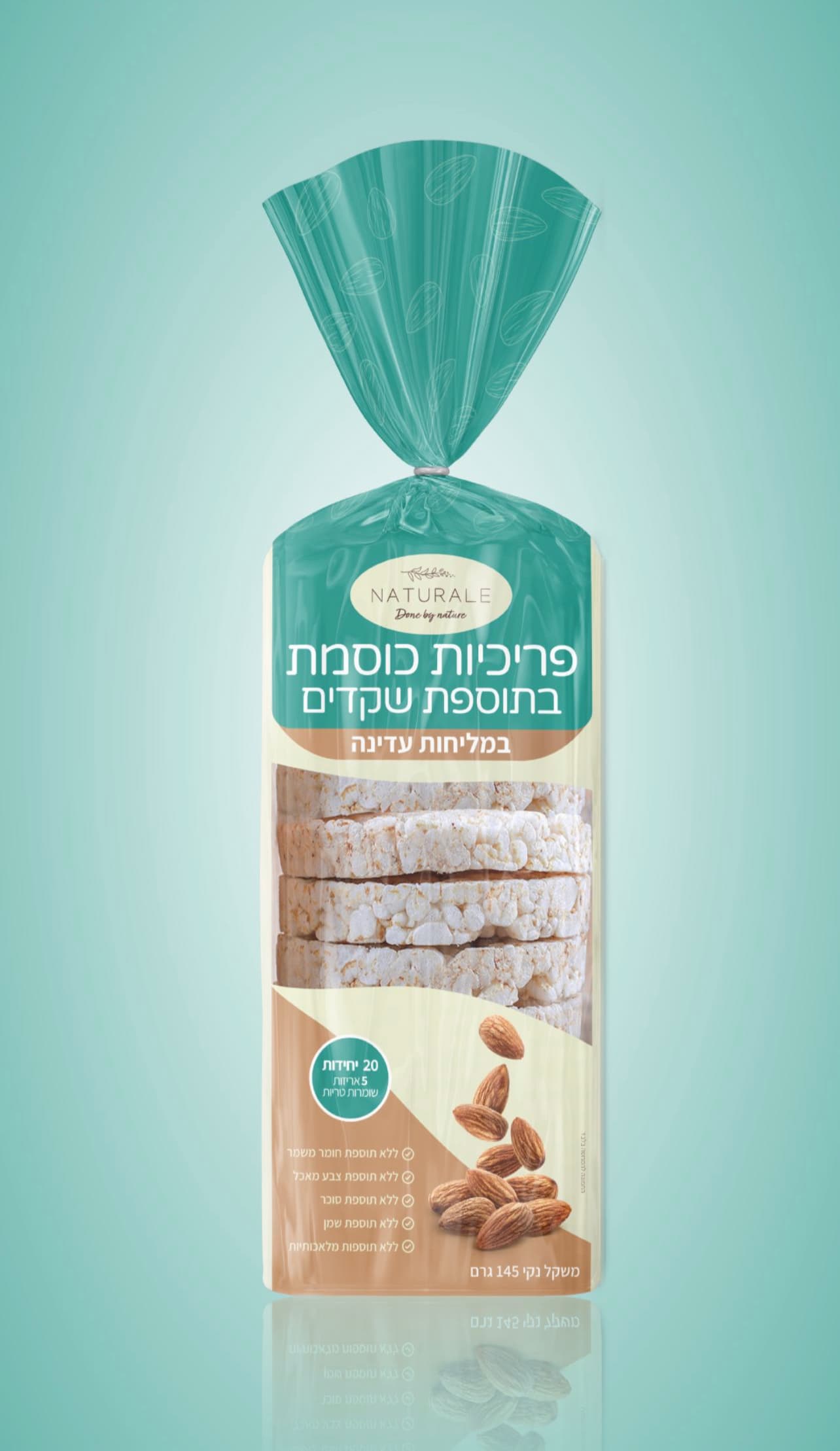
– My overall reaction is favorable. I like that there is a consistency in the graphics for the two products but they are obviously two different products. I’m guessing one is wheat flour and one is almond flour?
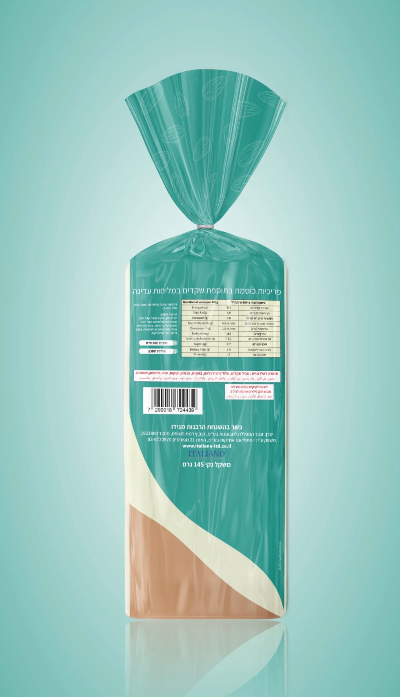
– The bluish-green on the almond packaging reminds me of the color of mold that grows on old bread. I’m not sure if the consumer would have a subconscious reaction to that or not.
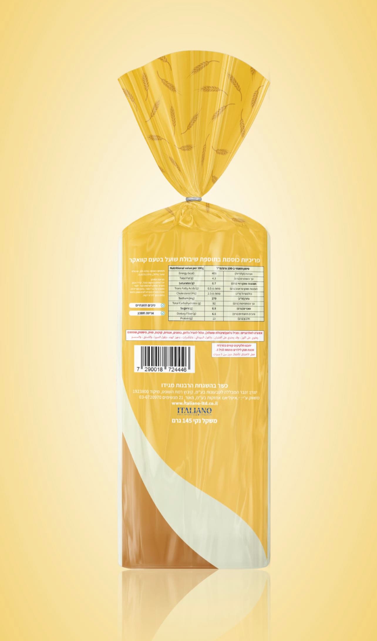
– This is a minor nitpick, but the check digit is missing from the UPC. Then again, maybe it is not included wherever this is marketed.
– What does the end of the loaf look like? Many times, the end is what the consumer sees when walking the bread aisle.
This isn’t a loaf of bread. It looks to be rice cakes, which usually stand upright on the shelf.
Are we rating the design? Or the creation of a mockup?
I see that now. At first glance, it looked like a floury, crusty loaf of an artisan bread.
This topic was automatically closed 365 days after the last reply. New replies are no longer allowed.