Pantone coated and Uncoated are the SAME INK on different paper. The ink mix is the same, those books only represent what the color might look like on coated or uncoated stock – and that is a lie unless you are using the exact same paper Pantone is using.
We always assume the designer means Coated when specifying a number without a C or U. If the number has a U, we will contact the designer and ask them if they meant C, or if they want us to match the actual uncoated chip in the swatch deck. They are, more often than not, totally different colors. This is in the US. In Europe, for specific print processes, they want you to be looking at the Uncoated numbers, but that’s a whole different and likely off-topic ball of wax.
Most digital print machines (in the US) are calibrated to profile on Pantone Coated.
Only about 80% of Pantone swatches can be matched via profiling on a CMYK inkjet press (maybe up to 85% if you add cmyogv capability.)
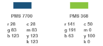
If you are trying to match a Pantone for CMYK, you’d find yourself a Pantone Bridge, find your Pantone in the Coated column, then check if the matching Process swatch next to it is even close. If not, search through the deck to see if there is another Process swatch that comes closer, and if so, use those CMYK values instead of the ones for your Coated color. I don’t have my Bridge here in my home office to check if that’s what they did.
Some printers will do a shotgun test for clients (for money) and come up with a custom CMYK mix that works on their press. The designer mistake is to assume those numbers will work on any press.
So,
If you are sending the design to a printer who either chart matches or is tightly profiled you can use the Pantone Coated color. Unless for some reason you want to match an uncoated color.
or
if going to a gang press or a CMYK printer use the specified CMYK values.
The RGB values, are not used in printing. Even the one RGB print process out there uses Pantone Coated, if you want a color match. You can use those for web work, but Hex color specs are better.
What isn’t catching on is LAB values. There isn’t an easy way to visualize LAB values in a book but if you have ISO verification and/or GRAcol standards, those are a very dependable way to get consistent color. I’m not a fan of either as they give up gamut to reproducibility, but I’m old and set in my ways too. I chart and shotgun to get as close as possible to the Pantone, if the customer pays for matches. Profiles are so tight these days they come darn close already and maybe only need a point or two of correction.
If color is important, get a proof.
And note:
Printdriver is a US-based digital-wide-format-print dude. Your mileage may vary. Slightly.