I’ve not been a big fan of Adobe Fonts for several years. The overall quality of some of their fonts isn’t much better than that found on the free font sites.
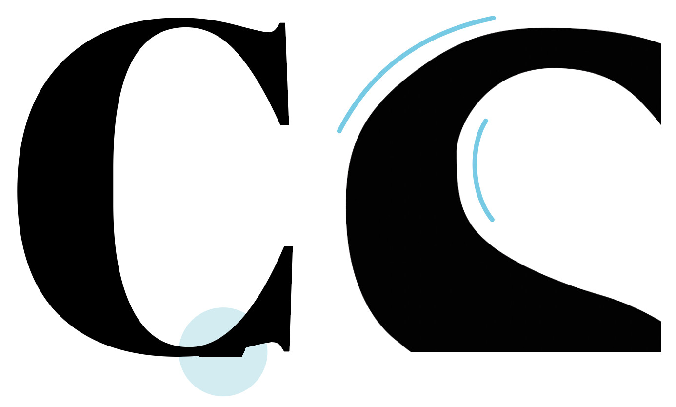
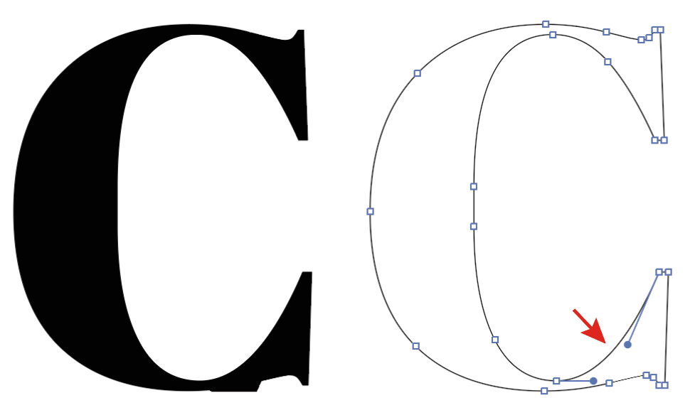
Today, for example, I ran into three issues with two separate Adobe fonts. The first involves an outline error in Abril Fatface. The second is the sloppy curves in Adobe Caslon. For the third, I couldn’t even get Adobe Caslon to load in either Illustrator or InDesign — just Photoshop.
I expect this kind of inattention to detail in free fonts, but I expect more from Adobe. At one time, I thought Adobe would likely dominate the type world — especially when they started providing access to their type library from within the CC apps. More recently, I’m less worried about that. I’m really not too sure they care all that much anymore since there’s relatively little money to be made in it.
I probably should, but past experience tells me that my picky concerns generate little interest. Although I find these kinds of problems annoying when I use Adobe Fonts, it’s just another reason for me to avoid using them. I’ve purchased a good selection of fonts over the years. In addition, Google has a growing selection that rivals Adobe’s in quality and exceeds them in variety. For me, what Adobe Fonts offer is mostly the in-app convenience of using them.
Those were the first things I tried. Unfortunately, it didn’t work this time.
Honestly, though, it works 95-plus percent of the time, and most of their fonts are pretty good. I’m just surprised I ran into three separate issues with them today.
It’s the people who expect Adobe to be the best who use these fonts, then blame ME when they cut like crap in vinyl or 3D lettering. It saddens me that Adobe can’t be bothered.
Had one just last week, It was a Caslon with a crappy outline file, and I mean reeeeeeally bad, but I don’t think it came from Adobe.
Cannot retire outta this industry soon enough. (sigh)
In fairness, I think they just bought Typekit - I don’t think they designed the fonts themselves.
Typekit was then renamed to Adobe Fonts.
I’d say they bought Typekit and made it plug and play with InDesign to fulfill a deal with a major client. I couldn’t be 100% sure though - but that’s generally how things come about.
I think Adobe Caslon was created by Carol Twombly who worked at Adobe in the early 90s.
Probably happened back then and nobody noticed or cared.
No, Caslon is one of the typefaces we check every single time. There are a lot of crappy outline files for that one, and a lot of free-font knock offs. I don’t know what Typekit was before they became Adobe, but this one has been going around since I first noticed back in the early aughts. Free-font Caslon is also notorious for dropping glyphs in rip. And once had it drop out all the letter x. The problem with that is there aren’t a lot of the letter X in any particular job so was hard to catch. Client actually caught it in galleys (that particular time we had to print the whole exhibit in miniature for the approval process.)
Carol Twombly is one of the pioneers of digital typography. She’s the one who designed Trajan and, with Robert Slimbach, helped design the ubiquitous Myriad (or, maybe I should say, modified it from Frutiger). Maybe it’s time somebody at Adobe tightened up her work from the late '80s to match what’s expected in the 2020s.
I checked, but couldn’t replicate the issue with Abril Fatface. So I am not sure the font is really faulty. There could be some other issue as well.
In general, I would rather contact the foundry of the font, in this case Type Together.
Adobe doesn’t make most of the fonts they offer as part of “Adobe Fonts”. But the foundries would certainly care to remove bugs so they have a good product to sell.
And I would say that Adobe Font in general are quite good. It’s a curated collection of commercial fonts and they have contracts with some of the best foundries out there. Unlike the regular shops like MyFonts, Creative Market and so on, which accept almost anything.
After a little more experimentation, the Abril Fatface problem seems to be confined to Adobe Illustrator. It doesn’t appear in InDesign or Photoshop.
In Illustrator, when I convert the glyph to an outline, the outline appears fine, but the odd glitch remains when displayed in non-outline view. When I shift the associated anchor or control handles a small bit in any direction, the problem goes away. The same is true when I add another anchor point to the path segment from which problem originates — the problem goes away.
Mac. I cleared all font caches and upgraded to 25.2. The problem remains.
At this point, though, I’ve moved on. The Abril Fatface was just something I used as a headline in a small ad I was building. Converting it to outlines, then tweaking it a bit solved the problem. I likely won’t have a need to use that font again. Still, it’s a weird problem.