I’m studying graphic design and this is my work for the assignment about pop art design . I need some feedback for my work.
Thanks.
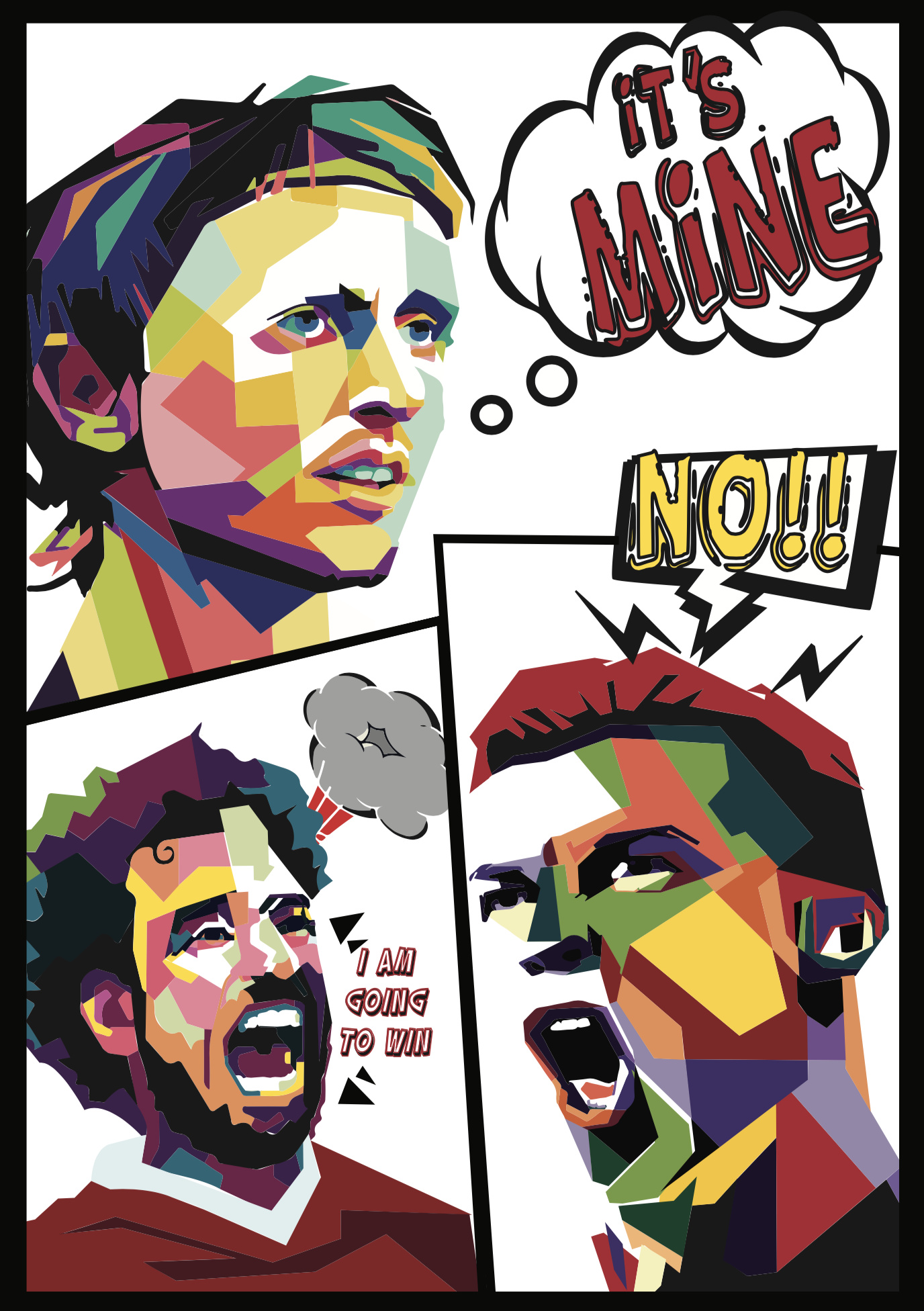
I’m studying graphic design and this is my work for the assignment about pop art design . I need some feedback for my work.
Thanks.
I’m not sure that you really understand what pop art was.
The entire movement was based around the notion of taking imagery from popular culture and treating it as fine art. At the time, this was a radical notion since there had always been a distinct difference between something hung in a museum and something found, for example, on a grocery store shelf or in a comic book.
Most pop art has a 1950 or '60s look to it since the movement was at its peak during that time. If you want your work to look authentic, it should take on that kind of a look. However, I think a modern version of pop art would likely incorporate popular imagery from today.
What you’ve put together doesn’t do either of these things. Instead, you seem to have concentrated more on exploring a personal style composed of fragmented planes. It might be an interesting look, but how does this style and the images you’ve used relate to pop art?
Doesn’t look like pop art to me. What example are you using for inspiration?
Cool! Thank you for sharing!
read the definition and look at other artist’s works, find elements that are common in them and try to imitate them in your own way.
Themes, typography, layout and colors. If you feel stuck you can copy a font or another element and base your work on that. You can play around with current popular culture themes.
Hope it’s helpful and not too vague.
For me personally, doing research is the most important part of starting a new project