Ooh, nice update.
You were looking for crits on the original post, are you still looking for crits?
Of course. Different perspectives always help.
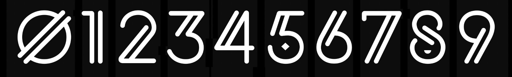
In case it’s relevant to a critique, the letters I posted this morning are the small caps that I’m thinking about substituting for lowercase letters. There will be three weights: regular, light, and thin.
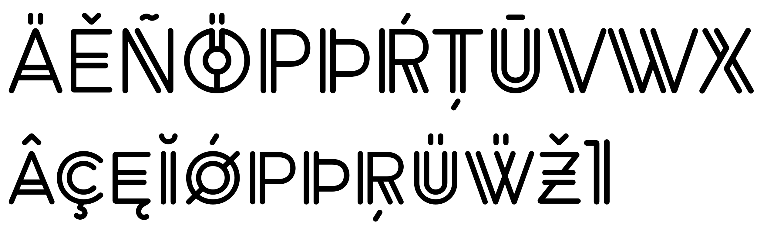
Here are most of the upper and (pseudo) lowercase glyphs from the regular weight I’ve drawn so far, along with some of their diacritical marks. The odd letter between the P and R is a thorn (used in Iceland).
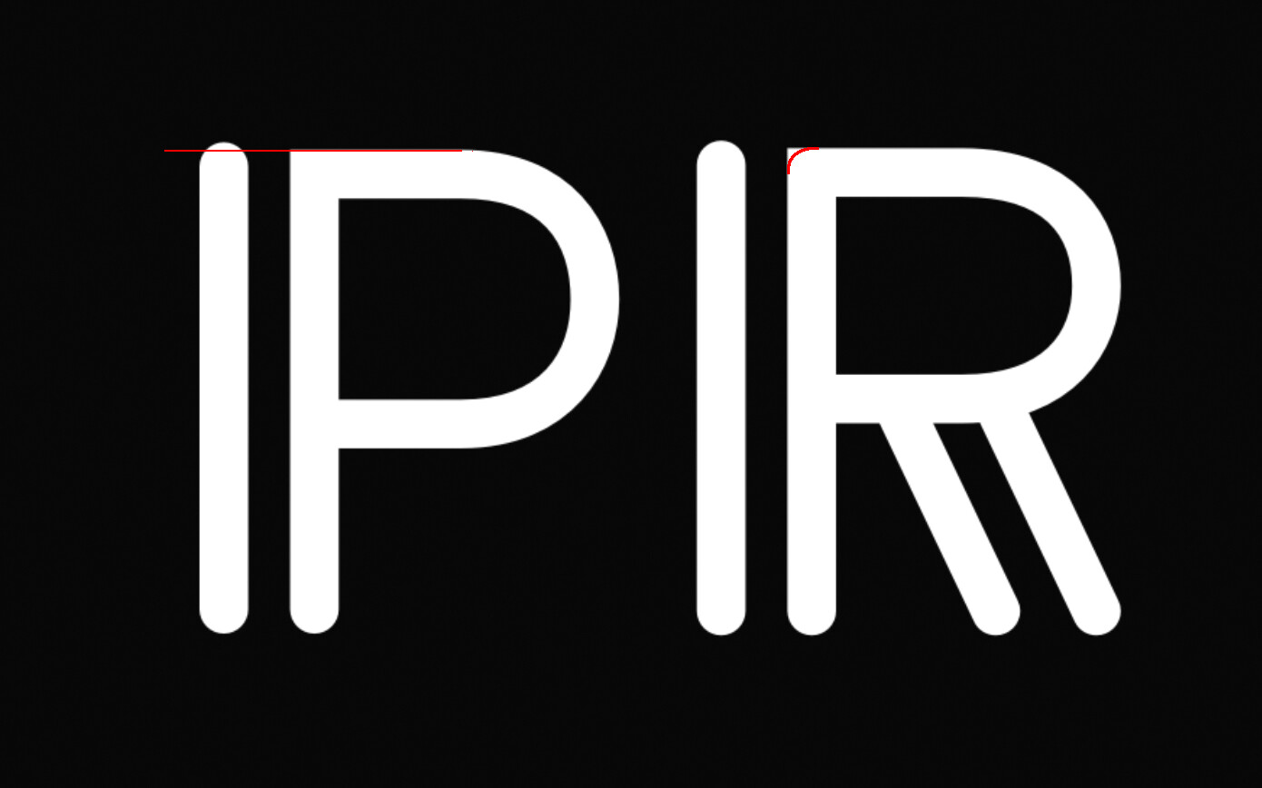
I know some characters are designed to be slightly taller than others, but the left side of the P and R seem a little too tall. Also, I’d look at rounding the upper left corners of the P and R.
1 Like
I agree about the R. I hadn’t gotten around to rounding off all the corners yet.
The difference in height between the tops and bottoms of rounded and flat glyphs is called the overshoot. For example, a round O needs to be a tiny bit bigger than a flat-topped or flat-bottomed letter to compensate for the optical illusion of the round letter appearing smaller. You already knew that, though.
In a more standard typeface design, round and flat tops and bottoms rarely appear together within the same glyph. The difference in height between a C and T makes the two letters appear to be the same height. However, in this typeface design, round and flat tops occur immediately adjacent to each other within the same letter. The proximity makes the height difference noticeable.
I wondered if someone would notice the problem, and you did, which lets me know it’s an issue to address. Thank you. I haven’t experimented with it yet, but maybe I could mitigate the problem with two different overshoot heights — one for the O, C, S, G, etc., and a smaller overshoot for those vertical strokes immediately adjacent to a flat top or bottom, as in the R.
A big part of designing a typeface is countering those little optical illusions that always appear as the various shapes interact.
1 Like