Possible typeface

Here are a just-for-fun bunch of letters I’ve sketched out. I can’t decide whether to spend more time on it, draw all the other glyphs, add a couple of heavier weights, and compile it into an OTF font.

I watched Black Panther two or three years ago and the movie’s unusual title sequence typeface caught my eye. After percolating and evolving in my head for a couple of years, I decided to draw what it had morphed into — sort of an Art Deco + tribal look, maybe.

I’m not quite sure why I’m even posting this — just looking for criticism or thoughts, I suppose.

7 Likes

It would be a very niche typeface. My initial reaction is that it would be best suited to a use when only a small handful of words is being set, for example a title sequence, book cover or album art. I’d be curious to see a few words set in this. That might be more revealing than looking at the alphabet.

1 Like

I agree that it is certainly a display font with short text at best, but it is well done.

There are some “oddities” (the U for example seems off with the lines coming through the bottom section), but I know at the moment you are more playing with it. I also think that the small circle in the A is unnecessary The circles in general seem inconsistent. Such as how the C, O and Q are more like a bolder outlined letter shape versus the rest. But then again the circles do add a little more personality. IMO the circles work best with the D, I and L.

Just my 2 cents.

1 Like

I like it, but have a hard time visualizing how I would use it. On the font sites, what are the inspiration slides called? I’d suggest doing a few of those first… work out the sales angle before completing the product.

1 Like

It’s beautiful. It would make a great choice for a retro piece.

3 Likes

Thanks for the feedback. :grinning:

Yeah, definitely a niche thing that wouldn’t lend itself to many projects. I can’t think of anything I’ve done where I would have used it. I think part of my struggle is that it’s more of a personal art thing than a practical typeface.

Yes. You’ve identified some issues that I was wondering if someone would mention and confirm. Thanks.

There’s always at least one or two glyphs in a typeface that don’t quite lend themselves to the theme and that have no counterparts in the typeface to enable the creation of a sub-theme, of sorts. In this typeface, it’s the U. Nothing I’ve tried seems to work with it. The German eszett will be a problem too, as will the 6 and the 9.

The dot in the A is a holdover from where I was initially going. There’s also a lowercase with many more dots, but the lowercase isn’t working out nearly as well. I think this might end up being an uppercase-only display font (without dots) if I decide to move ahead with it.

Achieving an even density or color is difficult. Some glyphs are simply more open or crowded than others in any typeface. I hadn’t noticed what you mentioned about the C, O, & Q. Similarly, when I’ve written words out, some look great, but others look off due to odd pairings that create uneven color or clustered repetitions. If I go through with this, I’ll need to create a set of alternate glyphs for, probably, a quarter of the letters to provide options (which is another reason I’m a little hesitant to tackle this one). In addition, all the glyph designs on the bolder versions will need to change due to line weight issues. That could be sort of interesting, but it triples the work.

The font distribution sites usually refer to them as banners. I agree with you; I need to start playing around with practical applications to see if it’s a viable font or an artistic dead end.

Very, Very Nice!

1 Like

Totally got Art Deco vibes when I initially saw it!

2 Likes

I like it, though, as CraigB pointed out, there are a few glyphs feel like they need a bit more resolving. I like the way the X works. Cleverly done and I particularly like to way the bold works with two strokes instead of three. The problem, of course, is the time to finish it, which is not an inconsiderable investment of time and its application is fairly limited.

The M feels a little unbalanced. It almost feels like the single, right hand stroke, want to continue to the baseline and the three strokes truncate next to it, if that makes sense, ie swap the stress over.

Overall; Nice one! I think, if it were mine and I had the time, I’d do it. Sadly it’s not and I don’t!

That explanation was terrible, so I thought it probably easier to quickly draw than explain. Hope you don’t mind. Something like this is what I meant…

M

3 Likes

As a sign guy I have a total aversion to skinny stick fonts.
While I can appreciate this, and could visualize possible uses for it, I just hope it stays on paper/online and not in any kind of logo.
(shudder)

1 Like

Good idea. Thank you. That makes the letter a little narrower and helps unify the shape into a more balanced M.

The X is my favorite letter of the bunch.

Have you thought about a lower case ?

I have, but I’m not sure the general theme carries over to lowercase all that well. Below is an initial sketch containing all the iffy lack of refinements one might expect in a sketch.

I think I’ll set this project aside for two or three weeks, which will help give me a fresh perspective.

2 Likes

The concept is good but without lower case, numbers, punctuation marks and various symbols it isn’t a working font. Carrying the concept over to these symbols brings compromises.

But it is looking good so far. :grinning:

Isn’t a display font a working font? I’ve seen plenty of display typefaces that are caps only with a limited set of glyphs. They seem to work for their purpose.

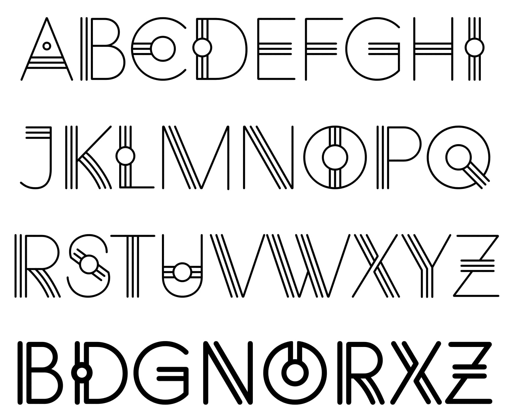
It’s definitely a display typeface that might only work in limited instances when spelling out a few words in large type. Even then, using it would require a very specific project that required a very specific look.

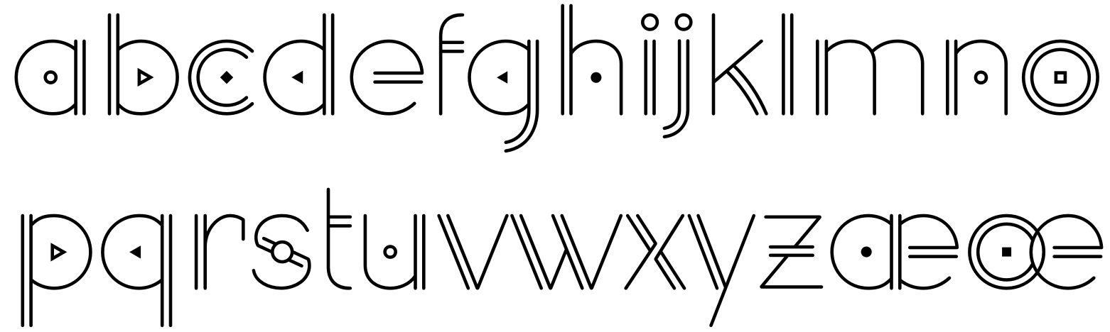
The lowercase, by itself, looks OK, but when spelling out a word or two, I can’t imagine anyone using the lowercase rather than sticking to all caps. Uppercase would almost always be preferable.

However, there is something of an informally agreed-upon minimum character set for complete fonts that roughly corresponds to the character set in the old Postscript Type 1 fonts. That character set always includes the lowercase. Some type distributors won’t even accept fonts without the lowercase

I can’t imagine myself releasing a font without all European alphabet characters not found in English, such as the ǫ, æ, ą, ŋ, ß, ª, º, ij, œ, ą, ħ, ð, þ, ø, ų, etc. And this is in addition to all the diacritics, math symbols, currency symbols, punctuation marks, fractions, and the never-used glyphs that for whatever reason made it into the Postscript Type 1 specs.

Another option with the lowercase is to make the lowercase small caps, which would be a bit unorthodox given there are separate Unicode positions for small cap glyphs. Doing so could work, though, but I haven’t tried it yet. As I mentioned, I think I’ll set this project aside for two or three weeks. My typeface ideas often lead to dead ends; this might be one of them.

This is a good option, either making the lower case a smaller version of the upper case or making the lower case a simplified (or modified) version of the upper case (which could be a little smaller). Just think what the end user would want from this font, giving the end user more options when designing their titles or signage is always a good thing.

My minimum definition of a working font is a font which has a glyph for every key (and shifted/alternate key) on my keyboard. That is the minimum but if it is to be used in Europe it should have various accented characters and the ß character for the Germans. Scandinavian countries will also need ħ, ð, þ and ø. I tend to do the Postscript Type 1 set as a minimum but usually much more. I don’t do many display fonts.

1 Like

Wow! Very cool!

1 Like

After a break of a few days, I’m beginning to feel better about where this is headed.

3 Likes