hello. im looking for some critical feedback for this logo for a post metal band.
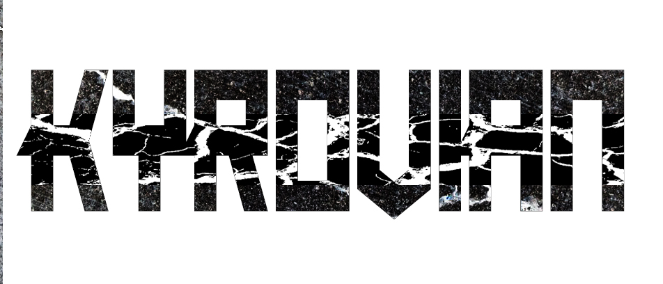
The texture within the glyphs, combined with their unusual designs, makes it quite difficult to read. It’s almost as though you have camouflaged the word.
The horizontal strokes are thicker than the vertical strokes, which is opposite to the way almost all typeface glyphs are built. Vertical elements carry a bit less visual weight than their horizontal counterparts, so making the verticals thicker than the horizontals compensates for the optical illusion. There’s nothing wrong with going against convention when it’s intentional and it works, but most type conventions exist for good reasons.
Finally each glyph is very mechanically geometric and built according to a formula. This is good to an extent since consistency is necessary, but rigidly sticking to that formula forces some of the letters into awkward shapes. Even so, your glyphs are reminiscent of the way certain Cyrillic (Russian) alphabet characters are usually designed, which gives the logotype an industrial look that’s appropriate for what you’re trying to do. I think the shapes just need some refinement.
I’m not sure the little angled extension of the middle crossbars works very well — they’re crashing into the adjacent letters.
Do you have a non-marbelized version?
Even if those are vector texture shapes, they are not repeatable other than by printing them. They are too complex and varied in tonality. And I mean by direct printing them, not silk screen, not embroidery, not stencil, etc.
That will severely limit your band’s application of logos to items or stage dressing and may have cost implications.
If the textures are raster, I hope you have enough resolution there to go Large.
Thanks so much. Appreciate your feedback.