Postcard Design

Hi, this assignment required a design for a postcard.
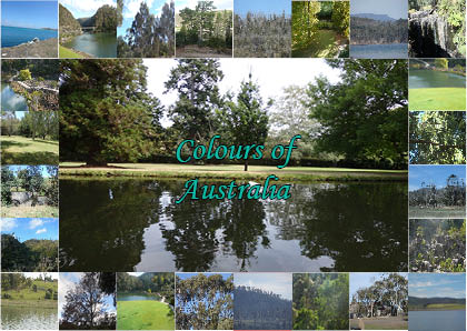
I had to use my own digital photos and a specific colour scheme.
I chose an analogous colour scheme using greens and blues.
The words “colours of Australia” had to be displayed on the front of the postcard.
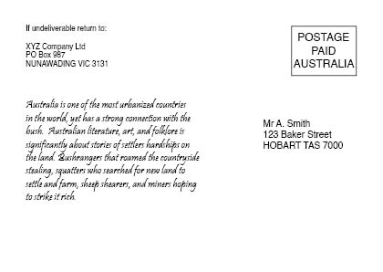
The back had to be set out according to Australia Post specific requirements and include the written copy provided.

front
postcard

back
postcard_back

  • Your postcard is basically showing the same images of trees and water. I know you’re trying to stick to a color palette, but is there anything else in Australia that could represent blue and green instead of just trees and water? Examples: Wildlife and aquatic life; architecture; public art; festival decor; flowers. If you are not going to have more variety, I’d cut down the number of photos since they are not helping to tell the story.
  • I’m going to question your usage of only blues and green. Having checked out the Australia tourism website, I noticed they’re using a lot of great images that take advantage of the large palette of colors of the landscape, which include blue, green, red, orange and yellow. It’s almost the full rainbow! Even their logo reflects the variety of color.
  • In the back copy you mention the historical connection. Why not use some historical photos? You could even do a color overlay onto black and white photos if you wanted them to better match.
  • Please think about where you’re leading the eye. This project is not aligning with a few visual design principles. I’m not going to go down the list, but there is an issue hierarchy of information going on. Aside from the title, all the photos in the outside frame are the same size and are competing visually.
  • The typography seems like an afterthought. Do you see how the line of the lake splits the words “Colours of” and “Australia”? That’s not a good thing since it visually breaks up the title.
  • The type color doesn’t match any color in the photos.
  • Some photos have a white frame around them, but not all. Either be consistent or remove that.
2 Likes
  • Which picture are you trying to get them to focus on the most? All of these are pretty placeable in most communities and don’t speak of something you’d want to show your family and friends who are home halfway around the world. Look at photo-oriented postcards from Paris, Egypt, China or New York and see the photos they use. Postcards are partly about inciting tourism so showing exciting photos is crucial.

  • Where do you see people writing their message? People always write on the back of postcards.