OK.
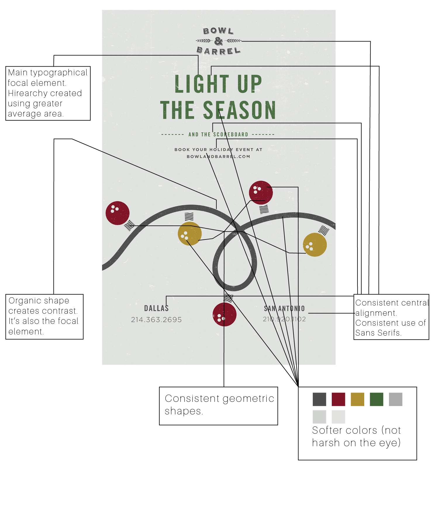
I think your analysis of the background grid largely consists of you having drawn a bunch of lines surrounding all the elements. On this poster, I’m not so sure there’s a readily identifiable grid to be found. Positioning objects to align with background grids helps unify a composition and make it appear logical, orderly and well-proportioned. That said, sometimes designers can do all this intuitively without the need for a rigid predetermined grid. Sometimes it’s just a matter of lining things up and positioning them where they seem to fit. When layouts are approached this way, it’s often possible to identify a grid, of sorts, that emerged as the design progressed, but trying to pin it down with a bunch lines, like you’ve done, ends up being an exercise in futility.
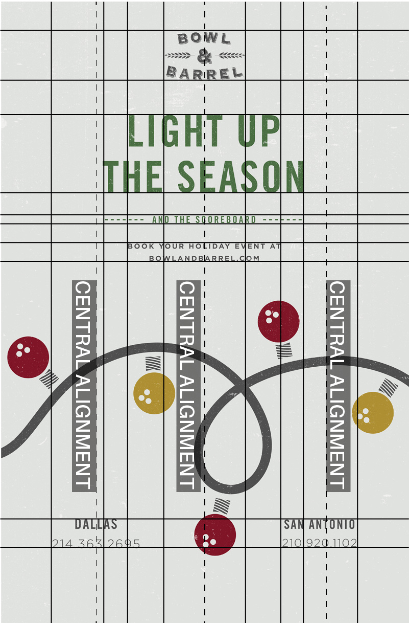
As for your having identified the layout reasoning behind the elements, I generally agree with what you’ve written. You identified some of the standard elements of design that relate to hierarchy, rhythm, balance, repetition, movement, alignment, etc.
There’s another important aspect of design that many design school programs seem to ignore or, at least, underplay. This being whether or not, despite the pros and cons of the aesthetics, the finished piece actually accomplishes the purpose for which it was designed. So with this poster, it wasn’t readily apparent to me what the poster was for or what audience it was intended to reach, which could potentially be a fatal flaw with the poster. In other words, a poster that confuses the target audience is a failure no matter how nice it looks.
Looking at the company’s website, however, made it make more sense. It’s for a combination bowling alley and restaurant (kind of a cool place), whose website design has much in common with the design of the poster (good, consistent branding). So assuming the poster was mostly hung inside the restaurant to a target audience that would immediately understand it, yeah, it’s not only nice-looking, it’s functional. On the other hand, if the poster was pinned elsewhere, it would largely fail to perform, despite it looking nice.