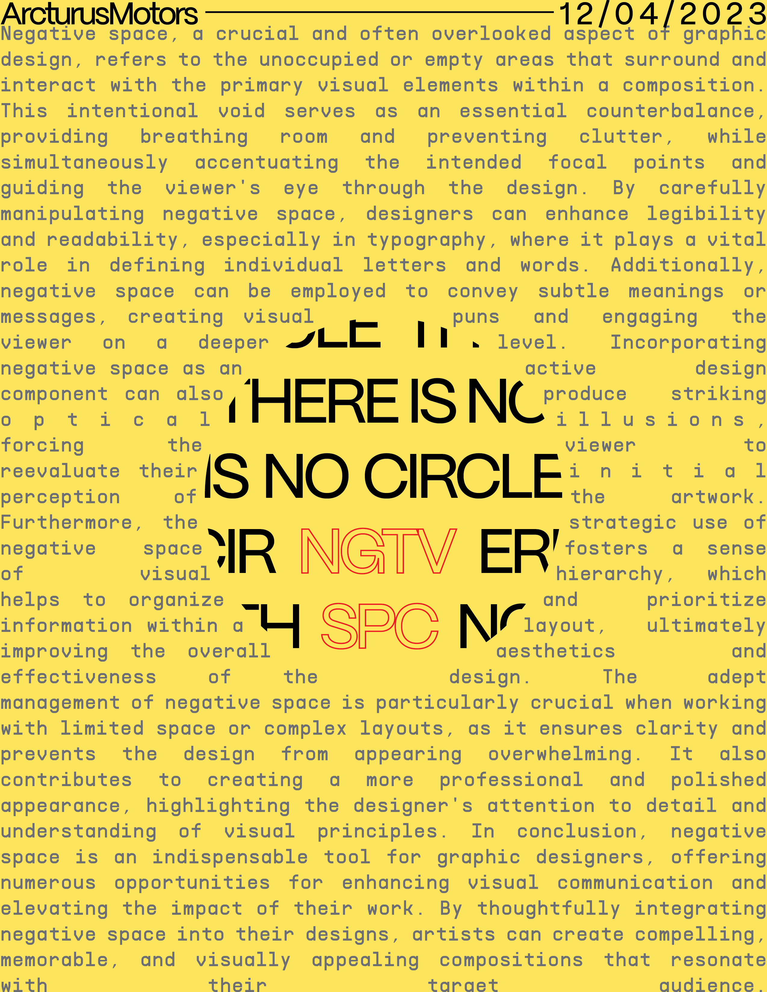
I’m still relatively new to graphic design (around 1-2 weeks worth) and i was messing around with graphic design concepts, and I was wanting to make a serious poster revolving around negative space (and a few other things). Thoughts on this design?
Not a poster. That’s an essay.
1 Like
The justified background text looks a little strange. I also don’t think this really qualifies as an example of negative space, since the vast majority of the space is occupied by something.
How the copy flows makes it look like someone with a skin condition. A course on typography would be a good prescription.
I’m very sorry, but there’s nothing about this that works well. The information is good, but it’s all but impossible to read with the tight margins, terrible word spacing, lines jumping across that circle in the middle, etc. In addition, there’s nothing about your layout that has anything to do with negative space. As was already mentioned, this is not a poster — it’s a difficult-to-read essay.
I’m not at all sure what was going through your mind as you created this. Perhaps you can explain your thought processes a little more to provide a starting point for more specific suggestions.
I was expanding on a concept I had of having text around a circular shape or some sort of negative space circle with text inside or somewhere near it just saying “There is no circle” over and over. I get what you mean by the background text being odd, and I’m just messing around with different placements right now. i’ll upload another one when I get it
You said you are very new to design. Are you taking classes, or self taught? Just curious.
Either way, IMO, you’re understanding of negative space seems off. While not exactly about negative space, I feel as if this video about Saul Bass’ movie poster designs might help.
While it doesn’t address negative space in the video directly, as far as I know, it shows how the negative space was being used as a design element. It is about using the negative space as part of the design to draw the viewer’s eye or to accentuate an overall feeling. Essentially the negative space is just as important as content, whether it is a text, shape, photo, etc.
Since I’m no writer I poked around and found this page which does a pretty decent job of explaining what it is, the importance and how to use it.
3 Likes
I’m self taught, but I am considering classes/tutors. I’ve got some classes online.
Here is another design I thought up of, but I wasn’t as fond of this one due to getting heavy inspiration (with the 4 squares) from that one cube you see everywhere with the heart on it
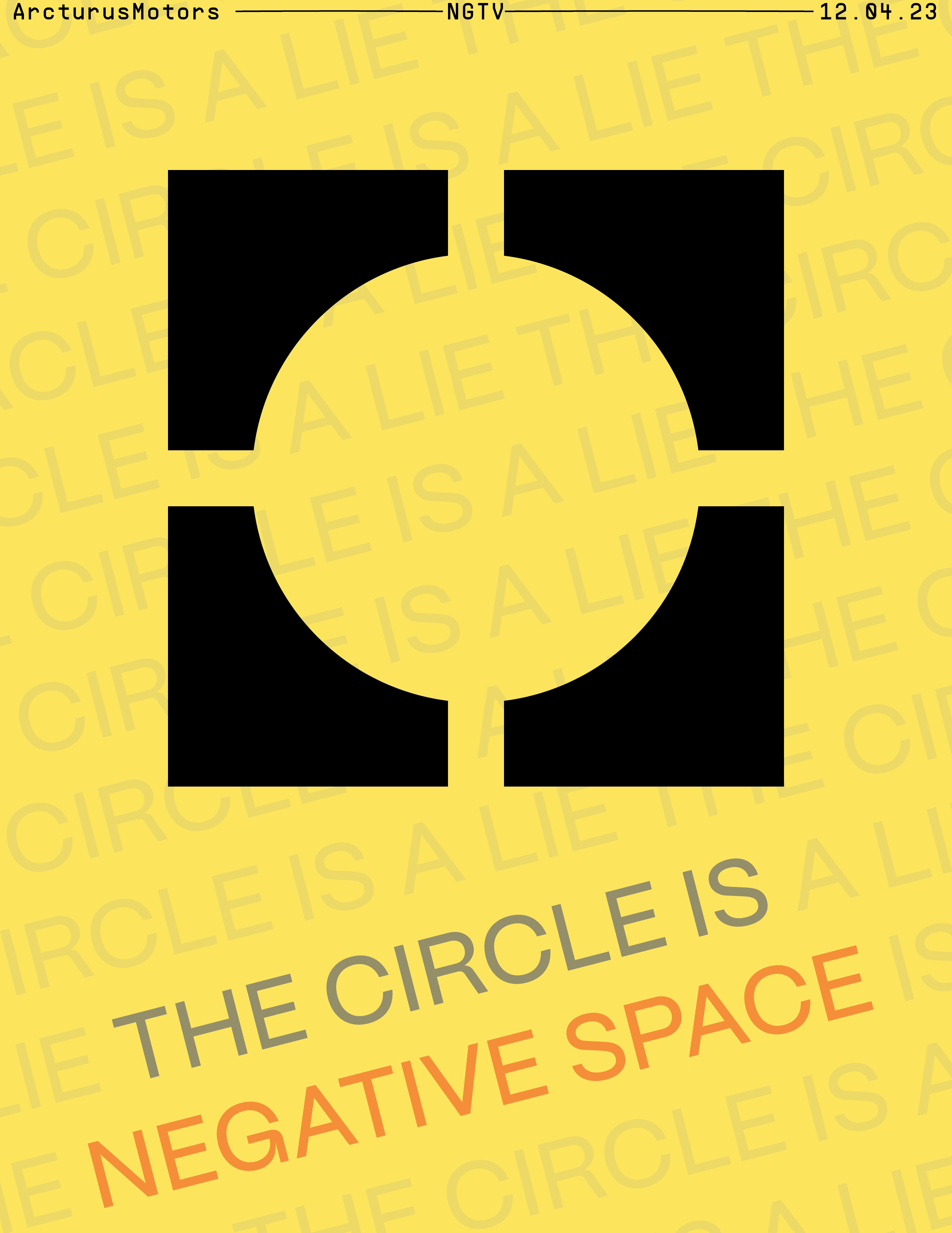
The rotation was just for fun, and it didn’t look terrible with it
Not trying to be harsh, but that is still not really using negative space in your design. Yes, there is a circle being formed by the negative space, but there is no reasoning behind it. Design is about the concept and solving an issue. I’m not sure if you watched the video I shared but it had made the comment about how Saul Bass had worked through 300 concepts/drafts of the Shining poster before settling on the final. And if you notice they were all hand sketched. Sketching is hugely important, especially if you are just starting out.
The main benefit of sketching when you are starting out is it lets you explore ideas and come up with concepts where you aren’t concerned with or struggling with how to create them on the computer. Or, you may not know how to create the idea on the computer. It also allows you to more freely generate ideas rather than get bogged down with fonts, colors and it keeps you from “fiddling” with tools rather than strengthening the design. (such as rotating the text “just for fun”).
1 Like
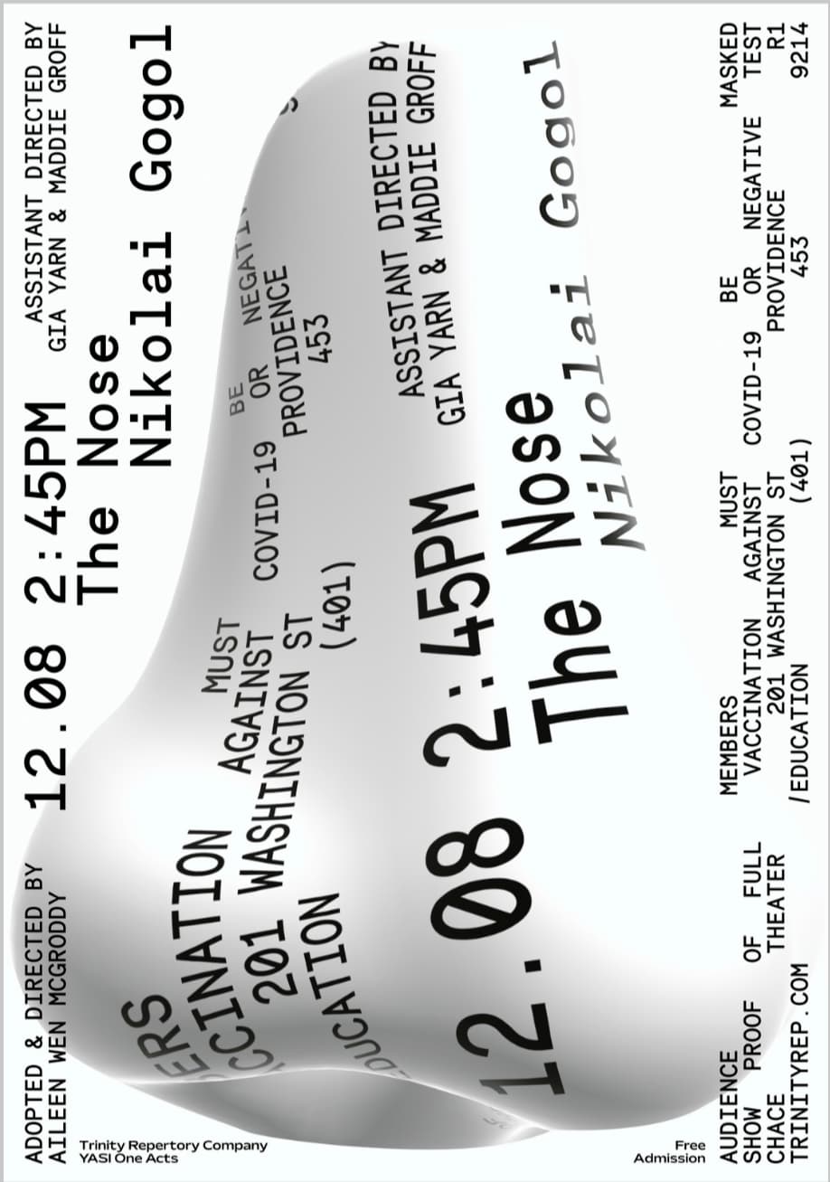
I get what you’re saying, but I’m looking at some designs on typographic posters and some of them don’t follow this. For example, this looks nice, but I’m not exactly sure what problem its solving other than being an odd advertisement:
Also, I’m terrible at hand drawn art and stuff like that, so I’m big on typographic design (I’m focusing a bit more on UI/UX design but I still enjoy making posters)
There’s sort of an anti-design aesthetic that rears its head now and again. David Carson’s Ray Gun magazine or Rudy VanderLans’ and Zuzana Licko’s Emigre magazine are good examples. Nearly every art form has examples of intentionally breaking all the rules to turn things on their heads. Off the top of my head, James Joyce did it with literature. The Sex Pistols did it with rock ‘n’ roll. Marcel Duchamp did it with sculpture. I could add dozens of others to that list, and some works from these movements are regarded as artistic milestones.
However, the artistic rebels who make their mark on the art world don’t represent 99.9% of graphic design. In general, graphic design is not about making artistic statements. Graphic design is almost always about how best to solve a problem by communicating a message to a target audience — usually to benefit a client. Sometimes that message is explicit, and sometimes it’s much more subtle.
Beginners in design, like yourself, probably shouldn’t concentrate on breaking the rules before they’ve even learned what those rules are. I don’t know the history of the odd poster you showed us, but it looks like an experimental piece of art that graduate students in graphic design programs might produce for an avant-garde acting company.
In practice, though, as I already mentioned and can’t stress enough, graphic design is not about artistic expression; it’s about communication and designing something appropriate for the problem at hand.
1 Like
Thank you. I legitimately don’t know what to say other than thank you.
Honestly one of the most helpful comments I’ve had about this topic. I enjoy having a bit of artistic expression with my posters, so I like making meaningless things but I think you have made the most sense from anyone that has said anything.
I’ll practice those posters that are meant to communicate something appropriate, but if I stay active here, you might see a few more random ones I think look nice.
Again, thanks.
Now, on top of such oxymoron as “military intelligence” and “jumbo shrimp”, I will add “graphic artist”.
I may be misunderstanding this, but is this whole website then a website of “artistic rebels”? (Mostly at least)
typographicposters . com/archive (Can’t post links)
We get lots of spammers here. Restricting their ability to post links helps keep them away.
I’ve bumped up your posting privileges by a notch. You should be able to post links now.
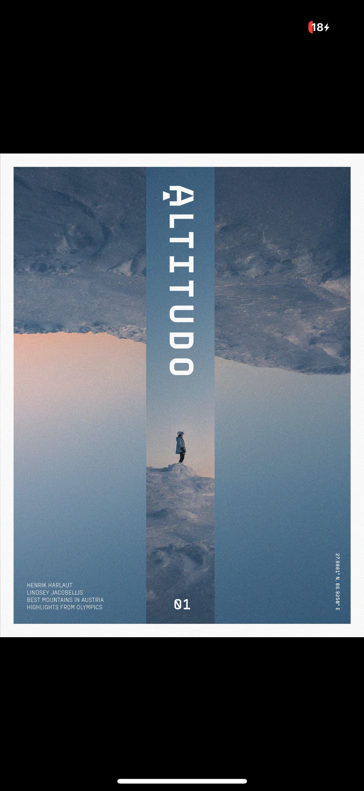
Ok. Here’s another photo for a magazing cover. I’m guessing these have a bit more artistic license due to their nature of depicting… whatever?
And the website I was talking about that by your terms is filled with “artistic rebels.” I’m not arguing just trying to pin down your terminology here and what you mean.
I don’t want to get too bogged down in splitting hairs over categorizing things, but I’d call the things you’ve linked to as a fine arts approach to graphic design instead of rebellious.
From an aesthetic viewpoint, I like some of the work. I like the looks of the Altitudo poster. But from a practical point of view, these posters might not be as effective in connecting with viewers as they could be.
People generally aren’t on the lookout for posters, billboards, or bus ads, so every second lost in someone trying to figure out what is being said is a moment wasted in which the viewer will likely move on.
For example, if a billboard takes more than two or three seconds to communicate its message, very few drivers will drive around the block to see it again to figure out what it says. In other words, if the goal is to connect with a target audience, the design must consider the realities of doing that. Someone sitting at a bus stop will have more time to digest a more complicated poster than someone walking past the bus stop on her way to somewhere else, so these realities must be considered.
The purpose of the posters you’ve linked to isn’t necessarily about connecting with an audience. They’re more about using graphic design as a starting point for making the artist’s visual statement as pieces of fine art rather than strategy-driven communication to help achieve an end goal for a client.
On the other hand, the unusual theatre poster you showed us might be suitable for specific situations where the essence of the poster matches the essence of the avant-garde production in a way that resonates with the audience most inclined to see that type of theatre production. However, as a suburban billboard, it obviously won’t work since drivers will have no clue what it’s about, but in a trendy coffee shop with trendy customers in a trendy neighborhood, well, maybe.
In other words, in graphic design, designers need to determine the purpose behind the design. If the goal is to sell houses in a subdivision or help sway voters, the design must consider and accommodate how best to do that. If the end goal is a personal artistic expression, that’s an entirely different problem.
That’s exactly what you should do – and at a good university. Don’t go for online courses.
When I was (I’m guessing) your age, I, too, was swayed, by the ‘rock star’ designers and expressive, creative work. It took me an education and a few years studio experience to ‘click’ that the trick is to remove your own ego. Your job, as a designer, is not to be an artist, but a conduit.
Excluding things that are ‘graphic artistic expression’ and not design at all, there do exist a few areas where you can be more expressive than others, but even then, none of it is about your own existential torture, it’s about telling someone else’s story.
I have been lucky enough to be able to have spent a lot of my time in various facets of two of them – the music industry and book publishing – though I’ve done my fair share of hard-nosed commercial design over the years too.
Taking the music industry, by way of example, depending on the artist you are working with, sometimes you had lots of freedom and sometimes you were in a very tight corridor. The clue here is, ‘depending on the artist’.
The first thing you should always do is, listen to the music. Immerse yourself in it. Then talk to the artist. Get to know them; see what their creative drive is, then visually represent this, so that when someone picks up an album cover, they already have a flavour and ‘tone of voice’ of the music that they are about to listen to.
Designing a book cover is much the same. You read the book, speak to the author, then distill the gist of the novel, or subject (if non-fiction) onto the front cover, so then everyone can do exactly what we’re told not to do and judge the book by its cover.
It should be a visual representation of what is within the pages. Books can live or die by their covers. The real skill though, specially with non-fiction trade (coffee table books) is capturing the flavour of the author’s words and carrying this through via the typography and use of imagery throughout the book. It needs not to be so obtrusive as to get in the way of the words, but to convey their tone of voice, along with the words you read. In a nutshell, it is attempting to get what is in the author’s head into yours as faithfully, seamlessly and efficiently as possible.
The same applies to even more pedestrian areas of design where less expressiveness is required. If you are creating a brand and promotional material for, say, a local pizza delivery service, you need to understand, the person running the business, their goals, ambitions, drive for the business, then you need to glean from them who their target audience is and speak to them in a tone of voice they expect to be spoken to in, conveying the business owner’s message using your skills, knowledge, experience and ideas.
Sorry! that was a very long-winded way of explaining what I meant by taking your own ego out of the equation. Design can be expressive, but it’s not your expression, it is communicating the message of the person who’s problem you are trying to solve. In most cases, it is not about expression at all, it’s about understanding people and speaking to them.
If you feel the need for a bit of graphic self-expression (nothing wrong with that), have personal projects and side shizzles. They are invaluable for helping to keep your head flexible.
Finally, learn to draw. Just keep at it. Even if it is awful and overly-tight at first, keep doing it, even whilst watching TV, sketch the dog, your own hand, the tv itself. Anything, everything, everywhere. Learn to see the world around you. Most people can do it to some degree if they keep at it. It’s about drawing exactly what you see, not what you think you see (hint: seeing negative space is half the battle)
Finally, go to university.
That really was a bit of a bombardment. Apologies for the onslaught. Another 3.30am bout of insomnia for me, it seems. When it happens, I am almost always wide awake at this time for about an hour and then I’ll slowly get sleepy again. Thankfully I can feel, that is just about to happen – though I fear I’m not the only one I’ve put to sleep this evening!
Goodnight.
The bombardment’s alright, I had to time slot to read it though ![]() .
.
Anyways, university graphic design is sadly most likely off the menu, so I’m going to stick with online stuff as I’m focusing more CS/AI, but I’m exploring graphic design to see if I might enjoy it more which , who knows, I might.
On that note, any recommendations for online courses? And where is a good place to post more artistic posters for feedback (what subcategory on this site or another site)? I know more systematic posters are the main thing here so I’m definitely going to post those here as I practice.
This topic was automatically closed 365 days after the last reply. New replies are no longer allowed.