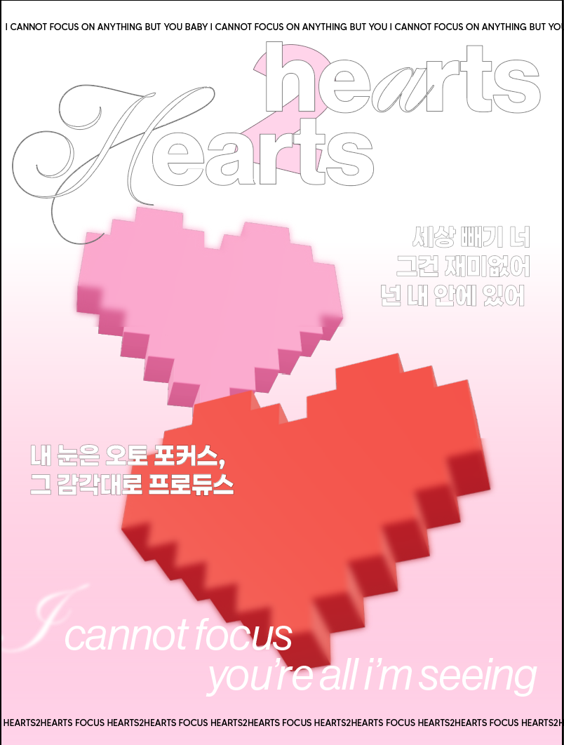
hi! i’m a design student and was looking for some feedback on a composition i’ve been working on (just for fun and practice) something about the type on the bottom i don’t like and i would love a bit of help
it’s a poster based on a song from a kpop group called hearts2hearts for some context
I’m going to be honest because that’s more useful than being polite.
Right now the biggest issue is legibility and hierarchy. There are too many competing type styles (script, serif, sans, outlined, italic, Korean + English, repeated lines at top and bottom), and none of them clearly lead the eye. It feels visually crowded rather than intentionally layered.
The bottom type in particular feels disconnected, the scale, spacing, and placement don’t relate to the rest of the composition, so it reads more like an afterthought than a design decision.
I’d suggest:
Reduce the number of typefaces (max 2, maybe 3 with clear roles).
Establish a strong hierarchy: what should we read first? Right now nothing clearly wins.
Increase contrast (either in scale, weight, or colour).
Reconsider the repeated border text — it’s adding noise rather than structure.
Align elements more deliberately; at the moment they feel placed rather than composed.
There’s a concept here (pixel hearts + layered type + soft pink gradient), but it needs restraint and clearer typographic control to feel intentional.
The main issue isn’t the bottom type it’s hierarchy and legibility overall. Too many type styles are competing, so nothing leads. Strip it back, reduce fonts, define a clear focal point, and rebuild with structure.
thank for your feedback. i def got kind of carried away with fonts haha
is the new haas grotesk font working? should i keep the large ornate “H”? i only outlined stuff bc it was hard to read against the background and didnt wanna make it black bc i was trying to go for a softer feel
I like the colours, this makes harmony also the letters but the Korean letters … I don’t know the meaning. Is the same phrase as to bottom ? why didn’t you put them together ?
its just lyrics from the song.. i don’t speak korean so just throwing some type in there hahah
i didn’t put them together to add type on both sides/top/bottom of the poster for balance
Just a suggestion, for the Korean characters if you are designing a poster from anything, even you like the Korean characters. The customer or a client may ask you, “what means those characters ?, do you speak that language?”. You may like the characters, but your client also may not like them, just when you add something even you like it a lot may be the other person may not like them. Just remember when you are designing something for a person, if you add stuff what they want or something that have a meaning for them. Adding some Koreans letters when you don’t read Korean or you don’t know the meaning, then depending on the person they may like the characters, but also they may not like them. This is a good example of what you can add to a design and what not.
Well, KPop is literally Korean Pop . . . so I think the characters are intentional and fit the theme. I’m not sure why would the client be concerned if you can understand it or speak it. If they asked for a Kpop poster, then the characters come with it. Why ask if you, the designer, could understand their language? It’s not really relevant, is it? It’s just the design they care about . . .
Hi, I’m just giving my point of view as a client (not as a designer). This is just to be aware that sometimes customer (special old people) will not understand this, for young people would love the Korean characters. Anyway, I have been checking and not all Korean pop poster are with Korean characters.
. All customers are different, and they are not equal, make that for sure. There will be happy customers, angry, grumpy etc … All these things you have to get as a consideration. When you design something for a customer, you need to be aware of all these things, you will need to use design thinking before to submit something to a customer because maybe they will not agree for example “If I add this Korean characters, would the customer be happy with that?”, “Will the customer have a concern of this Korean characters ?” etc … When you design something you will need to consider many things and specially for your local language and not for a language that you don’t know anything (Korean included). This is like an American Designer to make a Poster and add some Japanese charaters without knowing what it is the meaning.
By the way, speaking about Designers (well Graphic Designers), everything is relevant. I mean that it is important the colour, the shape, the texture, the psychology and so other many things. This is not as easy task … and it takes time. It is not only making a poster or anything else, adding Korean some letters because you like them, yes it may be fine for you, but you need to think that this may not be fine for other people and may be some may not understand the meaning. Graphic designers want to give a message that every public can understand.
thanks for the input
im just making this for fun so I guess i havent been looking at it from a client perspective
i have the english translation for the korean words, just found it made sense to add words from the song to a poster where the song is the main subject
the posters you sent are mostly focused on the group members as the subject, rather than the song and lyrics…
Yes I know you are joking, that’s fine for all us I just want both of you to be aware with the graphic design, I mean it is OK to joke, but just think about Smurf2 wrote something you should be aware of what he said. I mean, for example, if you make a poster like before with the Korean characters, and show this to the customer and the customer the first thing is :" What it is the meaning of this ?, can you explain the meaning ?" and if you say “Well I don’t know …” and what the customer would be thinking ? (Is this guy serious, is this guy making fun of me? … maybe I should contact another graphic designer)
coming at this from a web design background rather than print, so take this with a pinch of salt — but the colour palette is genuinely lovely. the muted pinks and that warm tone work well together and give it a soft, editorial feel.
where I think it gets tricky is the hierarchy. there are a lot of type styles competing for attention and my eye does not know where to land first. in web design we talk about visual hierarchy a lot because you have about 2 seconds before someone scrolls — posters are similar in that sense. the viewer needs a clear entry point.
if I were working on this I would pick one dominant text element (probably the song title) and make everything else clearly secondary. right now the outlined type, the script, the Korean characters, and the bottom text all feel like they are at roughly the same visual weight. making the song title significantly larger or bolder and pulling back on everything else would give it room to breathe.
the Korean characters are a nice touch and make sense given the subject — I would not remove them, but maybe treat them as a subtle textural element rather than giving them equal billing with the English text.
for what it is worth, the overall composition and colour work is solid for a practice piece. keep going.
By the way, just read the last post of Smurf2 and think about your graphic design. If you are still a student and show your graphic design to your teacher and what he thinks about, he will tell you his opinion.
Just to clarify my earlier point my feedback was about design process, not about whether Korean should be used or not.
In commercial graphic design, the copy is usually supplied by the client. Designers don’t typically invent or add their own wording especially in another language without it being part of the brief.
If the Korean text is intentional and tied directly to the song, then that makes sense in this context. My comment was more about being mindful of process in a real client scenario, not questioning the creative choice itself.
Thanks for make this clear Smurf2, this is my point. If the customer gives to you the stuff (the images) that’s fine for me but what if the customer didn’t give anything and “some one” (one designer), decided to add the Korean characters without asking or offering for the customer or client. Then what would happen may be he would not like it ?, maybe he will pleased or even maybe he would be angry ? (i was doing design thinking this way). In any case, just catch your attention what the designers (all on the forum, event me I get the messages from my colleagues) says, because they really give to you good tips that we can use as a designers.
In this specific scenario, the “client” doesn’t actually exist—or rather, the designer is the client. Since this is a self-initiated practice project, the usual rules of pleasing an outside stakeholder or a “grumpy old customer” don’t really apply here.
Why the distinction matters:
The Designer is the Supplier: They are creating the art.
The Designer is the Client: They set the brief (a poster for a song they like).
The Designer is the Target Audience: They are making something that fits the specific aesthetic of K-Pop subculture, where mixing Korean and English type is a standard stylistic choice.
While your advice about “Design Thinking” and “Target Audiences” is 100% correct for a professional commercial job, this is a speculative/fun piece. In this niche, using Hangeul (Korean characters) is a fundamental part of the visual language of the genre. The designer chose every element intentionally because it matches the “vibe” they are practicing.
The critique they need right now isn’t about whether a hypothetical client would understand the Korean, but rather how to make those elements look balanced and professional within the composition.