Hello again!
Being a bit lost is aranging the elements, I want to ask you these:
Do you thing that contrast in size is not enough? Does “Disco Capaki” competes “Dj snatch”?
Do you find the design imbalanced?
Which of the two version looks best?
Thank you!
I like these a lot. I love the colors, the subtle background patterns, and the clarity of the typography.
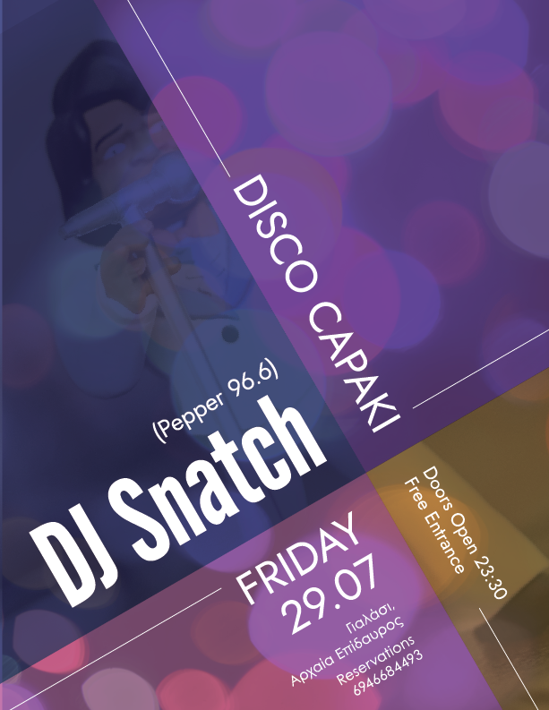
What is the illustration in the top left quadrant? Is it supposed to be the DJ?
You’ve capitalized DJ, as it’s supposed to be. I thought you mentioned that the client insisted it be Dj, though. In this instance, Dj would create a descender and cause problems.
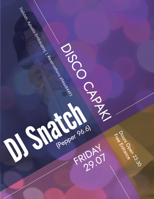
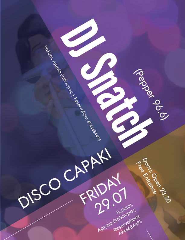
DJ Snatch seems like the dominant line of type to me — especially so in the third example. Which is best, I don’t know. I suppose it depends on how dominant you want DJ Snatch to be.
Yes, but no. The imbalance is asymmetrically intentional and consistent. In a way, this brings the imbalance into a tense sort of balance, which I like. Another way of putting it would be to say the balance depends on organized chaos, which is self-contradictory and interesting. The composition has a nice balance between tension and grid conformity. Again, I like it.
You’ve posted three, but out of those three, the top two are similar. I like these two equally well, but there are things in each that I like a bit better than the other.
I like the third poster too — possibly the most. However, that depends on how prominent you want DJ Snatch to be.
Below, I’ve attached an image showing alignment problems — especially with the typography in the bottom left quadrant.
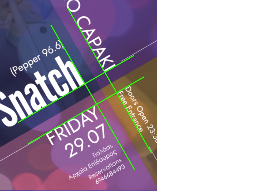
Thank you! I have already fixed the alignment issues (I uploaded the wrong png), but the forum didn’t let me to edit the original post (a message that It passed a lot of time or something like that).
About the imbalance I was referring to, was about that the bottom is more text heavy.
The point that the four images join, is exactly at 2/3 of the width, as I used a grid.
I’m still trying to get used of basic design principles, as balance, contrast, repetition, repetition etc, therefore I don’t make very “fancy” posters.
Thank you again., and I am sorry for pesting you with constant posts and questions
Weight distribution is something I like just a bit better about the 2nd poster. I like the small line of type extending into the upper reaches of the poster. I like that line of type better in that position than tucked in at the bottom, as you’ve done on the other similar poster.
I haven’t measured, but it appears that the juncture point is two-thirds of the width and the height. Centering everything around that juncture creates a nice asymmetrical balance that’s heavier at the bottom than the top. I don’t see a problem.
This topic was automatically closed 365 days after the last reply. New replies are no longer allowed.