For one of my classes, I am required to create a super Hero Poster.
The poster is 11x17 and be superhero based with location, date, time and price for the information placed.
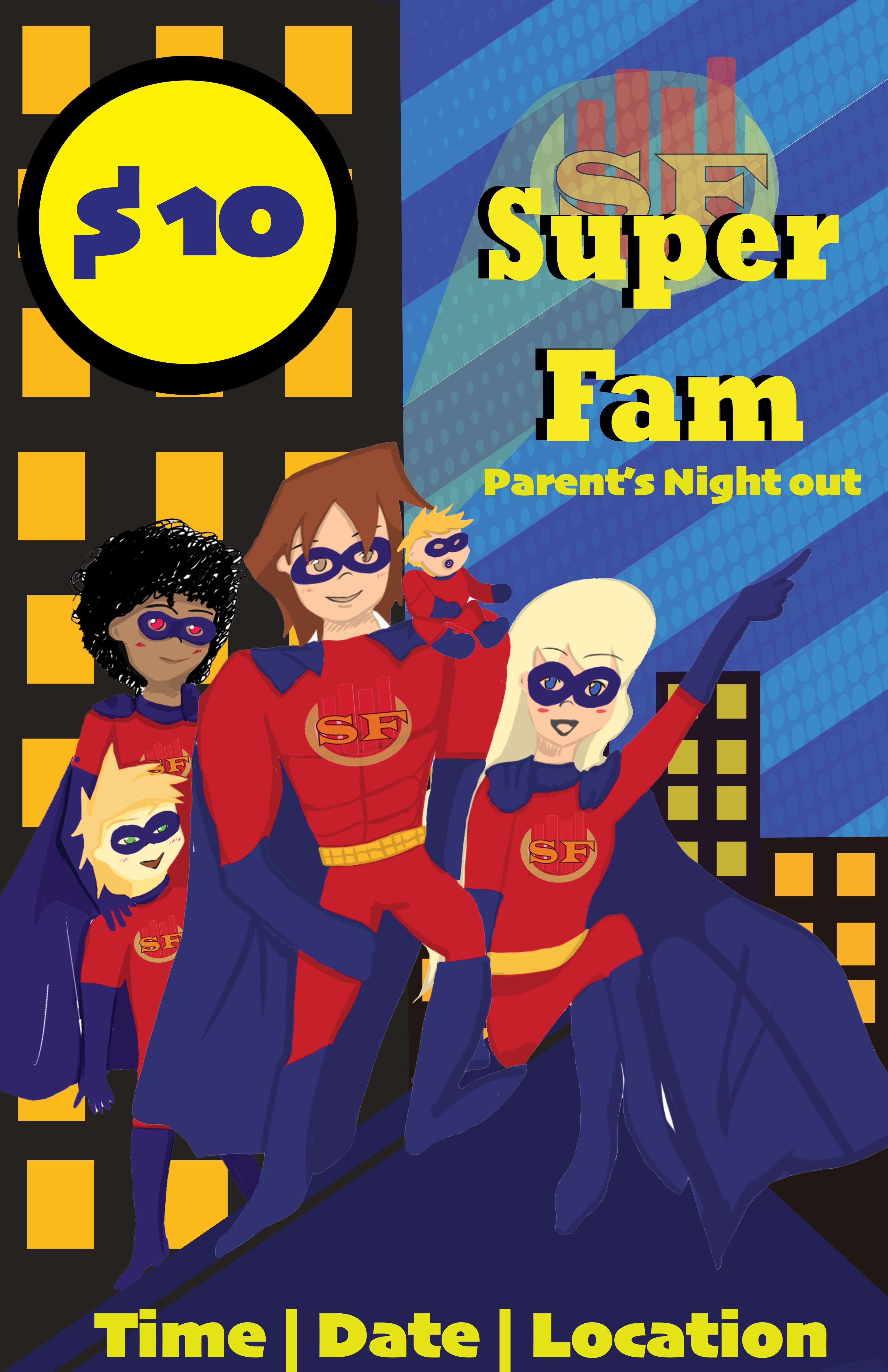
My art skills could be improved, but I was wanting critique on design, position and poses. This is probably one of the first posters I created that had me do a full drawing on it so I would like some advice.
Hierarchy.
Where do you want the eye to start and where do you want it to go.
You have a woman pointing to somewhere off the poster, you have a big bright yellow thing with a 10 in it, you have a mass of purple that doesn’t readily sort out into capes or boots (causes eye confusion) and your logo is the least important element in the poster, competing with SuperFam.