For those who are hesitant to download a PowerPoint file. Download is the wrong word in this case. The PowerPoint file displayed through Google Docs on the viewer’s web browser. No PowerPoint file is downloaded. It seems pretty safe.
As @Smurf2 said, people hesitate to download files from unknown sources since they can sometimes contain malware. With the war in Ukraine, people are especially hesitant to download files that originate in Russia.
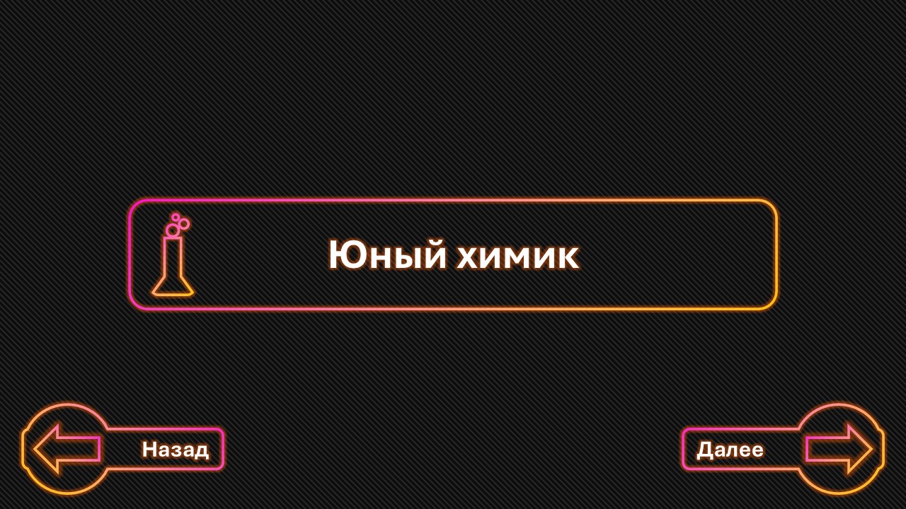
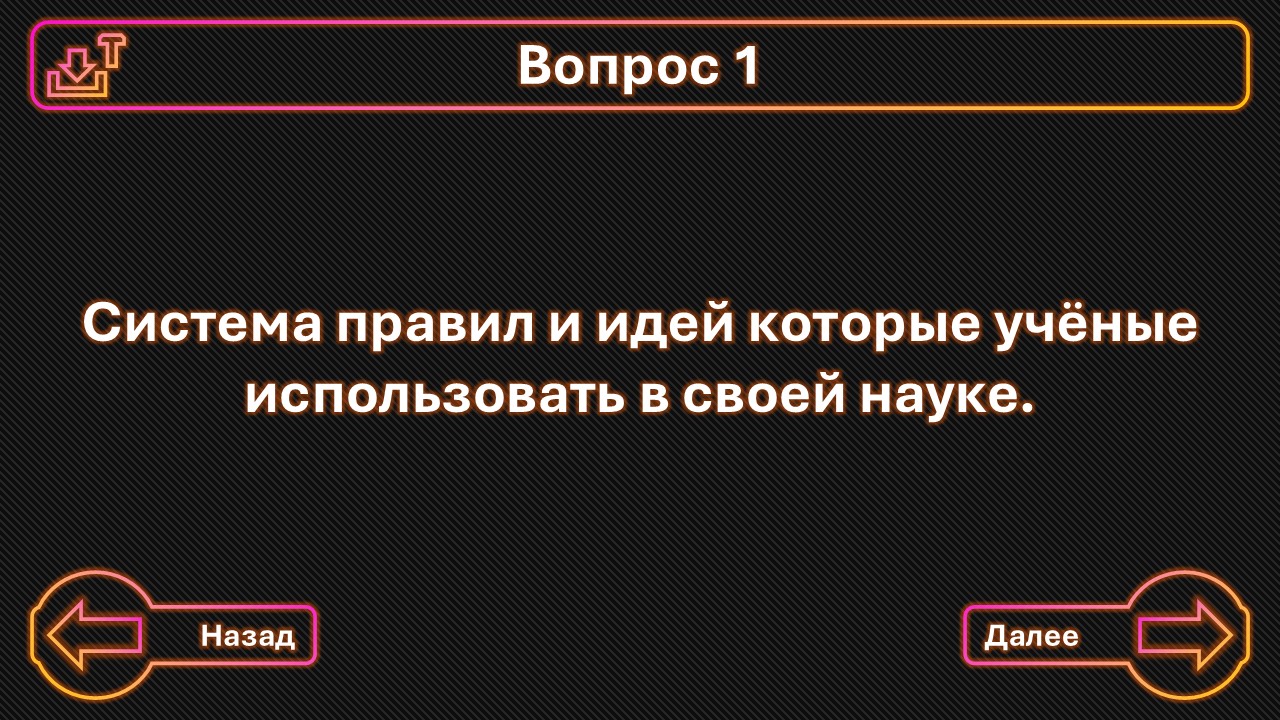
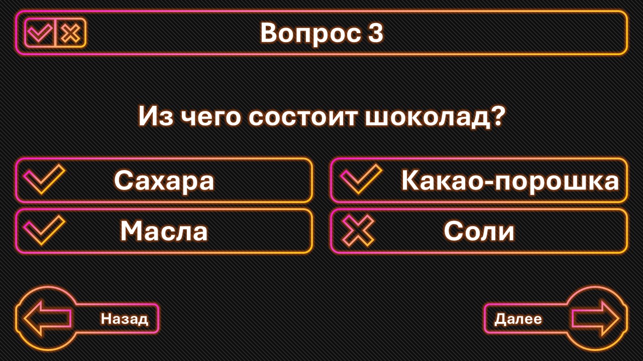
Critiquing your PowerPoint pages is difficult since there’s no context, as Smurf2 also said. For example, context would include how the PowerPoint slides would be shown. The slides are obviously a learning exercise about basic chemistry concepts for children, but would the children view this independently at home, or would a teacher display it on a classroom screen and answer questions and provide additional information to the students? Or maybe it’s a quiz where students will be graded.
The context of the slides is important since the design of the slides must be appropriate for the context. In other words, the design must be functional within its context.
You said you “strive to create gorgeous presentations,” This leads me to wonder whether you’re considering good looks to be the objective rather than contextual functionality. For example, should a dictionary be gorgeous? Maybe so, but that gorgeousness should always be subordinate to its functionality as a quick word reference.
With that in mind, a quiz for children should be simple, focused, and consistent, and I think you have done that. You have already changed the solid purple in your original PowePoint slides to a purple and orange gradient because, I assume, you sensed the purple was a little overwhelming, which was a good observation. However, many other opportunities exist to make the slides attractive without interfering with their functionality or, perhaps, increasing their functionality by making the quiz more understandable.
For example, the boxes at the top where you write Questions 1, 2, 3, etc., could be a solid bar in another subtle matching color rather than surrounding them with a purple-orange line. Perhaps only the possible answers to the questions could be surrounded by the purple-orange line, but not the forward and backward arrows and words at the bottom. There are many possibilities, but you should design the quiz to be easy to understand and more functional as a quiz for children rather than thinking you need to make it gorgeous. Making it look better is important, but the objective shouldn’t be to make it gorgeous. If it were me, I would save gorgeous for a PowerPoint presentation where the need to look gorgeous was part of its function.