Hey everyone,
So, I am designing a business card and I need a lighter color of black to show up in a darker black background, BUT, I don’t know how much lighter it needs to be to appear.
I Printed a few business cards already and in some of them the colors I choose weren’t different enough… what would you guys use?
ex. Blackest black for back (100.100.100,100) and what on top of it would appear fine?
Sorry if the question is dumb, but I always have this question.
Thanks in advance!
Jessica
The trick to making that work is spot varnish to make one of your blacks glossier than the other. Ask about it.
Not sure how you arrived at 100|100|100|100, but I wouldn’t do that (the printer may well refuse too). Even if it’s allowed, why would 100% Yellow make your black any blacker?
Check with the printer. They probably have a “rich black” that they prefer to run. It might be something like 40 / 20 / 20 / 100 or 30 / 30 / 30 / 100. I’ve never run 100 / 100 / 100 / 100.
I agree with HotButton’s suggestion that a spot gloss coating (or even a mix of gloss and dull coating) would be a good way to go.
In terms of a specific tint mix, that’s really going to depend on how much contrast you want, the stock you’re printing on, and the quality of the printer.
Do you really mean “on top”? You can’t print process colors on top of other process colors? I’m assuming you mean the shape contained within the solid black background just needs to be a bit lighter.
Picking up on what others have said, 100C, 100M, 100Y, 100K isn’t a good combination. There’s just way too much ink involved. Something like 40, 30, 30, 100 is far better, but as has already been suggested, ask your printer.
As for how much lighter, these kinds of subtle differences in shades of black are difficult to predict. For example, an absorbent uncoated paper will produce significant dot gain, and your 100% black won’t look that much different from an 85% black. Whereas with a hard, coated stock, there would be an easily seen difference.
Given the variables, and assuming you’re printing this offset, I’d use gloss varnish or, possibly, foil for the shape printed onto the black, which you might even have printed on a matte finish stock or with a matte varnish. In other words, it’s safer and better-looking to obtain a distinction between the blacks using gloss and texture rather than using screen tints of process colors. Another way would be to use Pantone ink colors where you would have some assurance what they’ll look like since no halftone screen would be involved.
If you’re sticking with digital for cost reasons, though, your options are limited, and it will mostly be a guessing game as to how it will turn out.
I have seen matt varnish work well but if varnish isn’t an option you could try a rich black / 100K combo but it probably won’t come out well. It would be easy to run off one copy on a digital as a proof. Your only other option is a tint of black (85 - 95%) with solid black.
This is something you really have to get onboard with your printer.
For them, it is a simple question, for us, it’s all guesses.
Starting first with how you are printing these. Digital? Offset? Process? Spot? Using a Brick-and-mortar vendor or an online gang press?
Simply balancing a “light black” so that it doesn’t go pink or green if using digital or process offset is a variable depending on machine and inkset. Only your printer would know the answer to that.
If running on a gang press, good luck with that. They aren’t the most color critical of folks.
Thanks everyone,
I’m don’t really understood about printing so a lot of terms you used Im lost. lol. But I asked in the place and they told me to use 60,40,40,100 background. And I decided to try a 85% black image “on top”.. On my regular digital printer here I was able to see it. but I did that before and the card arrived here bad.
I really hope I can see the image
I attached what I was trying to say.
Are you wanting the dashed line to appear lighter than the card background? If so that could possibly work, but I wouldn’t want to try to print it. You’re going to get ghosting during printing. If you bump up the ink to prevent it, you’re going to get too much dot gain and the dashes will disappear.
Your best option is a combination of matte and gloss varnish or UV. What you are looking for is not uncommon. A lot of people do that. You just have to do it correctly to get the result you want.
Froma printers point of view: Never 100,100,100,100. I think everyone is correct with the suggestions. I have 2 more that I think will help.
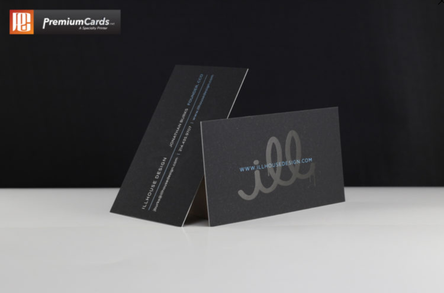
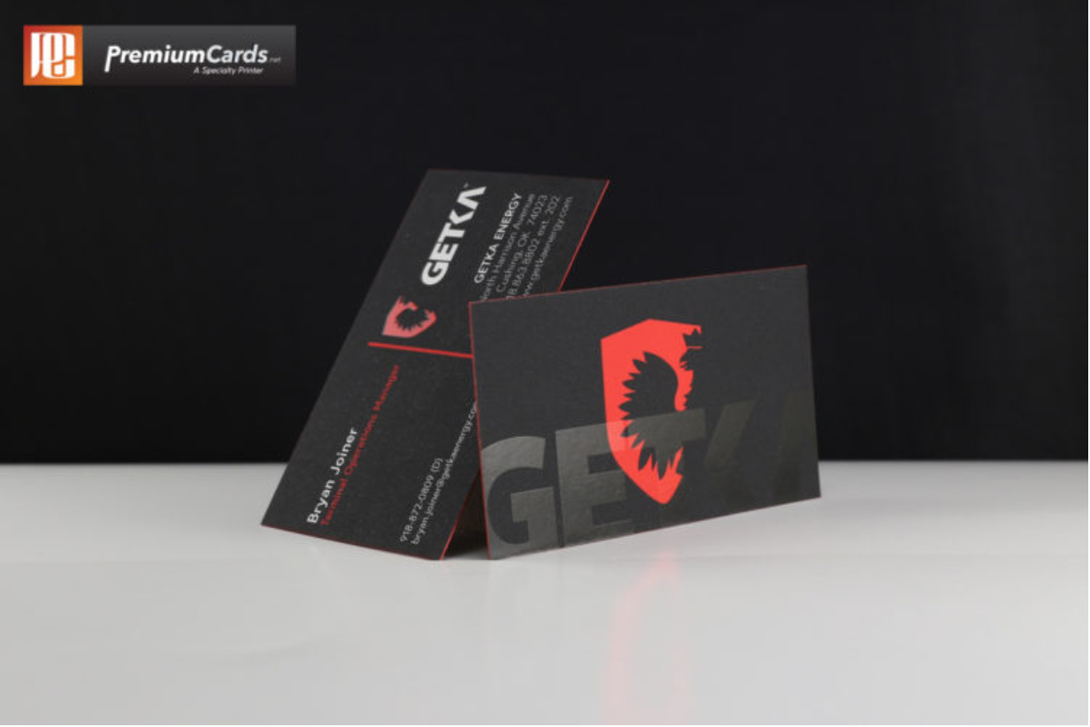
1.) If this is a digital run (small Quantity) then something like what is pictured above. Your best bet would be a printer that has the ability to run a 1 off proof and show the actual product. There are all digital printers that will do the same as the above picture
2.) If this is just going to be a shell for business cards ,example the company logo and then imprint the personal info separate I would recommend look into black stock and then going with clear foil. The consistency of the stock color and the strength of the foil and the contrast is really amazing. I seen a small invite done this way, turned out great but I am sure that the invoice wasn’t as great.