Hello, new here.
I’m working on a gray book cover with an illustration. I don’t have much experience working in CMYK, so I’d like to run this by you all.
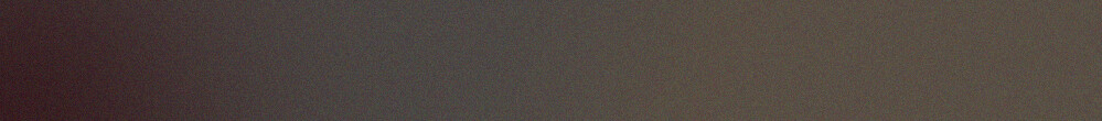
The colorist (primarily a digital artist, also with little experience in print) originally had the illustration sitting on a background gradient that included 3 colors, like so:
It’s pretty subtle, starting at (35,35,40,75), and ending at (37,35,35,80).
So I have a few questions.
Would this create banding (or some other undesirable) when printed on a stock cover paper?
Is it too subtle to even show up?
If it actually would print well, is there an ideal way to set up the gradient in my layers, to produce the best result?
There are people here with more printing experience than I have, so I won’t offer my opinion on whether you’ll see banding in either when they’re printed.
However, when I’ve been concerned about banding, I’ve occasionally used a noise filter to add a bit of texture to the bitmapped image in an effort to help mitigate the problem.
Your revised gradient is so subtle, it hardly warrants the risk of banding.
The standard procedure is to get a test print done on the same stock and the same machine that will be used for the actual print run. This could be expensive, and is in any case an extra cost, assuming you haven’t budgeted for it.
The revised gradient is so subtle that depending on the print process you may as well not even bother with it, let alone risk banding with it. Only 2 points of change in CMYK levels doesn’t even fall within the Delta E for some machines (the amount of acceptable color shift from actual to output)
How is the gradient created? Illustrator or Photoshop?
If Illustrator, the gradient algorithm is good for approximately 8" and certain colors band more readily, and more radically than others. Grays suck to begin with cuz they always want to tip magenta or green on output. I always proof fields of 4-color digital gray and gray gradients to be sure we aren’t going to get something unexpected. There are times when, as the gradient approaches 0% you get a miraculous magenta band depending on how the CMYK percentages fall.
If Photoshop, B’s solution is often used when we have to “fix” banding in something. I’m sure he overdid the noise level to make it obvious in his example. It can be more subtle. Where this is just a bookcover-sized thing, subtle works.
I’m making it in Affinity Publisher (like InDesign), and the cover will be 10" tall.
I want to tip the gray towards cyan, but I suppose that could still lean into green. I’ll definitely get a proof.