So I have made a catalogue on Indesign for a client, and it is almost ready to go the print.
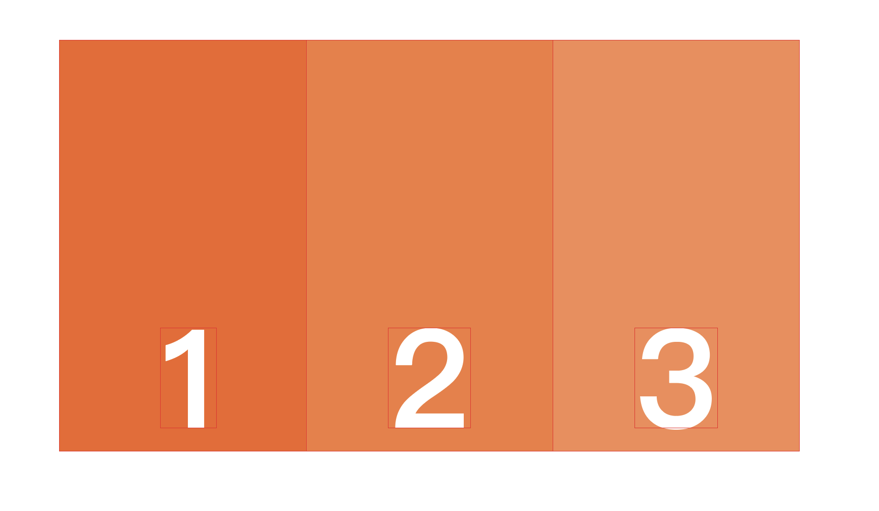
They only now want to put three Monochromatic Colors together with one being a Pantone color (1) and the other two CMYK (2 & 3).
Now that if I understand correctly CMYK can potentially come out a bit different when printed, and I am wondering if it will run into a risk of the Pantone looking very sharp and the rest looking dark & dull, even if they look quite close on screen?
Any advice would be greatly appreciated and thanks!
Boxes 2 and 3 appear to be tints of box one. Why would you want to make 2 and 3 CMYK equivalents of what could more easily and accurately be done by just using screen tints of the solid Pantone color?
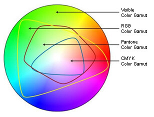
Assuming you have good reasons for what you’re proposing, I don’t know about dark and dull. All the colors appear to be within the CMYK gamut, so a close match is probably doable. Even so, your intuition is correct — trying to match a Pantone color right next to its CMYK equivalent is something best avoided.
Monochromatic means 1 colour.
To use CMYK to achieve what they want is not possible.
Well it can - as CMYK and Pantone are different Gamuts.
For Pantone you can have a reference, a printed reference swatch in a Pantone book.
CMYK is dependent on output intent, without a colour sample with the printers the same print shop using 2 different printing presses would have different CMYK outcome.
Pantone looking sharp would be due to Pantone being a specialised mixed ink. CMYK is dull as the inks have impurities and when converging CMY and K in print you’re mixing those impurities - let alone that the gamut in CMYK is the smallest of Pantone/RGB, meaning you don’t get those brighter outer limit colours.
I’d go with @Just-B and do it as Tints of Pantone.
Pantone doesn’t have a gamut. Well, it does and it’s only about 1200 colors.
It really depends on how you are getting this printed as to what will happen.
Doing it as CMYK plus a Spot pantone will be more expensive than doing tints of the Pantone if you are doing this on a conventional plate press. You’d be paying for that extra spot plate and depending on the press, an extra set up charge.
But if you are printing it digital, chances are, that Pantone color will be converted to process colors. If the print vendor is properly profiled you may actually get something quite close to the actual pantone chip. We’re running about 80% match on profiled Pantone in wide format. That particular color has no siren going off in my head for being out of gamut. What may happen though, is the CMYK mix to get that color may not come exactly close to the CMYK mixes you used in the other two colors.
Using tints would be better, but even that can have unexpected results sometimes. I wouldn’t expect so in this case, cuz you aren’t going under 10% but a proof is always in order. Stupid things can happen when a CMYK mix has an element that approaches 0 before the other colors in the mix. Or if it has a very dominant color. I really hate when some blues turn magenta around 8%, LOL.
To me, gamut means a range, as in everything between two extremes or everything within specified parameters or boundaries.
Pantone comes in a range of colors, but it doesn’t cover everything within that range — just specific points. I wouldn’t normally think of that as a gamut, but I suppose it depends on how one defines the word.
Saying “the gamut of Pantone colors” sounds a little off to me, but if someone mentioned it that way, I’d know what was meant — all the colors Pantone offers.
Scientifically, in the context of color, the term “gamut” refers to the physical possibilities within a color model. The limits are known, constant, and subject to laws of physics.
Pantone is a series of color matching systems. Colors, finishes, and formulations can be added or taken out by the purveyor in response to market needs. In that sense, I’d say the range of colors possible within Pantone systems is more of a product offering than a “gamut”.
We’re discussing different aspects of the same thing.
When referring to gamut I see it as a continuous spectrum, not individual points, as Just B noted. There is no Pantone gamut between two adjacent color swatches. It’s either A or B. And while the color range of Pantone may fall outside of CMYK in places, Pantone has far fewer possible color possibilities, if kept strictly as an ink matching system. It’s sort of the difference between having a continuous tone print or a 256 color .png.
Once you convert spot to process though, it’s all off the table.
I’m sure the OP doesn’t care. I’m just b.o.r.e.d right now. Waiting for dinner time. Pizza tonight!
I learned a long time ago that Pantone is made up of a combination of 18 inks.
And I’ve seen first hand that there is a subset of Pantone inks that can reproduce CMYK colours and labeled in Pantone guides.
The 1,114 spot colours that cannot be created with CMYK are 13 base inks (pigments not including Black here otherwise 14).
We are talking about the same thing here, right? Gamut - the range of colours achievable in within the mixture of different inks?
CMYK (4) vs Pantone (18 or outside CMYK 14) vs RGB (3).
Clearly - each colour model can only achieve a certain range of colours (gamut)?
Are we talking about the same thing here at all? I’m confused.
Using only Pantone’s base inks, yes, I’d say the possible colors achievable by mixing those inks constitutes a gamut of possible colors. I thought it was 14 inks, but it could be 18 now — I really don’t know, but that’s beside the point.
The collection of individual color mixes specified by Pantone using those inks, like PMS 185 or PMS 7404, wouldn’t constitute a gamut, however. They’re just the published colors that Pantone lists within the larger gamut of what’s possible by mixing its base inks according to predetermined formulas.
Of course, there’s a bunch of specialty Pantone colors too that lie outside that gamut, like fluorescents and metallics or their textile and coating colors.
That’s all great but rather than a blob representing Pantone, it should be a number of scattered points. Sure a good pressman or silk screener can mix any color imaginable using the Pantone inks with a reference color to match- if in fact they are actually using the Pantone inks - we use Nazdar for silkscreening- but anywho, yes we are talking about the same thing.
As for what’s achievable in CMYK, that all depends on what press you are using. Like I said, in wide format and especially on a machine with an extended ink set, we can hit somewhere around 80% of the Pantone book. The Pantone Bridge is relatively useless to us but if someone insists, I do have a swatch deck showing the PC colors. And if told to, we’ll run your job with your applied CMYK colors too. Just don’t expect it to match anything you’ve gotten printed elsewhere.