Hey Guys I’m busy with a Public Service Campaign about “Education for all”, I feel like the concept is there but when the execution just isn’t, for some reason just feel like I need something more to grab the attention of viewers.
The campaign is regarding access to education? Is there a call to action?
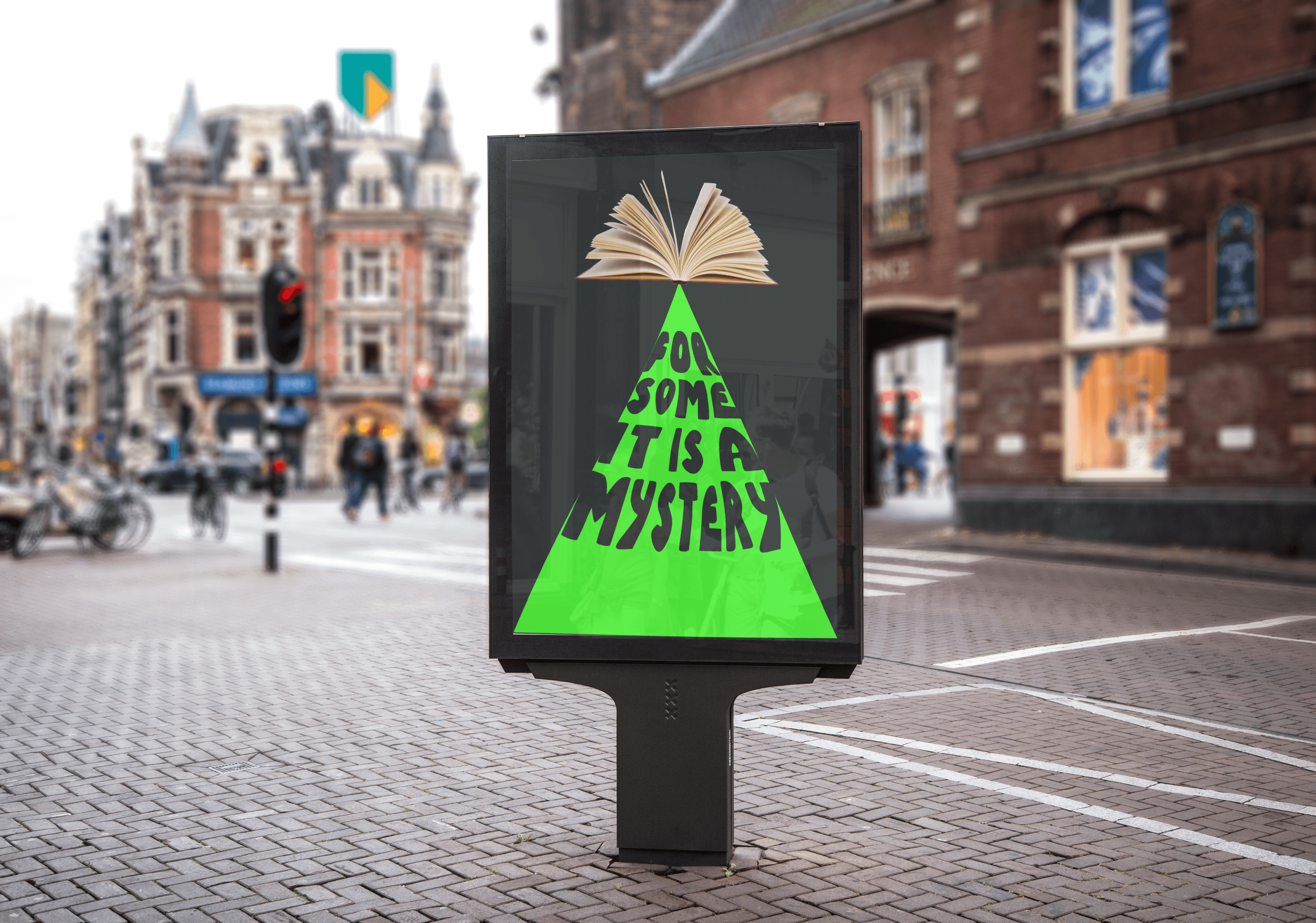
The Project brief states the ad needs to be inclusive and accessible to all cultures in Africa, the call to action is to provide quality education to all. My research indicated that there is a shortage in books and textbooks. I need to use the Microsoft Persona spectrum to foster empathy.
I only understood what your poster was about after reading your explanation. Without that, the only mystery would have been what the ad was about. Rather than being inclusive of all cultures in Africa, I’m inclined to think it would be exclusive of almost everyone because few would get what the ad was about.
That isn’t a “call to action.” Instead, that’s the end goal of the ad campaign. A call to action is a more immediate and doable action that the ad encourages the target audience to take — for example, visiting a website, contributing money, signing up for something, buying a product, signing a petition, donating a book, etc.
I’m assuming the Microsoft thing is part of the assignment. I’m not at all sure how your poster fosters empathy. Fostering empathy requires evoking the right emotional responses from the target audience, which your emotionally neutral poster doesn’t do.
I hate to say this, but your poster makes little sense without it being, first, explained. Even then, it’s a stretch. Bringing awareness to the problem of some people lacking adequate access to books is a great cause around which an effective ad campaign (or poster) could be created, but you haven’t done this. Instead, you’ve created a vague poster that most people will not understand and, even for those who do, there’s no obvious next step people can take (a call to action) to help address the problem.
Furthermore, the bright green pyramid is the dominant element in the poster, but what does a bright green triangle have to do with anything? Why did you hand-letter the type rather than use a well-designed and more legible typeface? If this is directed at Africans, why have you placed the poster in what looks to be an old European city? If it’s meant to inform Europeans about a problem in Africa, it makes no sense at all given that there’s no reference whatsoever to Africa.
I’m sorry, but the only thing good I can say about this is that you’ve identified a good cause. Unfortunately, your attempt at bringing awareness to this good cause would not be effective. You really need to think this through more thoroughly.
I do appreciate all the feedback, like i always say to myself that all opinions are good advice so i do appreciate it. Thank you
Also LOL the Billboard was also just a mock up not really a final, just thought it was easier to present
Actually it is not. To a client, perhaps, but to fellow designers expecting critique, just present the poster alone.
I agree with what SurfPark and Just-B said.
1 Like