So I have a -40% Saturation Shader applied to the whole program when one of the menus is open and it mostly looks like I want it to. However, I had to adapt some .pngs to look normal even when the Shader is in effect and one is giving me trouble. For most of them I just used Gimp to invert the Hue and cranked up the saturation of the base image so that it won’t look washed out and it worked, until I got to the image included below. Increasing the saturation doesn’t seem to do anything to the image and it looks too desaturated out. Is there a way to prevent this?
New forum members can’t post images. It’s a measure we’ve needed to take to keep hit-and-run spammers from posting ads and other junk.
You’re obviously not one of them, so I’ve boosted your posting privileges by a notch. This will enable you to post that missing image, which seems critical to getting feedback.
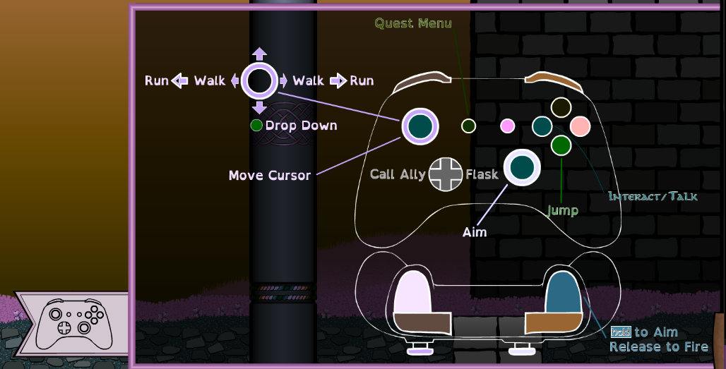
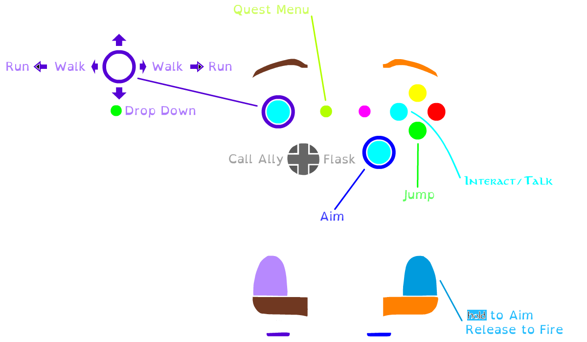
Thank you, I do believe that will help quite a lot. Image 02 is the image in the proper color saturation level I’d like, image 01 is how it’s currently rendering in the program. I don’t know if there’s a trick or way to fudge the image to keep it from de saturating to this degree, but the techniques I used to bring the other images up to par didn’t work.
Is this a website? Maybe a game controller superimposed over the game in the background?
If so, how are you doing it? Are you using straight HTML/CSS and the CSS saturate() property? Are you also using Javascript? If you’re using the saturate property, how and to what are you applying it? Is the background just a static image on a website or is it interactive,like in a game.
Is the entire menu invisible before it’s activated? Or is it in a neutral state of some kind, then brought into focus once it’s triggered?
There’s lots you haven’t explained, but if you’re using CSS to desaturate or apply opacity, why are you applying that saturation value to the menu items you don’t want desaturated? Are you using z-index properties to keep the menu on top? If so, why are you applying a saturation or opacity value to the objects on that layer?
I’m not even understanding why you’re using PNGs. SVGs might be better, but that’s another subject.
I haven’t helped much, but I think it’s because I don’t quite know how you’re going about what you’re describing. Maybe I’ve missed something obvious.
**Sorry, I wasn’t sure how to pose this one. I’m still not sure what area best applies, I am a web designer, currently, so I chose this category, though I’m half convinced this is a question an adept in color theory might better know the answer to.
I’m using a universal engine that exports Apps and Games in whatever format you need (HTML5, Windows, Mac Linux, IOS, Flash, etc). It tends to favor .pngs, as do other graphical programs I use.
In this engine the Saturation Shader is (unfortunately)universal, affecting everything on screen to the desired amount(in this case -40%). There is supposed to be a toggle that lets you exclude the HUD Layer(s), but I’m not sure if that feature is functional at present. After working on this from a programing side for the better part of a week and hitting brick walls the whole way I started to try and circumvent the problem by changing the graphics to counteract what the Shader was doing. Which worked until the image of the controller you see here. Most of the colors are already fully saturated, so I can’t up the saturation to counteract the Shader, at least not any way I’m aware of.
So I guess the question I mean to ask is: Is there a way to alter the image so it’s look as it is now after the Shader is done with it?
Okay, your explanation makes a lot more sense to me now. Thanks.
If the saturation change is universal, I know of no way to somehow change the colors in a way that circumvents the saturation change being applied to them.
There might be a way in the application to exclude objects, but you already mentioned that. Applying desaturation to the HUD layer would seem like a major fault of the application since the whole point of the heads-up layer is to make what’s active highly visible against its background. I’m sure you’ve looked for it, but if the capability isn’t in the program, you’re sort of stuck.
However, there are some odd things happening to some of the colors that aren’t just about saturation. For example, the purples have changed to lighter, unsaturated pinks. How did that happen?
You mentioned inverting the colors in GIMP, but inverting purple would result in green, not pink, so there’s still stuff here I’m not understanding. You also mentioned one of the images/colors giving you trouble. If you’re reasonably happy with some of the desaturated colors but not others, why not pick other colors or values?
For what it’s worth — at least in my opinion — the most important thing is legibility, and the desaturated colors are still legible and clearly distinct from the background.
Again, not much help, I know. I think the best answer is finding a way to keep the HUD layer from desaturating.
I guess I’ll have to pursue that HUD Layer separation again, but oddly my first attempts at color compensation did work. As you can see the CM Slider 00.png is just the right shade of green to get the pale pink I wanted on the other end. I’m not sure that would have been possible if it was just a change in Saturation as the code states. Nor would it turn the player character’s eyes from a deep green to a pinkish-purple.
It’s a beautiful effect, hence why I’d like to keep it, but it’s hard to say just what it’s doing. So your defiantly right on all points, and legibility is key. Heck, that’s why I chose OpenDyslexic for the font, but as the control(s) have a dedicated color scheme associated with the face buttons I think retaining that would help with conveyance.