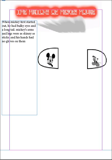
Hi all!As I said in my intro,Im not graphic designer.My professors requirements is to design,many different solutions,with only the same picture/illustration of mickey.The text which I must use,is this:<<When mickey first started out, he had bulky eyes and a long tail. mickey’s arms and legs were as skinny as sticks, and his hands had no gloves on them>>
So, what is the question? ![]()
Hi
@OVOAO
The question is how good is this solutions layout according to my professors requirements
Well they said ‘many’ and I only see one.
Have you ever seen a flyer or piece of marketing material like what you have done, anything that has come to your home, or in a Poster for a movie or any other well formed design.
I know you’re not a designer - but you have to admit this is a very poor attempt.
And not being a designer is not an excuse. If you are serious about the assignment then you will have to do a lot better.
1 Like
Thank you for reply…Maybe is it exist,a guideline that will help me?(for example, all letters must be nearly identical in size and the type of the layout must be nearly in the same size e.t.c
Well, since you say you’re not a graphic designer, I guess that depends on what you study.
If you study art, you achieved to make a thought-provoking graphic about - I assume - a butchered childhood, where the childhood hero got chopped in half and placed inside vacuum chambers, alongside the quote reminiscing how humble he used to look like. The title of your work, “The History of Mickey Mouse”, highlighted in a toxic glow and underscored by an explosion dust cloud, presumably shows that the humble nature of your childhood hero is history now. This could be read as a critique of the Walt Disney Company that whored out Mickey for capitalist gain until all the humility he once stood for is in shambles, or of a broader realization that we live in a world so grim that there is no more place for all our naïve childhood dreams. A sad image, so harrowing, it makes me cry as well. I guess, for an art student such a feat can be seen as a success.
Sarcasm aside, I think that your design does not really follow the brief well - or at least the little tidbits of the brief that you shared here. If your professor asks you to design something for many different solutions, think about some different use cases and then apply some design on them. For example, you could design three household items (or whatever else you like) to feature the quote the professor gave you and the illustration of Mickey Mouse. Eventhough I mocked it a bit, I like that you picked the illustration of Mickey apart into seperate pieces - though I would split them up even more to be more in line with the quote (bulky eyes, long tail, skinny arms, skinny legs, hands without gloves) and place them all over your design in repetition. For that I would look for a more suitable illustration of Mickey where it’s easier to pick the body parts apart.
As a little piece of inspiration, I’ll leave you this link about a grafitti artist in Berlin who is famous for spraying yellow hands all over the city. Maybe Mickey’s body parts can be used in a similar way.
https://www.streetartbln.com/the-yellow-fists-a-post-about-graffiti-writer-kripoe-and-the-cbs-crew-by-street-art-berlin/
1 Like
Thank you very,very much!!! @OVOAO
Couldn’t possibly teach you design in a few forum posts, it takes years to learn, and having some design ability at the start helps.
https://blog.usejournal.com/10-basic-principles-of-graphic-design-b74be0dbdb58
If you don’t have design ability, it’s like trying to teach someone how to run before they can crawl.
Take your time. Study a bit.
Step away from the computer and use pencil and paper first and foremost.
Forget about adding colours/effects.
Get the basic design in paper first.
Then transpose that to the computer.
It’s a study in contrasts. The text of the old Mickey against the image of the new.
Think on that and do over.
Either that or your teacher doesn’t know what is going on either.
1 Like