For an infographic in school, I used only one typeface Neue Helvetica, and used the different weights and styles to denote hierarchy. I think there was like 40+ styles in that package. It wasn’t my favorite typeface but it was a great way to convey hierarchy on the page.
Now I’m on my own, I don’t have access to a large font family like that and it’s a struggle for me to create hierarchy with text-heavy projects without having a few good, large, font families to choose from and experiment with.
I looked at Fonts.com and each individual font in Neue Helvetica is $35 each! And buying the whole package is $400. I simply can’t afford that.
How does everyone else do it?
From what I’m reading free fonts have some limitations (missing characters, numbers, not much font variation) and can be more trouble than there worth with regards to rights issues.
Do you simply have to save enough money to invest in a typeface with a good sized type family?
Or is it often times an issue of eyeballing it, and purchasing the individual fonts within a type family for the goals of the project you’re working on?
I’ve been working in an apprentice-like situation at a print shop and I’ve had to make a variety of different brochures, business cards, banners and posters, and it’s frustrating because we don’t seem to have any typefaces that offer any real variety in styles. There’s no Helvetica, and the best we have is Futura, which I’m using for everything. I’m lucky if we have a typeface that’s comes in italic and bold.
If you have a creative cloud subscription, you have access to Adobe fonts (formerly tyoekit). Another one I use is The Monotype Library Subscription (I use myfonts, but it can also be purchased via fonts.com. Other than that,I am afraid you just end up buying them for client work over a period until eventually you have your own library.
Another thing to look out for is, once a year myfonts have a fontacular week, where they have a sale. There are often bundles for a few tens of £/$, which contain some good basic fonts.
That helps greatly, thank you!
That makes perfect sense about acquiring them for various client projects until you have your own library. Kind of like a crawl-before-you-walk situation.
I’ll check out the Monotype Library Subscription, and definitely “fontacular week” at MyFonts. I have to utilize Adobe Fonts more too.
I while back I had a monthly subscription, $9 or $19, from one of the big font sites (Fonts.com or MyFonts), and I could use any of the available fonts, but only as long as I had the subscription. I still have the app on my laptop, the one that has two rounded arrows making an “s” but now it says “Google Fonts” when I click on it, which I don’t remember it saying before.
That’s a good way to describe it. I don’t like the idea of renting fonts from Adobe since the use of those fonts means paying them their monthly CC fees, but it’s a way to have wide access to lots of fonts.
Most designers end up with a handful of favorite go-to fonts they use over and over, which are typically purchased. Lots of companies have font licenses they’ve purchased for use within the company. When free fonts are needed, Google has some pretty good and reliable ones.
CC doesn’t come with a standard Helvetica typeface/font set? I couldn’t live without it.
Frutiger is nice supplement, or any other Neo Grotesque Typeface should get you close.
The world of Sans-serif typography has a lot of options that could easily be used day-to-day.
The beauty of sans-serif really gets into nitty-gritty detail - negative space, natural kerning ability, symmetry, slope angles, subtle flares and curvature.
I must say, Helvetica was extremely well done. The finest of detailing, subtle to the point that each element on it’s own would be insignificant at best, but compiled together, made this typeface one of the most visual pleasing typefaces in history.
No. Hence the need for the Monotype subscription, which does include it, along with a stable of other workhorses. I’m usually pulling from Monotype to do catalog work, and Adobe Fonts to do the creatively styled projects (working on a flyer for a zombie event now), and supplement that with purchases of individual fonts on an as needed basis from MyFonts.
I do have Frutiger, so I’ll be giving that one a try.
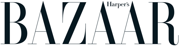
Maybe it’s because it was so prevalent in all our college design projects, but I was thinking that it was too plain to use for commercial projects. I just had this idea that Helvetica had become the default typeface for design students and that it would be better to use slightly newer, different sans serif typeface for ads, brochures, websites, etc. I’m looking at the masthead for Harper’s BAZAAR and even that seems to looks more sophisticated than the sans serifs on my computer, but for all I know it’s something like Frutiger or Helvetica.
I have a tendency to stay away from Helvetica for that reason too. On the other hand, I use Myriad a lot (which is basically Adobe’s clone of Frutiger). I feel bad about using Myriad since, in some ways, it’s like using Arial instead of Helvetica, but I’m off on a tangent now.
Anyway, there is a reason why typefaces like Helvetica and Frutiger have been so popular for so long. They’re extremely well designed and neutral (not plain) in the sense that they tend to take on the personality of whatever they’re used in. You can use these typefaces for almost anything and they just work without drawing attention to themselves.
I suppose if I were limited to just one typeface for the rest of my life, it would probably be Helvetica. Like I said, I rarely use it, but if I had to choose just one, Helvetica would be the one I’d chose. The problem today, though, is which version of Helvetica to choose — the brand new one or the older versions.
I guess masthead is the wrong term. It’s the credits page in the beginning of BAZAAR. I googled the term and it said “masthead” and “impressum.” This is the page and font I’m referring to.
I just took a picture with my phone and tried to clean it up but the lettering got a little faded to the right.
I really like the capital K, and the counter of the lowercase “d” looks more robust and wide than in Helvetica. I really like Futura, but it’s a bit too conspicuous at times and this one here appears to be a meeting middle ground.
I’m looking on WhatTheFont and can’t find a match.
Not necessarily. Some magazines and newspapers refer to what you posted as the masthead and call the publication logo on the cover the nameplate. The publications that call the logo on the cover the masthead, often refer to what you’ve posted as the imprint. I’ve run into this terminology difference more than a few times. It might be mostly a British vs. American thing, but I’ve run into it here in the U.S. too.
As for the typeface, I could easily be wrong, but it has a strong resemblance to Gotham. But if it is Gotham, it’s been artificially condensed to around 90 percent.
I was thrown by the slightly oval shape of the ‘O’ and ‘C’ etc but it is definitely Gotham Light / Medium. The lowercase and numerals match too. It may be the pic but I got a perfect match at 93% width. I had to monkey around with the tracking too.
Thanks for helping me find out what font it was @Just-B and @StudioMonkey
I’m glad to know that it wasn’t just me that felt like Helvetica can appear too common, although I won’t be so quick to dismiss Helvetica either. It’s nice though to have a “correct” gut feeling when it comes to aesthetic or design.
In regards to Gotham, it’s a beautiful font and I looked into purchasing it. Is it for 1 Computer? For a Website with 250,000 page views per month (1 year license)? Complete or Bundle?
Wow! I’m overwhelmed with the rights, licensing issues and all the stipulations therein. And I definitely can’t afford it any bundle.
But I’m assuming that BAZAAR has an in-house designer, or the company has their own license to use Gotham and many other expensive, popular fonts. So it’s not like it’s expected for every aspiring graphic designer out of college to have Gotham at their disposal.
On one hand I find this all a bit frustrating, because of the cost, different pricing plans, legalities involved…it’s a lot to take in.
On the other hand, it’s actually fun being able to take notice of subtle nuances of a sans serif font in the imprint of a magazine which most readers, I’d guess, take for granted. And in the mean time, it forces me to do more research so I can get a better appreciation and understanding of typography in general. Knowing a little bit more just how difficult it must be to create a solid, working typeface, let alone one that becomes wildly popular…I completely understand why the costs and licensing are what they are. I’m actually finding graphic design to be fun again.
I’m looking through Adobe Fonts and there’s some beautiful sans serifs over there. I’m especially liking Mr Eaves XL from Emgire.