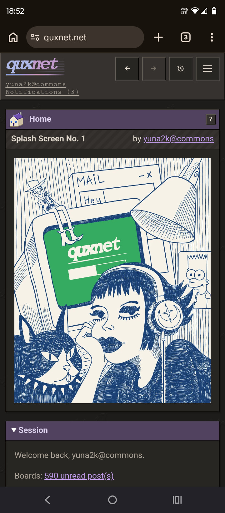
Recently I was commissioned by the quxnet creator to make the first Splash Screen Art for his site/forum. I also made a mobile version so it wouldn’t just be a cropped version of the desktop one.
What do you think?

1 Like
This is lovely — the loose blue-ink style suits the old-internet feel of the site perfectly, and it sits really comfortably inside that dark retro UI frame.
The thing that impressed me most is that you made a proper mobile version instead of just cropping the desktop art. Most splash art falls apart on portrait screens because the subject ends up awkwardly sliced, so recomposing around the character and the cat for the phone version was exactly the right call.
Two practical things worth double-checking, from a splash-screen point of view:
-
First read at small size. At full size all the background details (posters, the little notes, the speaker) are a joy, but shrink it to an actual laptop window and some of that linework will melt into texture. Worth viewing it at 50% and, if it does get muddy, bumping up the weight and contrast slightly on the three things you read first — character, monitor, cat. The green screen already works brilliantly as the single colour focal point, by the way.
-
Safe margins. Splash art tends to get centre-cropped or partially covered depending on window size and aspect ratio, so it’s worth checking that nothing important lives too close to the edges, and that if a loading bar or login element gets overlaid, it won’t land on the character’s face or the screen.
Looking forward to n°2 — a series of these in the same style would give the place a real identity.