I realize this is student work but
Logos are not supposed to be created in a vacuum.
Who is PayIt
What do they do? What is their purpose? What sector of business are they in?
Who are their clients (age, gender, culture, geographic location, etc)
Who is their competition?
That’s only the beginning of the list of questions that you have to answer before creating a logo as part of a larger overall Brand experience.
Without those answers we can only “rate” your work as pretty much a picture.
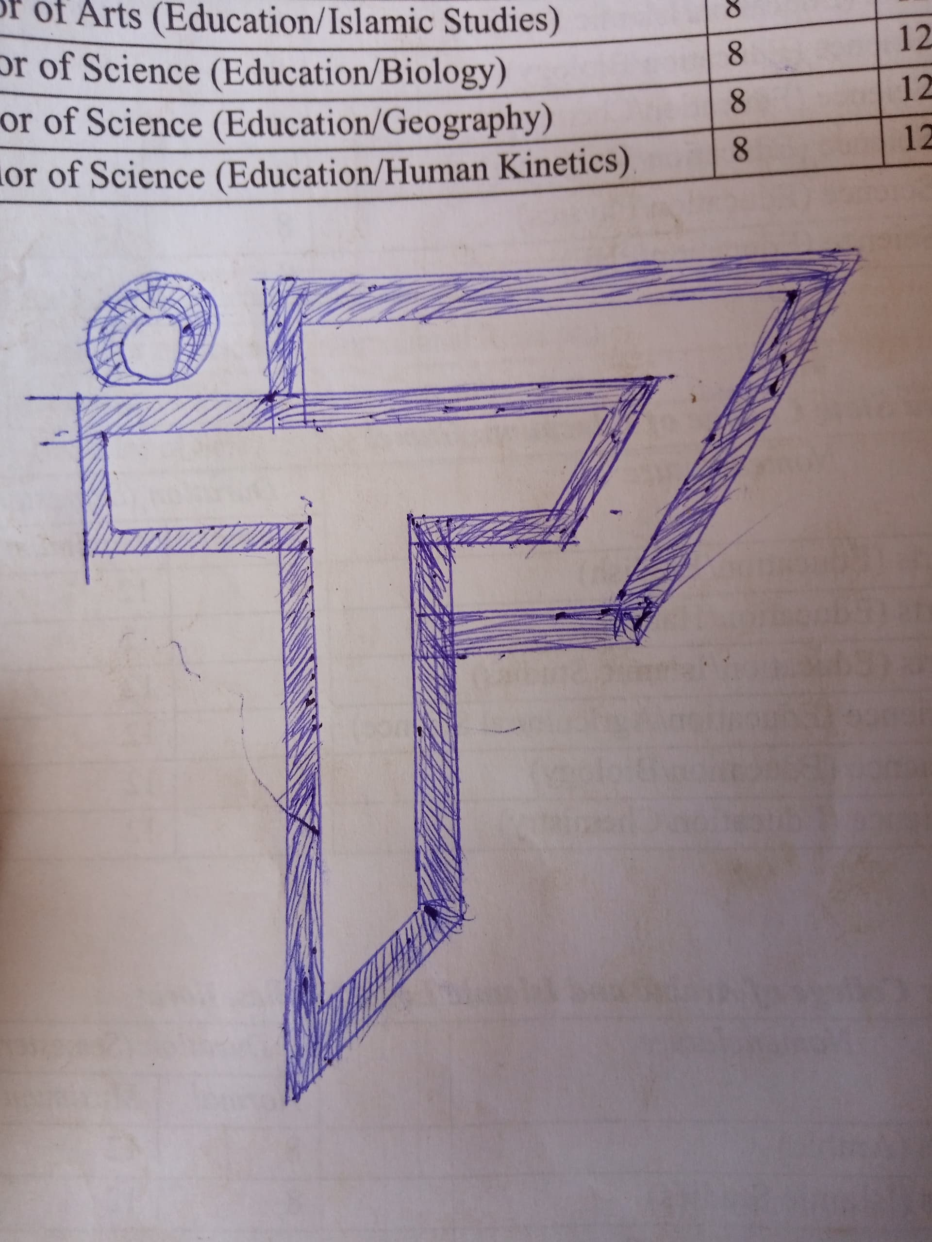
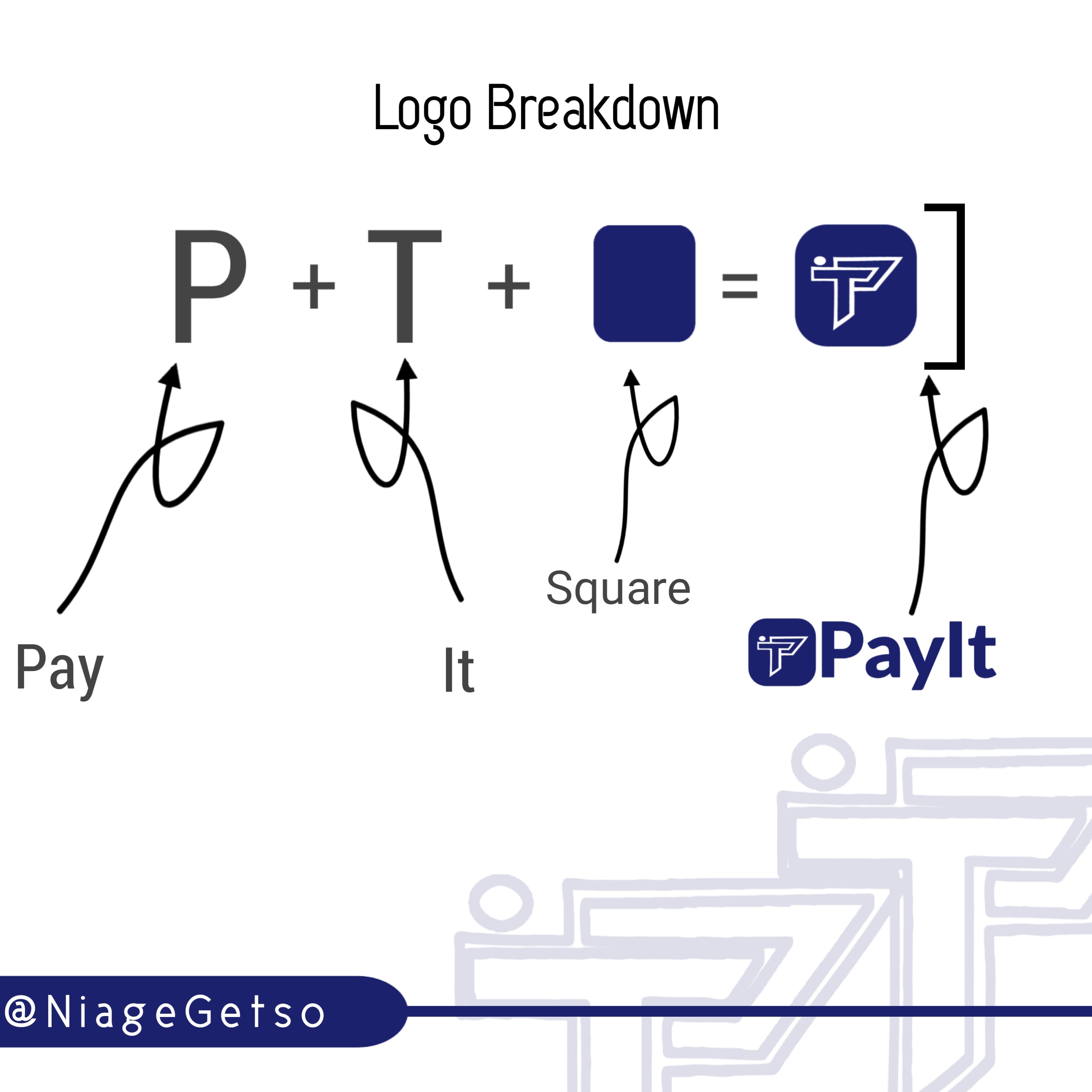
If you want to use the initials, as PrintDriver mentioned, PayIt would be PI, not PT. This problem alone is a deal killer.
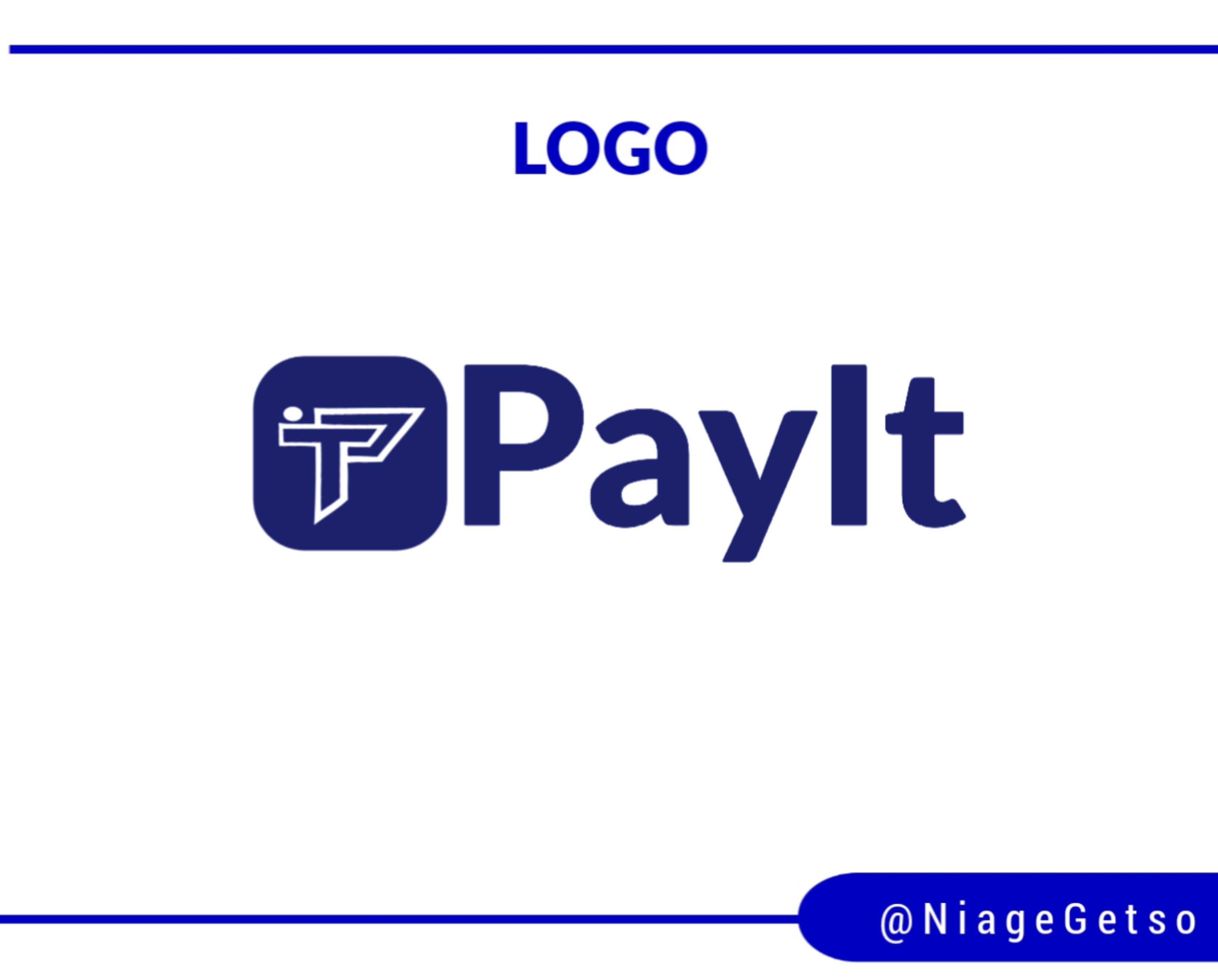
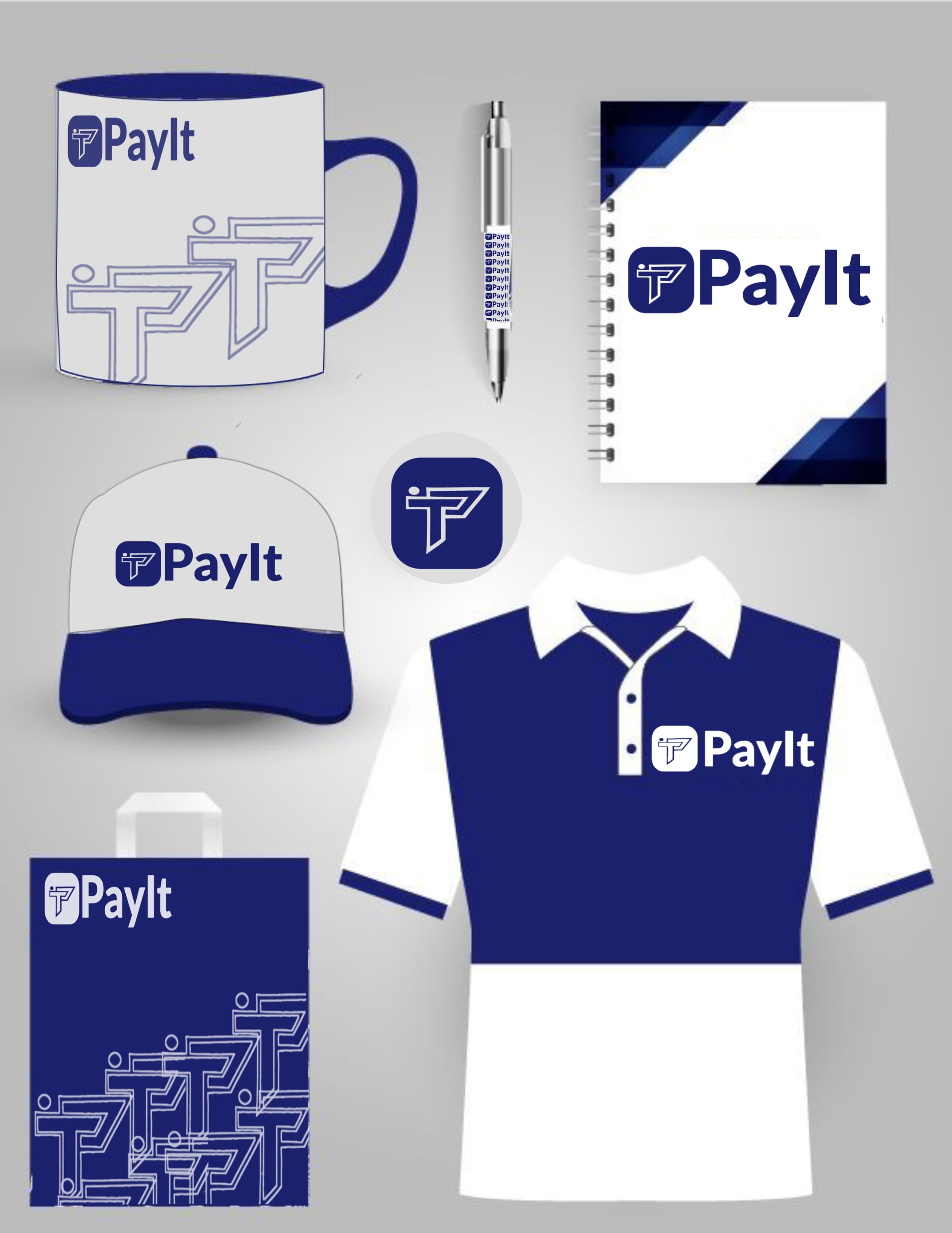
In addition, you seem to have spent more time showing how the logo might be used rather than on the logo itself. You’ve horizontally compressed the logo in some of your examples, which isn’t good. It drives me bonkers when my clients squish their logos, but to have the designer (you) do it is worse.
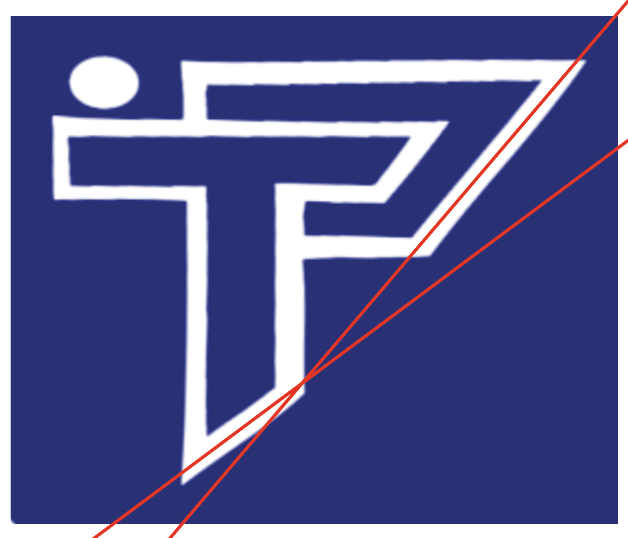
Your craftsmanship needs work. All the strokes in the logo are different widths. What is the reason for the oval? The diagonal angles should probably match (see attached images).
You’re a student, so I don’t want to discourage you. You’re still learning, so less-than-perfect solutions are to be expected. Keep working on it.
I wont address the monogram since you’ve already received good feedback on that front.
On the positive side, you’ve showed some restraint. By that, I mean the logo is one solid color (no shadows, gradients or effects. It would be easy to reproduce in one color across a wide range of applications.
The font you chose is okay, but maybe a little boring. There are a ton of great looking sans serif fonts out there you could consider.
The size of the type looks too large in proportion to the logo. I’d look at reducing the size of the type.
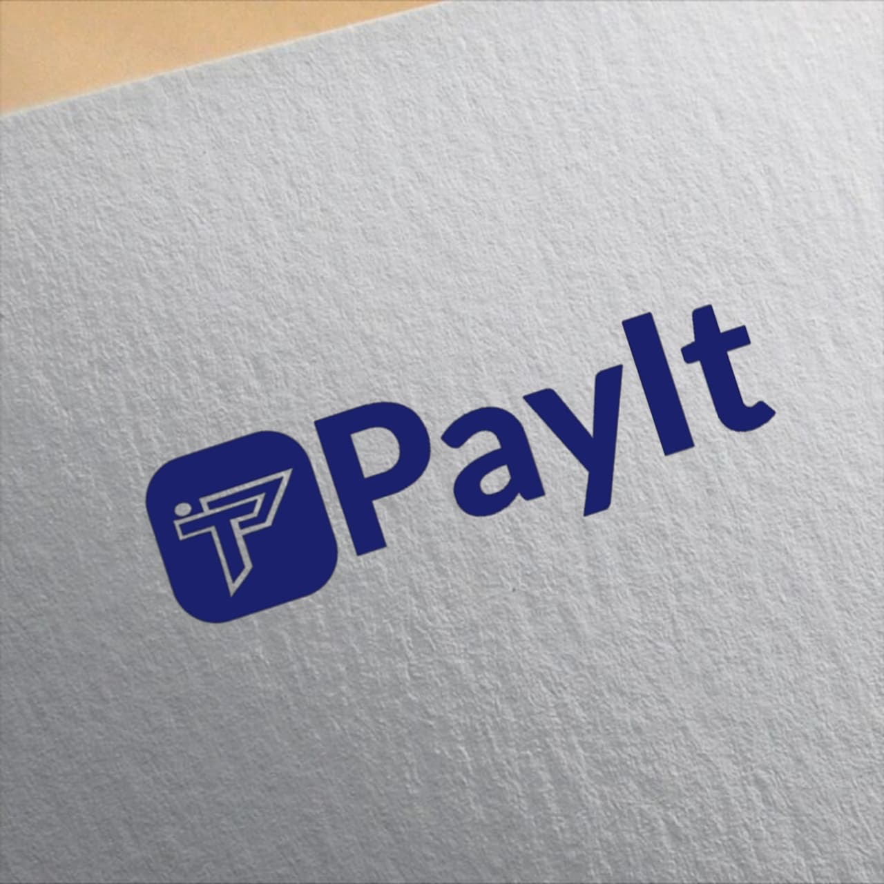
You did really well, I like the mockups of it and the effort you put into the presentation.
What software did you use to create the logo?
If you have access to it, would recommend using Adobe Illustrator, if not, you can download Inkscape which is totally free: https://inkscape.org/
Ideally you want to create your logo as a vector (this is what professionals do) so it can be scaled without pixelation, also you’ll be able to adjust all the lines quickly without having to redraw surrounding lines. It takes some getting used to, but it’s worth it for the payoff.
@PrintDriver
Thanks you so much sir for your response, as you said it’s a student work, this is just a practice, and I understood your explanation especially the questions and I’ll do some changes to it to make it more better and apply the corrections I got, thanks you.
@Steve_O , thanks you so much for your response, noted, I got an allot of corrections and I appreciate it all, and I’ll do some changes to the design and make a correction to it, thanks you
Thanks you so sir @pluto, I’m on the process to have a computer but before then I used what I have an access to (phone) to design as to learn and got an experience.
Thanks you sir for your kind encouragement , I used to design (learn the design) using the phone before having a computer, I think that will help me to have a little knowledge of design before a have it.