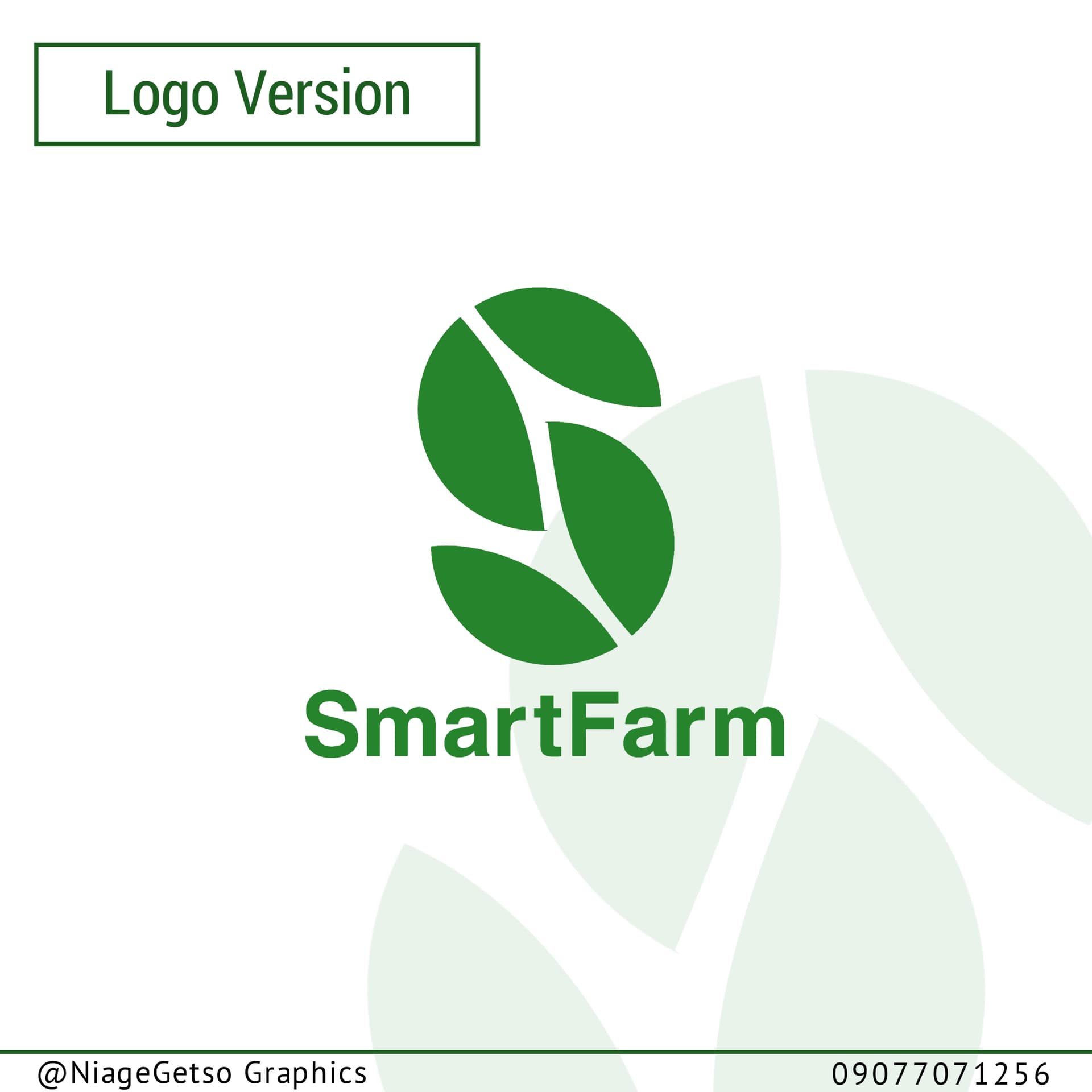
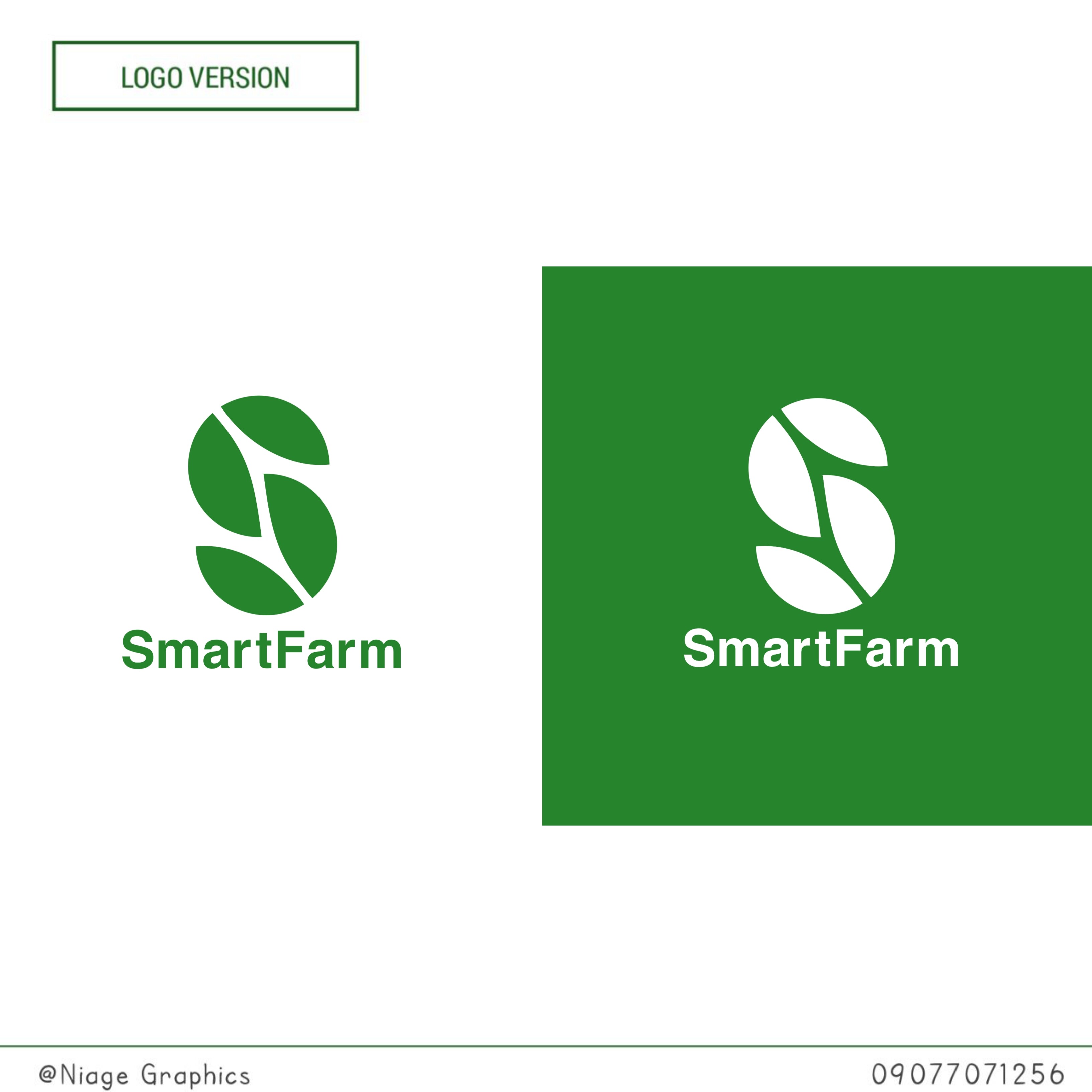
I Designed a logo for SmartFarm, a company that uses technology to make farming better.
I’d love to hear what you think about the Design.
#niagegetso_graphics
I Designed a logo for SmartFarm, a company that uses technology to make farming better.
I’d love to hear what you think about the Design.
#niagegetso_graphics
I’ll ask the same questions again:
I realize this is student work but
Logos are not supposed to be created in a vacuum.
Who is PayIt
What do they do? What is their purpose? What sector of business are they in?
Who are their clients (age, gender, culture, geographic location, etc)
Who is their competition?
That’s only the beginning of the list of questions that you have to answer before creating a logo as part of a larger overall Brand experience.
Without those answers we can only “rate” your work as pretty much a picture.
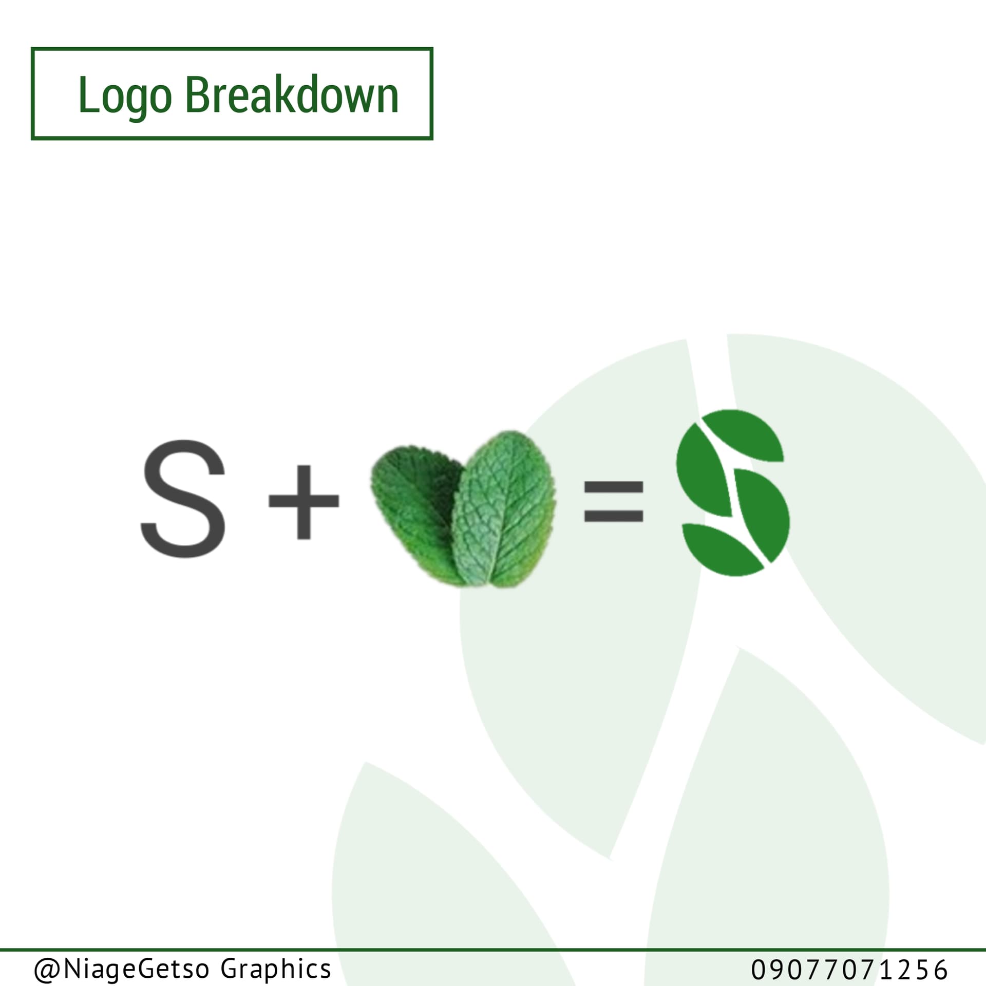
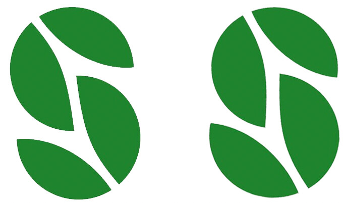
The S is tipped to the left. It feels awkward.
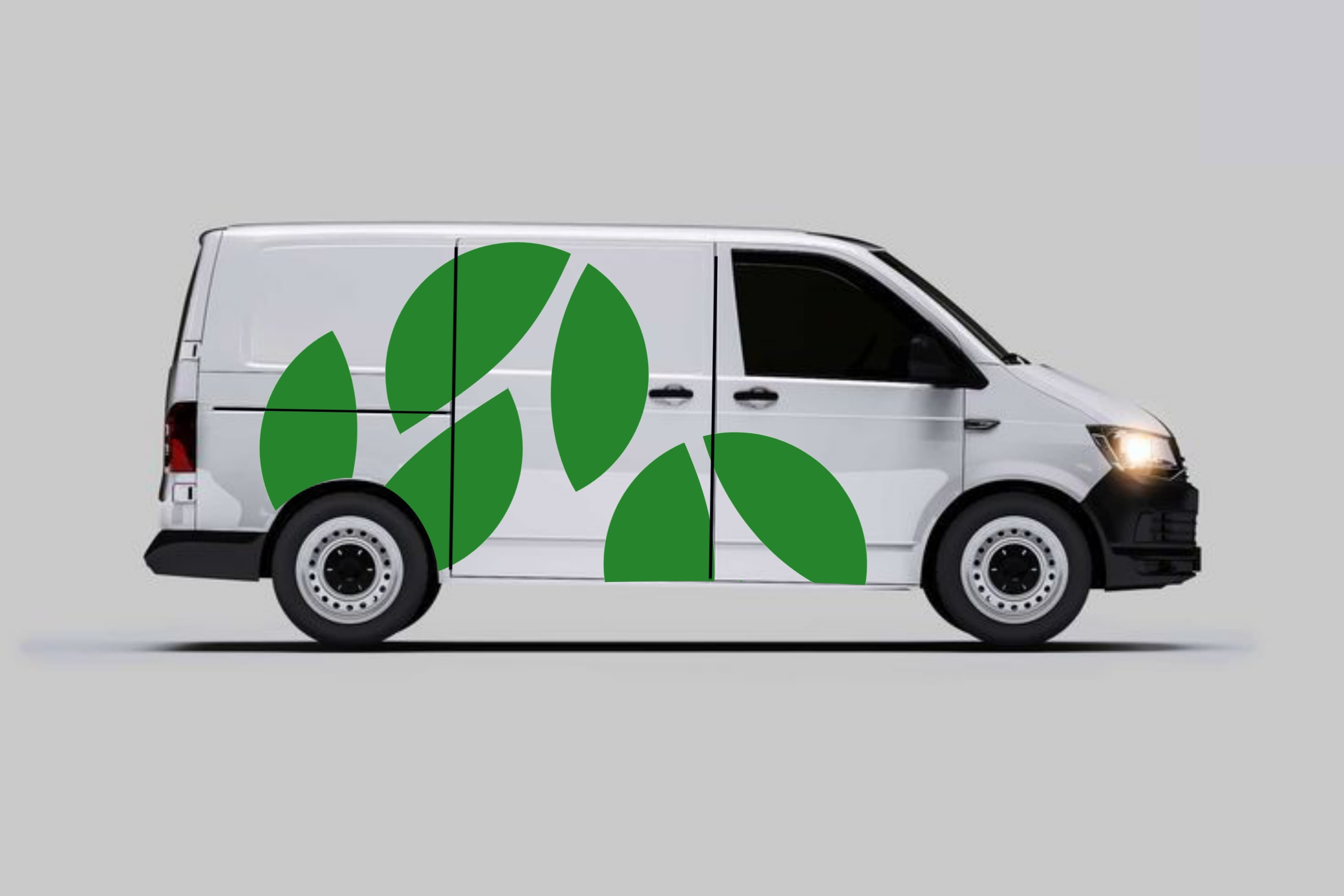
The logo as depicted on the van looks like the old PacMan game characters. ![]()
I would have an impossible time explaining what I mean without showing you an example, so I’ve made a few changes to demonstrate what I’m referring to.
As @PrintDriver said, your S is tipping over backward. An S is the most challenging letter to draw because it can’t be constructed geometrically. All the curves need to balance each other visually instead of geometrically. An S is full of small optical illusions, so you must compensate and adjust for them to make them look correct. Before you can do that, however, you need to learn to see them.
The bottom of an optically balanced S is never simply a flopped version of the top that’s turned upside down. Instead, the bottom needs to be slightly larger and wider with more weight. The top right of an S often needs to be slightly smaller, while the bottom left usually needs to be slightly larger.
Every S is different, and an S composed of leaves comes with its own challenges. I’m trying to say that you should work on seeing the little balance problems because you can’t fix them if you can’t see them.
Your S below is on the left. I made a few adjustments to the one on the right for comparison. It’s still imperfect and needs further adjustments, but I’m hoping it helps you see by comparison those things you weren’t seeing at first.
On the positive side, you did a good job with your creative thinking to take leaves and make them into an “S” – nice work with that. This is the kind of thinking that you need. On the negative side, it’s hard for me to see that and not think “Pac-Man” right away like @PrintDriver mentioned — but I’m of the age that grew up with Pac-Man. Maybe others won’t see that or maybe there is a way to push the illustration to emphasize the leaf aspect more.
As to the type, I love Helvetica. It’s a safe choice. But it’s a little boring in this application. I think another face would help enliven the design.
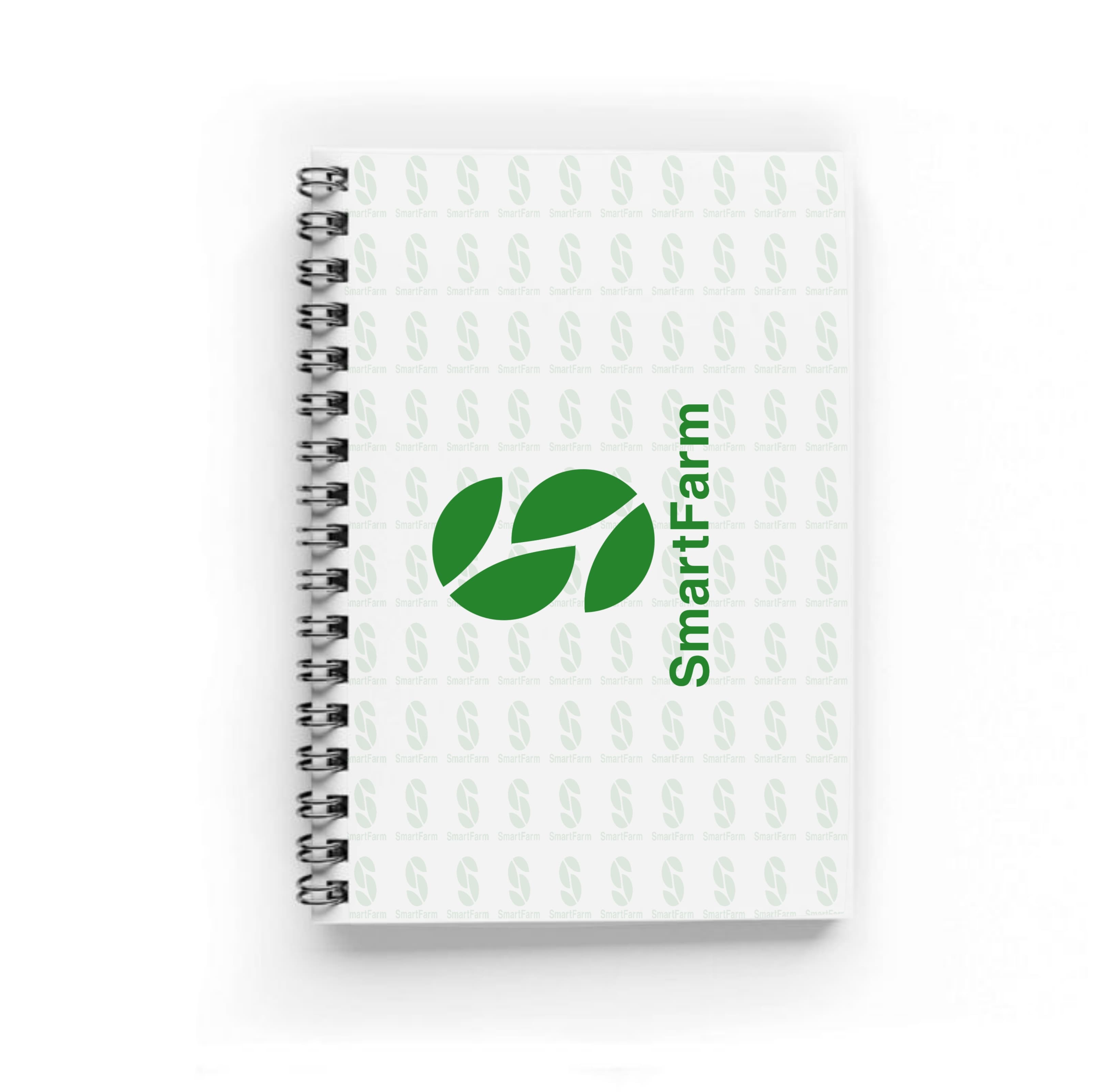
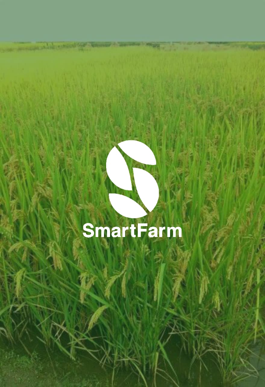
I don’t care for the rotated applications of the logo on the note pad and van.
The “S” made up of leaf shapes is a clever idea. However, I fail to see a connection with Smart.
The kernings needs a lot of work.