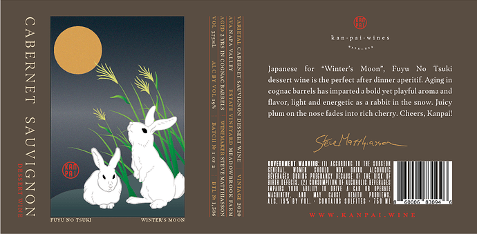
I’m designing a wine label and I’d like to have the label wrap 3/4 around the bottle. Some of the wine information is sideways, but I’m wondering how easy to read it will be. I do want people picking up and interacting with the bottle, I don’t want them to have to rotate it this and way and that just to make sense of it. What do people think of a small amount of sideways text? I’ve attached an example of what I’m aiming to do.
My inclination would be not to do it — at least with Cabernet Sauvignon. The words are a bit less readable, but in addition to that, running it sideways interferes with the label’s psychological hierarchy. Consumers don’t expect the most important words — the product’s name or contents — on a label to be sideways, pushing the words to subordinate importance, even though they’re the most important words on the label.
As for the small, technical details that you’ve run sideways, I don’t see a huge problem there. Right-side-up or sideways, people will need to pick up the bottle to read chunk of text anyway, and besides, that information is already clearly meant to be subordinate.
I’d agree with Just-B on this. The smaller type doesn’t bother me being vertical, but I’d say the varietal (and the year) should be clearly visible on the front of the label as the bottle is placed on a store shelf.
Readability is significantly hindered, even made more frustrating, when you make a potential buyer “work” to understand important content. Hindered readability means fewer sales at the checkout counter.
Bottom line: never choose clever design over better communication.
I’m more bothered by the rivers in the left-right justified text than a common varietal name put sideways.
The winery logo is very very tiny in comparison to everything on the label. Did you drop it down low to avoid competing with the roundness of the Winter Moon?
I agree with those issues, but this is actually an old, unused label concept used as an example. I ended up ditching the vertical type because I don’t see the need for it here. While I’m not opposed to it in general, I don’t think it was doing any work in this particular design.
