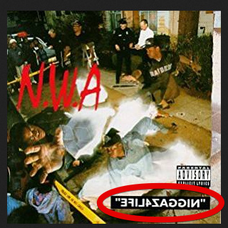
Before I begin I’d like to let everyone know that I do not intend to ignite any sort of discrimination. Although this might be too subtle to be excluded from the NSFW category, I’d suggest to not read out the word loudly. I’ve put a red ellipse around the element. Is there any graphic design term for this kind of element? Should I consider this clever? Anything else I need to take into consideration?
In Illustrator, you do this with the reflect tool. Photoshop and InDesign refer to this as a flip. Yeah, it’s not to be considered clever. At least not in this application.
Clever to me is something that is unexpected, or if you work at it you see something that you may not have first noticed. Simply flipping text in order to flip the text in itself isn’t very clever.
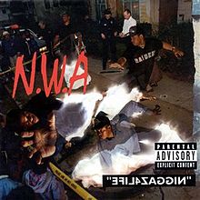
Why is the type flipped? Looking at the album cover, I don’t see any justification for it. Now, if the flipped type reflects the theme of the album (maybe the lyrics say that the artist’s life is backwards or heading the wrong direction), I’d be okay with it. But flipping the type just for the sake of flipping it doesn’t do too much for me.
Isn’t the text flipped so that most people reading it do not end up saying the “word” which might get them into trouble? Isn’t the word with which the text begins can only be used by a certain race of people?
Because it begins with a word which is considered offensive if people who don’t belong to certain race read it out loud especially in front of people of that certain race. BTW that’s the name of the album itself. It’s NWA’s second album.
I doubt it’s to prevent people from reading the album name out loud.
If you went into a brick and mortar store and asked for this record, you wouldn’t say the title backwards.
It may have been done more to avoid the online filters for the various online places that sell this record.
I just finished the typography for a rap artist who’s been with me and I’ve had the utmost pleasure to be with him so long he calls me fam! He has some of my graphics tattooed on his arm.
So, The typography I just finished features the N word loud & proud! Ruffly speaking it takes up about 1/3 of the jacket … not only that it also goes on to say Shot Dead. His closest friend was shot dead.
Perhaps his art … Grime … is not commercially restricted as other forms which allows for a broader expression … dunno.
Since I love hip hop and seek new music quite often, would you mind providing me with a link to his music(any song he has uploaded on certain platforms like youtube?) if your NDA(I’m assuming you’ve signed one) allows that. I hope he does not create corny and meaningless(esp. mumble rap) music though.