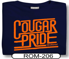
I am a t-shirt graphic artist and I have a client who is wanting to recreate this look, obviously changing the text to say her mascot and match her colors. She is really just wanting this “connected” look.
Is there a certain font or any suggestions on how to recreate this look?
I suppose you could find a similar sans serif font, but other then that, the connecting lines aren’t particularly “special” I’d do it in Illustrator. Start with your font and design “pre-skewed” to make it easier. If I were doing it:
-
Type your text
-
Outline the font
-
Add Anchor points to the edge of the font to add the connected lines
-
Use the Direct Selection tool to “pull out” a connection line from your newly added anchor points
-
or … for consistency simply draw a horizontal rectangle that matches the weight of the font. Duplicate it a lot, align it to tops and bottoms of font shapes, stretch as needed.
Once happy, use pathfinder to merge shapes and skew it all.
2 Likes
Oh, that kind of cougar.
2 Likes
I agree with @CraigB, this will be done mostly via hand. There isn’t one font that will create this.
- You can start with Arial Semi Bold Rounded.
- For this kind of thing it’s easier, yet front end heavy, to type each letter out separately so you can use the alignment tools. (learn these and pathfinders completely)
- Outline Font
- Create rounded rectangle shapes “connect” the letters to the lines
- Pathfinder-Add to make it one object
So now you have the design.
The outline looks hand drawn or is made to look hand drawn. There are 100’s of techniques to change the edges to look less precise and more hand-made.
Thanks for the help everyone! I was hoping there would be a quick “type it out” way, but drawing the rectangles and positioning them didn’t take as long as I thought it would. I actually like the way it turned out!
Yeah it’s surprising how fast one can work with simple geometric forms in illustrator.
Are you going to post the result?
I’m still waiting to hear back from the customer if she likes it or not, but I am happy with how it turned out.
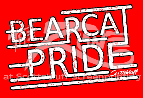
Wow, very red ![]() thats a pretty good recreation. Though I think you should align the top of the letters to eachother, it looks kinda rushed like this.
thats a pretty good recreation. Though I think you should align the top of the letters to eachother, it looks kinda rushed like this.
What is a BEARCA?
1 Like
Thanks for catching that! I have realigned the top of the R in Bearcat so it lines up with everything else. It is going on red shirts, so I have to design it on a red background using just white and black.
Good point, I didn’t even pay attention to that. Still rubbing the red out of my eyes lol
@sspartist Is it really going to be saturated pure red? Otherwise, try to shift your colorpicker a bit more to the lower left corner ![]() I think your design will come across a lot softer.
I think your design will come across a lot softer.
Also, sorry about me nitpicking about it, but wouldn’t it look better without the black stroke? Just some suggestions, as this is more like the original design. I’m also not a fan of strokes a lot, so yeah ![]() this’ll also leave more space between the letters.
this’ll also leave more space between the letters.
Its a little overdone in areas, the top R is an issue as already pointed out, and I think skewing it versus just rotating it would make it match closer. The T in Bearcat is also los, also mentioned above.
1 Like
That typo, looks intended. ![]()
I think it was. Good one.
Ha. Nope, it was a legit typo, but it was perfectly timed.
1 Like