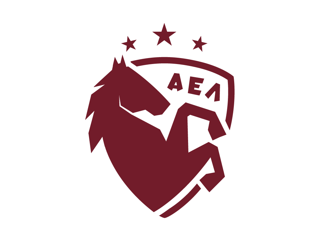
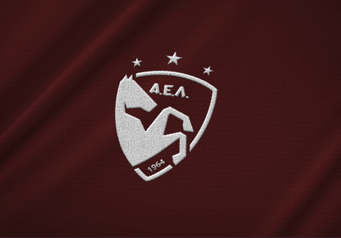
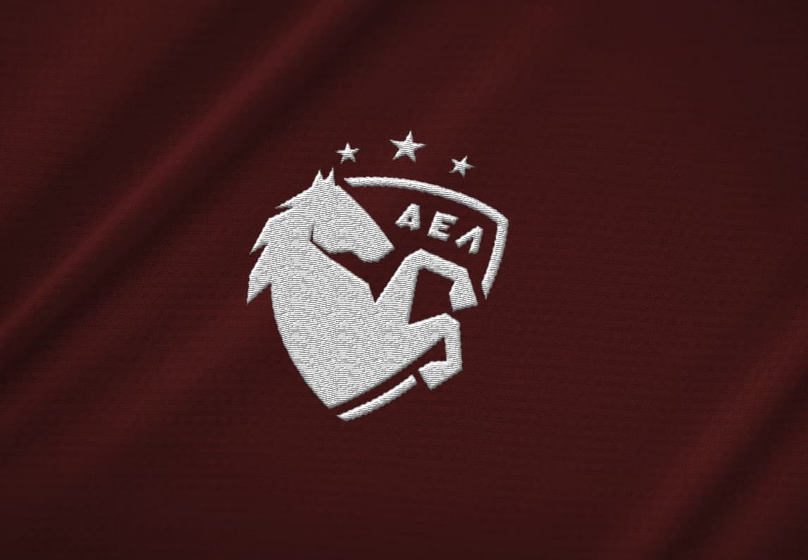
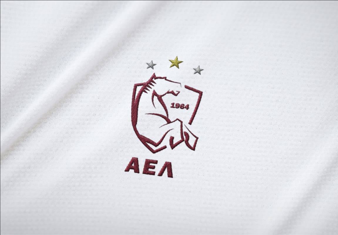
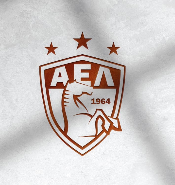
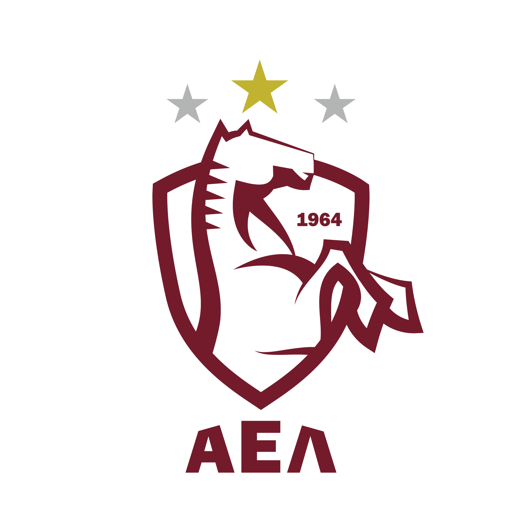
I like the idea of retaining the color palette and the rearing horse, and I like the idea of working a more modern horse into the shield. That said, I’m trying to like the horse illustration more than I actually do. Sometimes I look at it and think it’s not too bad; other times, it reminds me of Saul Bass’ poster for Man with the Golden Arm — but not in a good way. What I don’t care for is the AEA typeface. I realize this is a school assignment, but I don’t think that face would age well in the real world. I’ll look again tomorrow to see if I feel any differently about the illustration.
I agree with Steve’s observations, so I won’t repeat them.
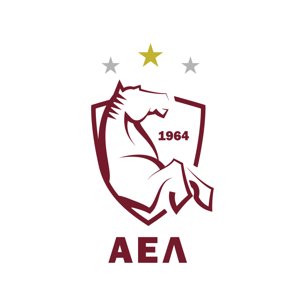
I think I would like the horse more if it weren’t composed of straight lines and abrupt angles. I suspect this was on purpose. It does match the typography, but again, I probably wouldn’t use that typeface to spell out Α.Ε.Λ. The straight lines, I think, clash a bit with the curved shield and curve of the horse’s back.
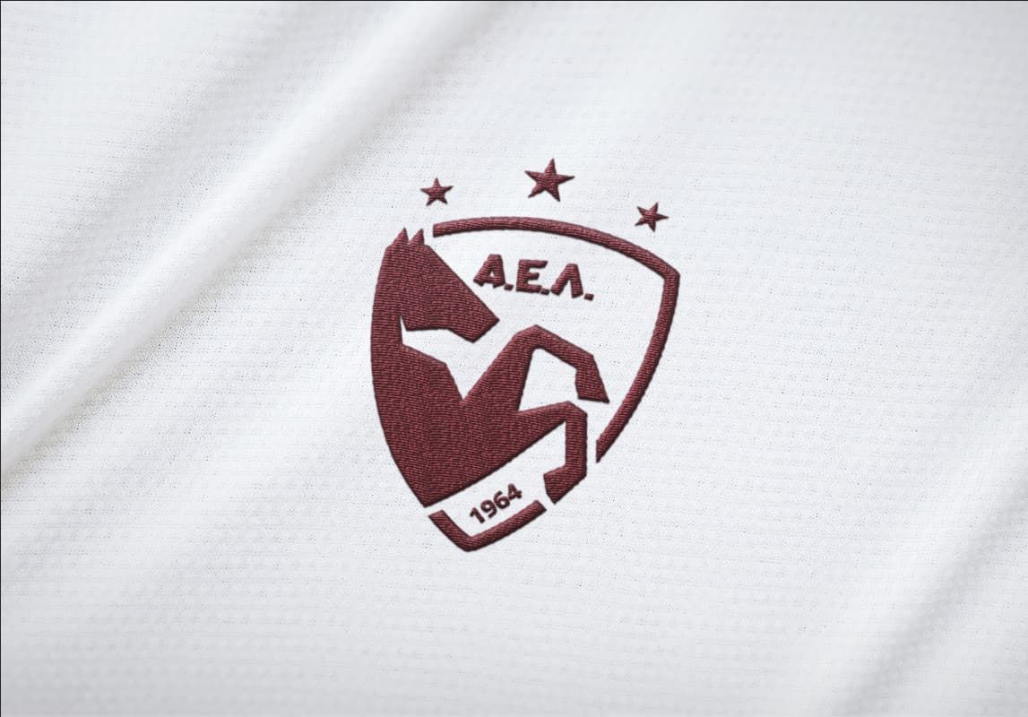
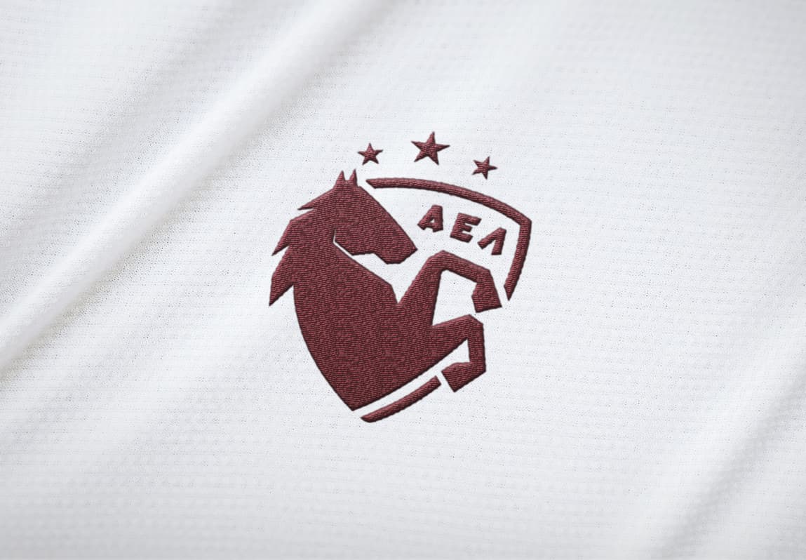
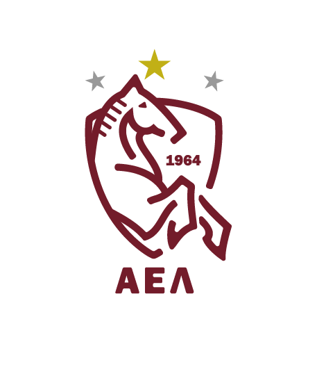
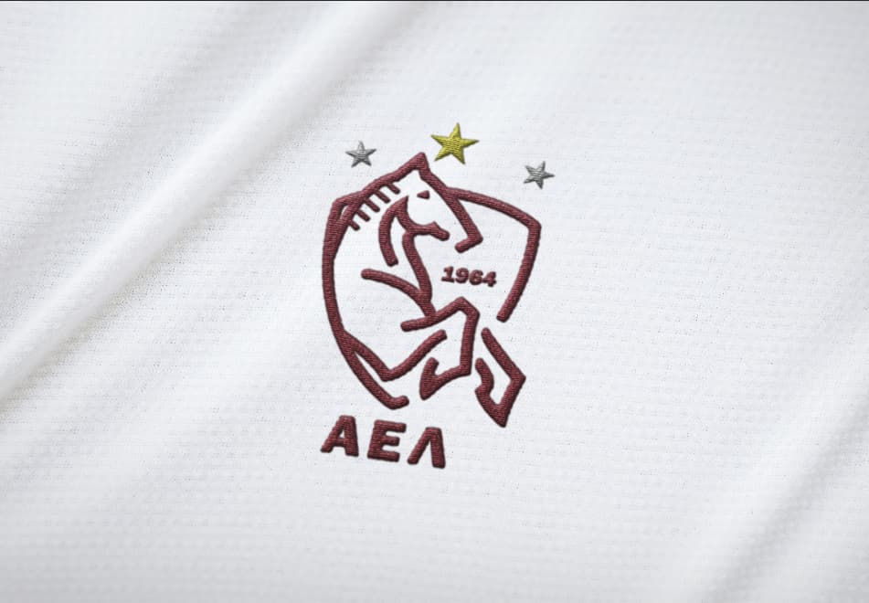
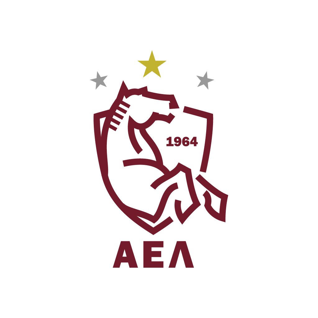
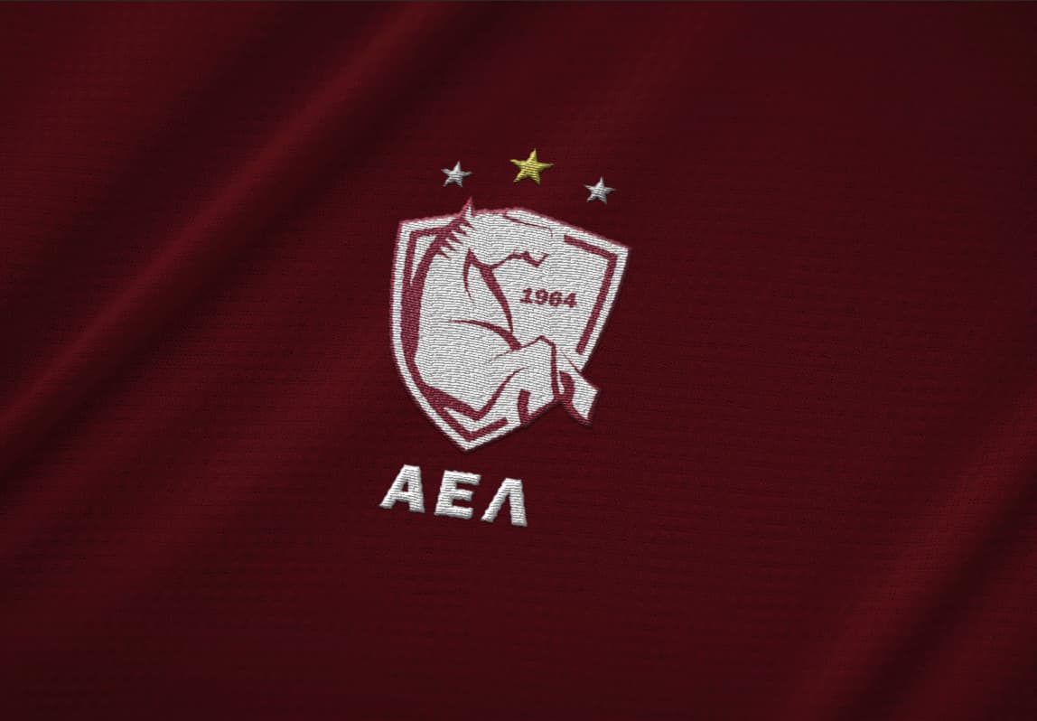
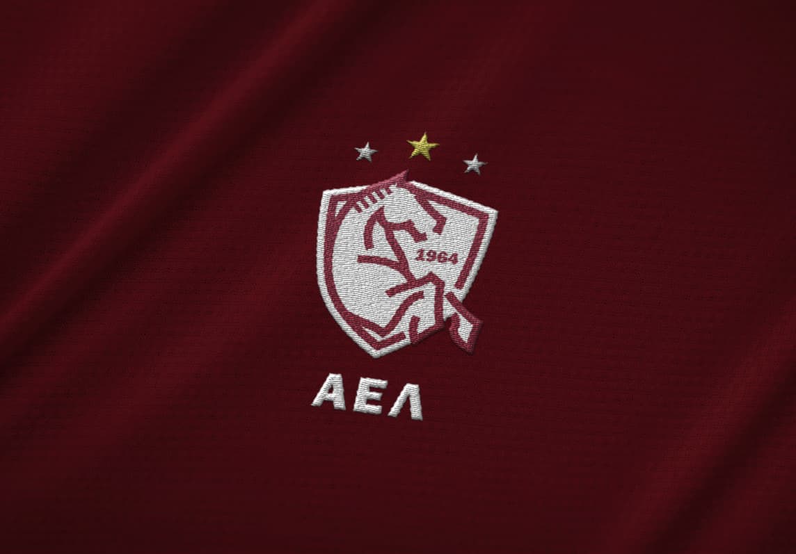
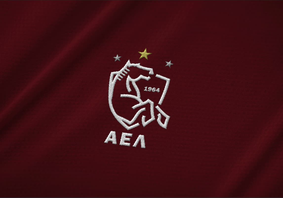
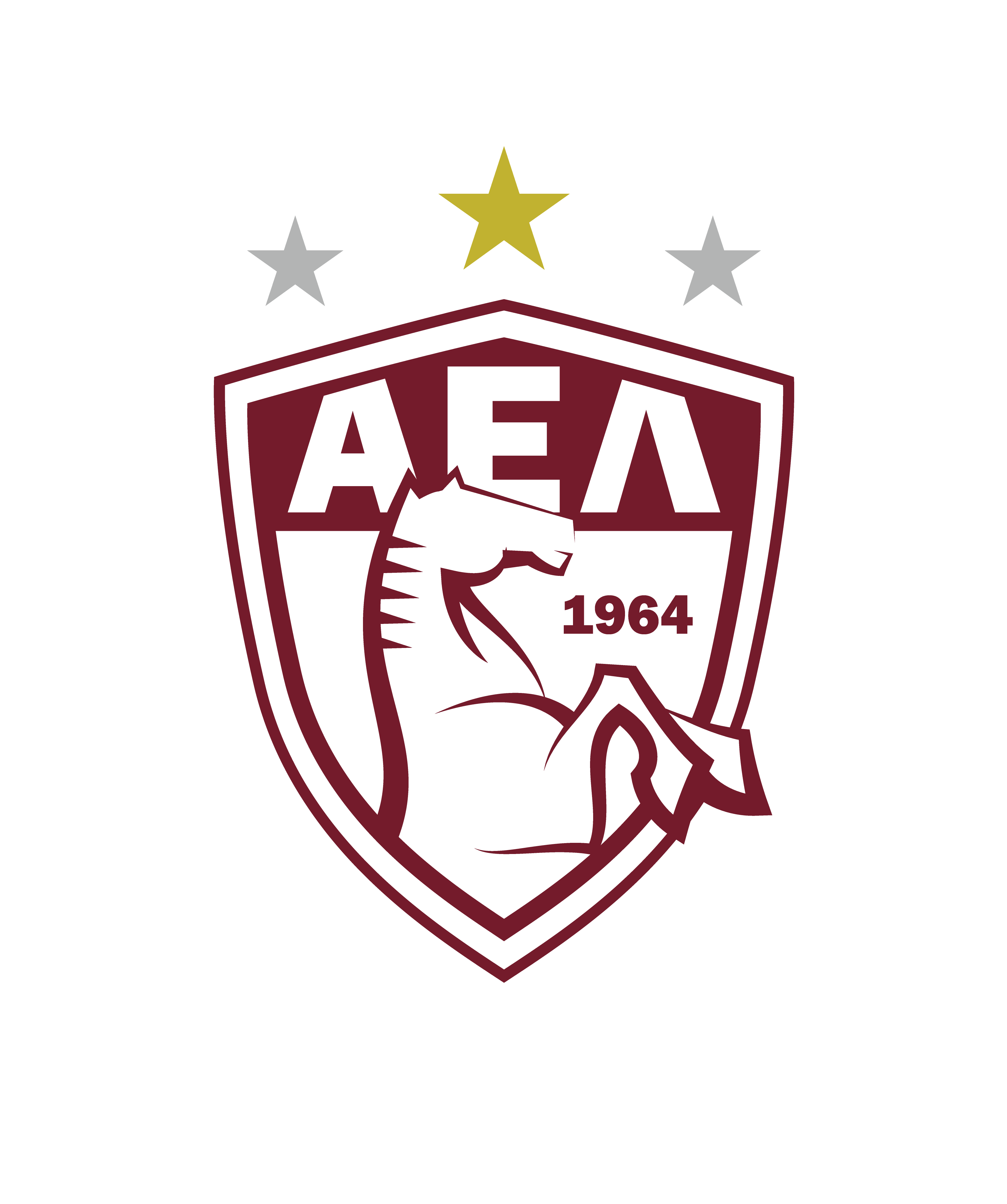
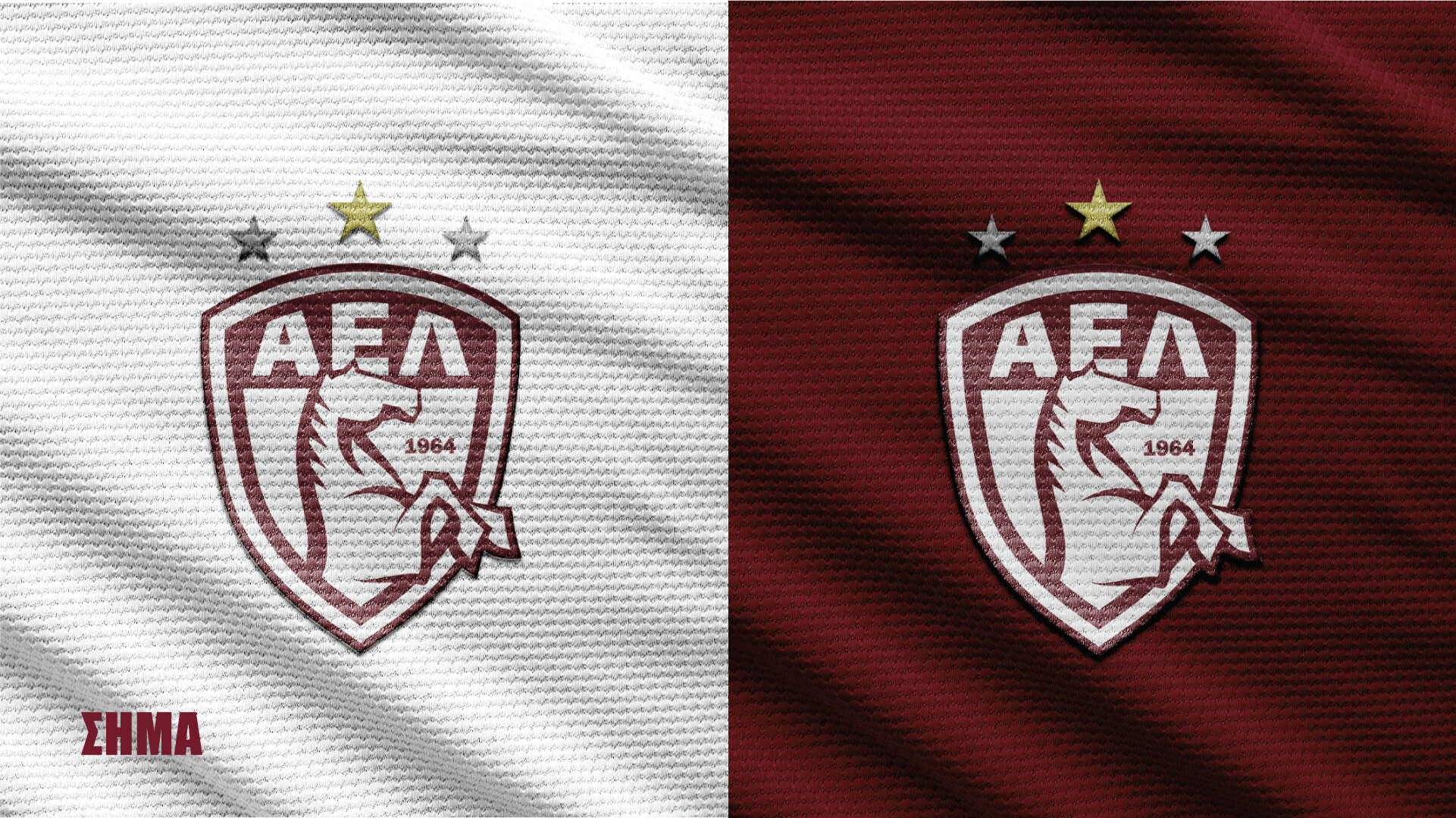
I like the version that shows the horse’s mane better than the one that doesn’t.
Thank you all for the comments.
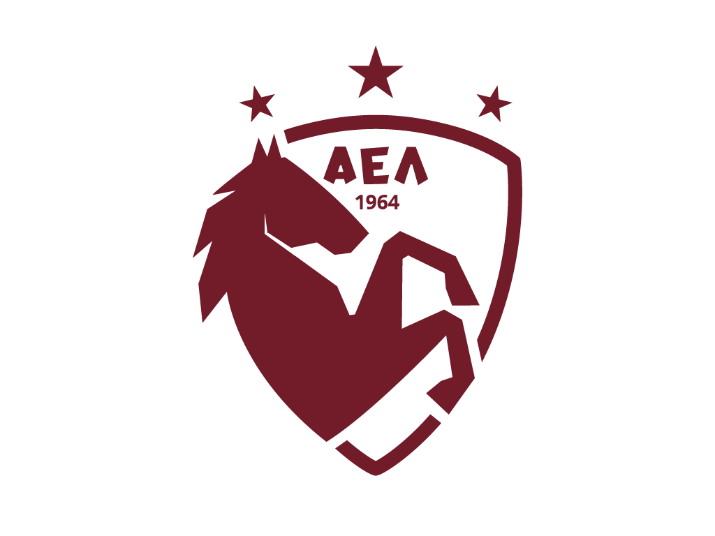
Smurf is right , I shouldn’t change the color of the stars.
And of course I will try to improve the illustration with something more timeless and memorable.
I don’t care if it’s just a project for school, I want to make quality designs for my portfolio.
Maybe my approach is a bit generic.
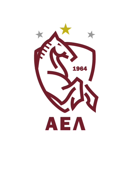
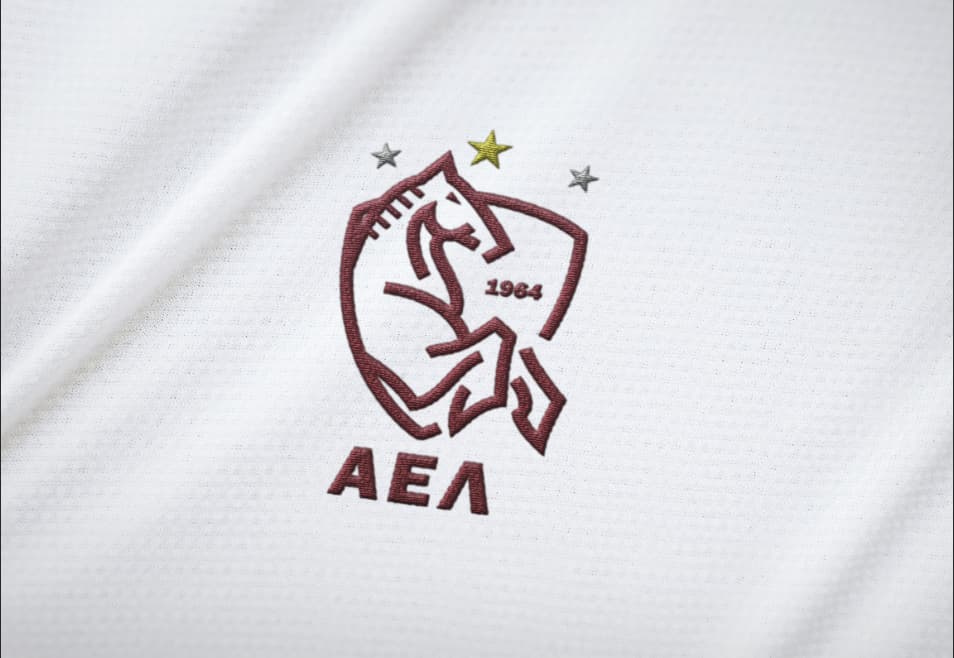
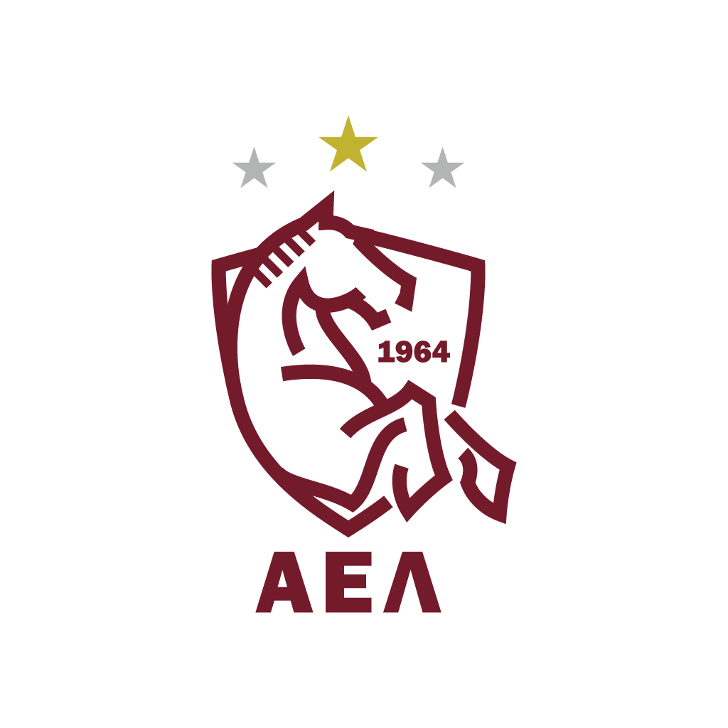
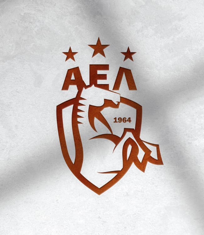
The horse illustration is an improvement over the first attempt, but I think it could still use some refinement. To my eye, the head looks proportionately small compared to the shoulder and legs/hooves. Maybe look at tweaking the size a bit. I’d be tempted to round the corners/points on the art just a bit. Lastly, I think you should do some more work where the left leg meets the right leg. Right now, the left leg looks sort of tacked on. Good work on revising the illustration, a few more tweaks, and I think you’ll be there.
Thanks for the advice Steve_O.
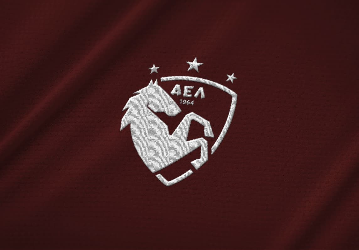
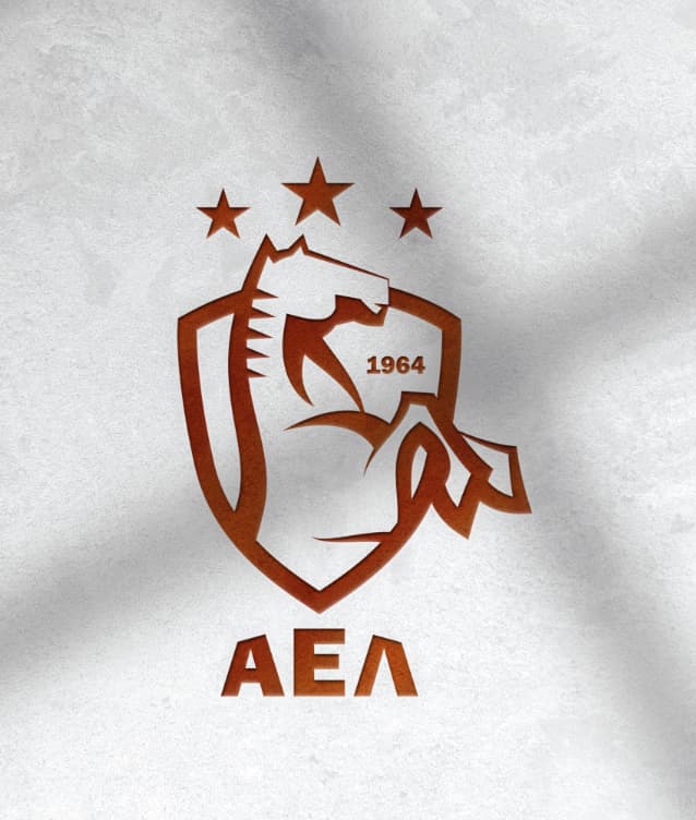
I made the refinements you mentioned. The left foot need more refinement to match better, I know.
What do you think of the rounded corners? (I hope that is what you meant)
I also made the head a big bigger.
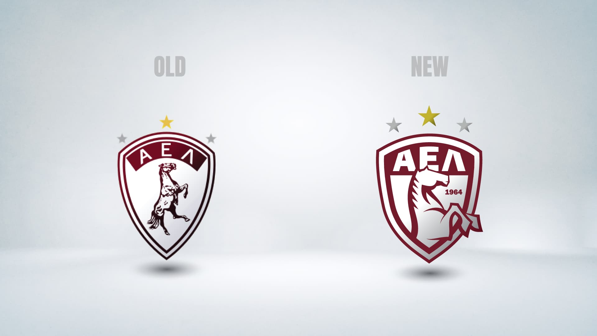
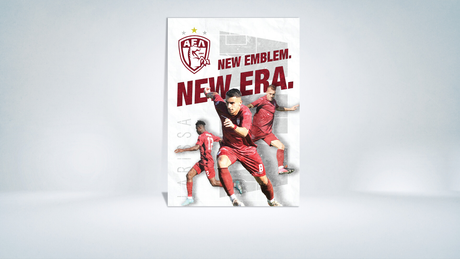
The real question is… can this considered to be an upgrade to the original logo of AEΛ? (look at the first post)
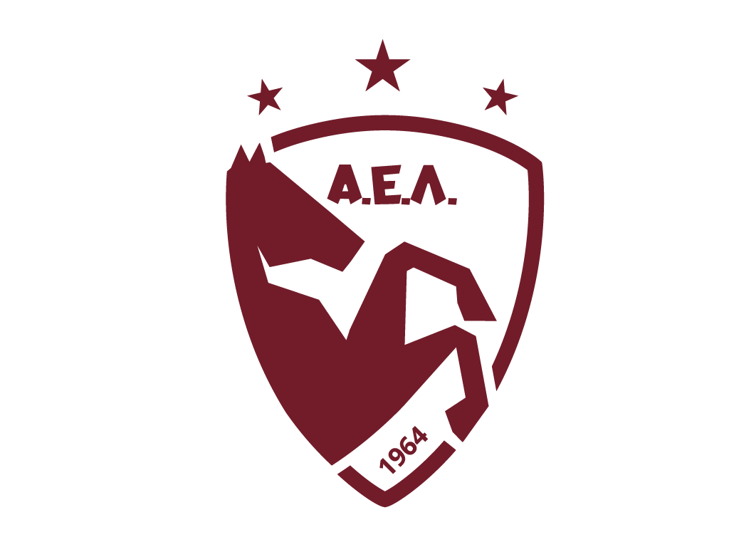
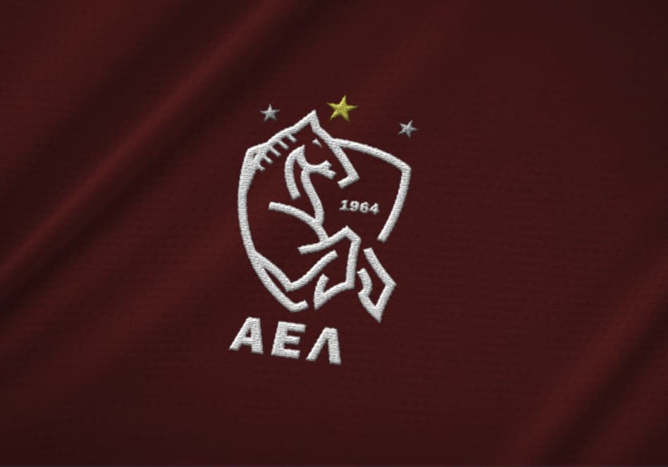
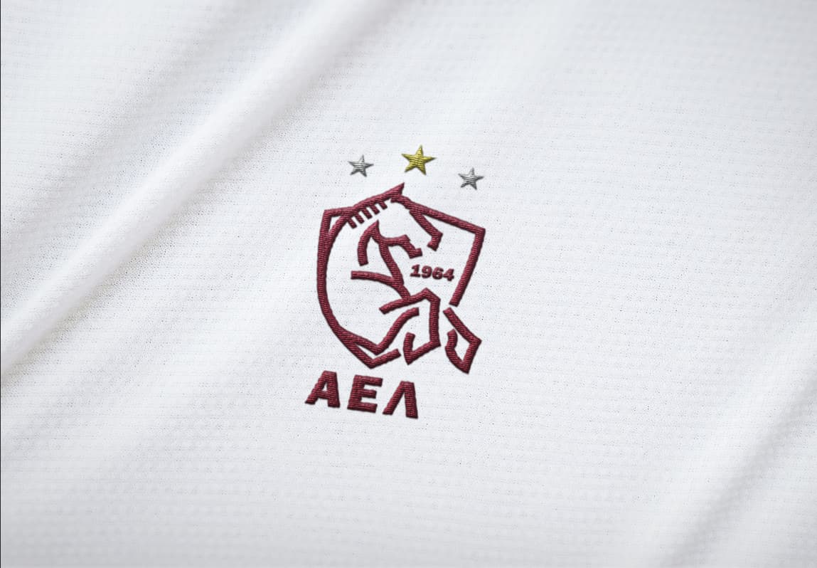
The bottom one is nice, but I sort of like the type standing on its own too since it highlights the quirky slants on the top of the letters, which I like.
I notice that you’ve played around quite a bit with the weights and balances of the lines making up the horse. The horse’s hooves look a bit heavy. The line from its forehead to its muzzle might be a bit too thin — especially when the logo is reproduced in small sizes.
I’m wondering if its mane should extend backward and a bit down instead of forward and horizontally. When a horse rears, its mane usually flies backward and is pulled downward by gravity. Even if you keep the mane pointing forward, I’d point it just a bit downward. (I grew up with horses.)