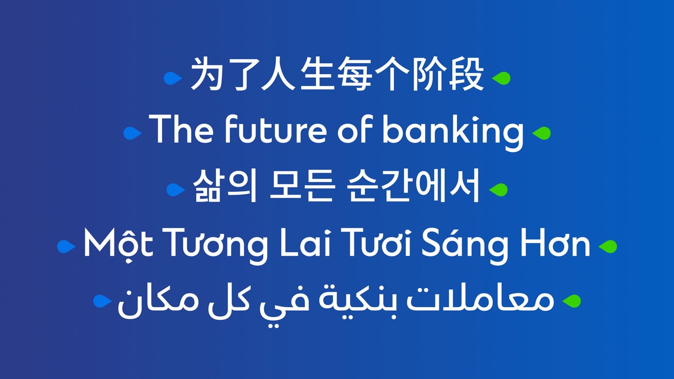
How do you enable an established financial brand to reflect its true strength as a global powerhouse while effectively communicating across sixty countries? This was the challenge Standard Chartered brought to Lippincott.
The bank has been on the cutting-edge of financial expertise across the world’s most dynamic and diverse markets for over 160 years, with headquarters in London and a unique footprint across Asia, Africa, and the Middle East. With a legacy of evolving its capabilities to meet and exceed client needs across this range of diverse markets, Standard Chartered recognized that its existing brand no longer reflected its aspirations or ongoing digital transformation. This, coupled with the need to connect with a younger generation of wealth creators, sparked an opportunity to evolve.
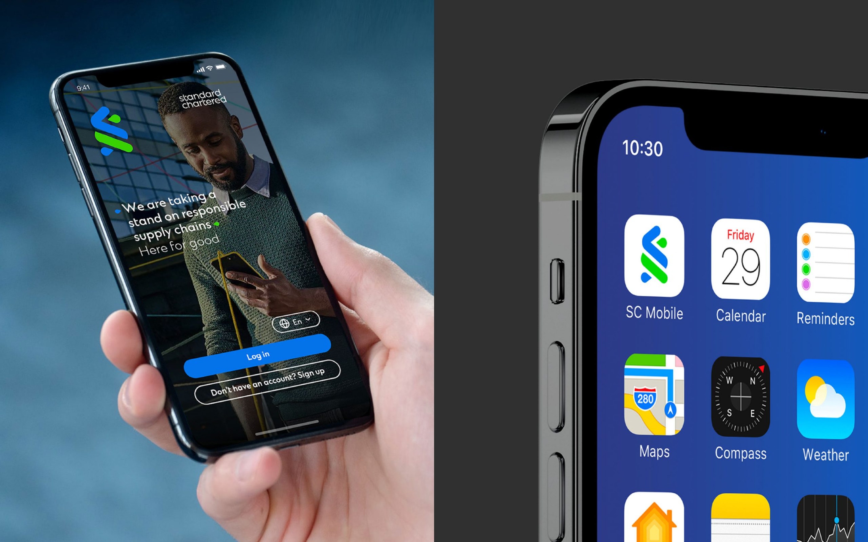
Lippincott partnered with Standard Chartered on a full-scale evolution to develop a digital-first brand that communicated the full breadth and power of its network, drawing in new audiences and inspiring the bank’s existing base across the globe.
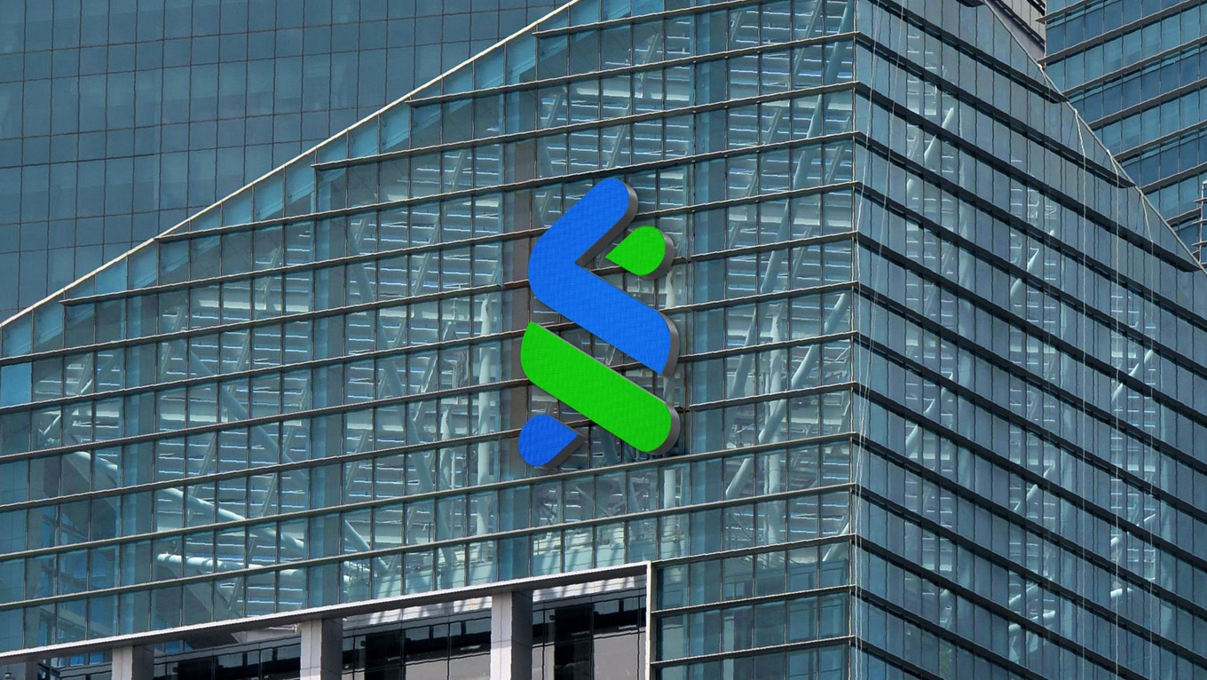
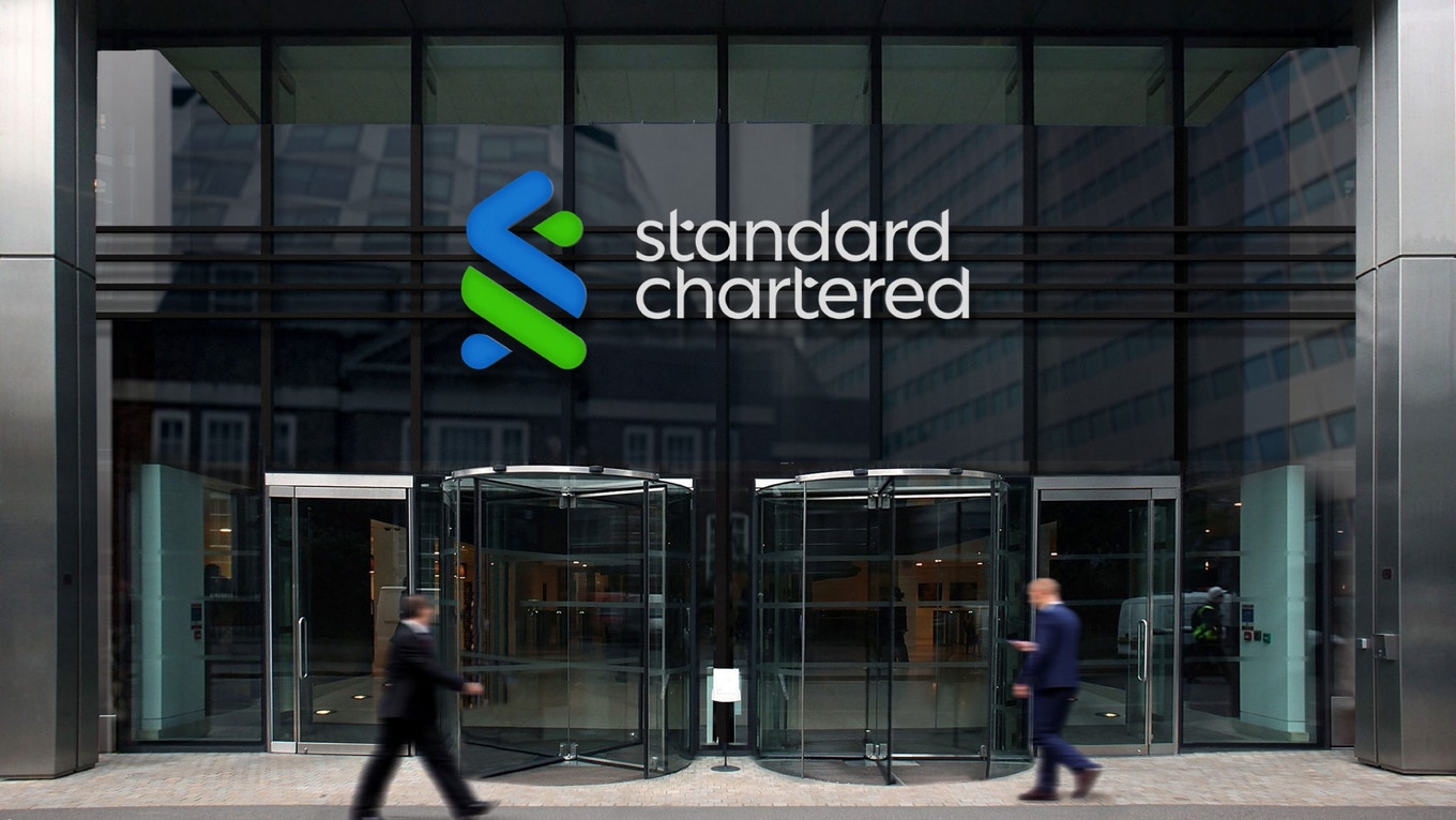
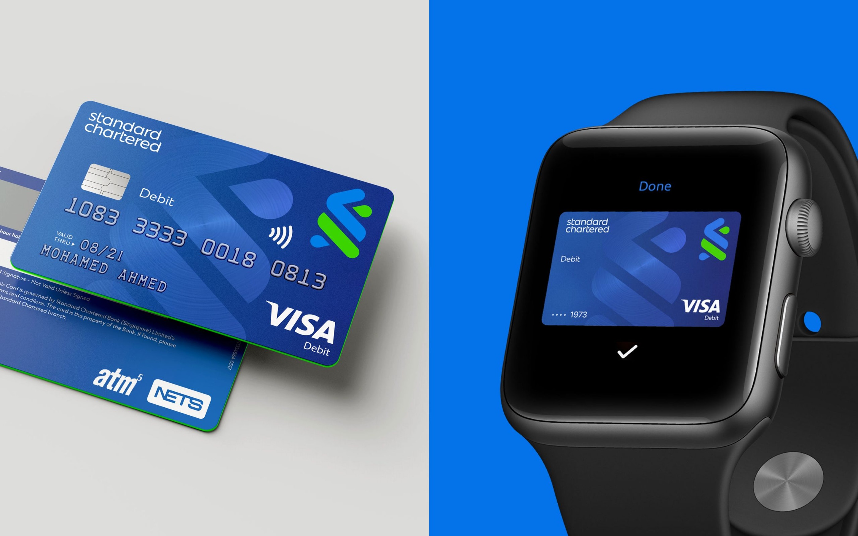
The Trustmark, Standard Chartered’s symbol for over 50 years, was redrawn to be simpler and bolder. The optimization works across many dimensions while retaining the bank’s visual equity along with a redesigned wordmark to reflect the symbols simplicity and recognition.
The new adaptive visual system was built to flex across a vast, ever-changing world of content, formats and platforms. And since Standard Chartered’s presence across diverse geographies and markets has led to regional, informal monikers for the brand, the symbol acts as a beacon to drive recognition and consistency wherever it’s seen in the world.
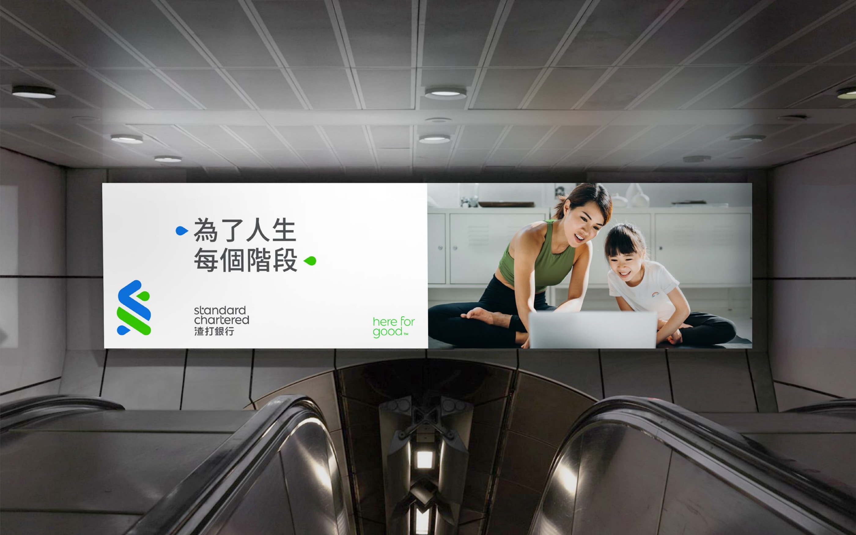

The evolved brand also champions the bank’s commitment to sustainability by elevating the ‘here for good’ promise, giving it a contemporary visual treatment that complements the logotype. Along with the refreshed colors, a bespoke typeface, digital design system, brand voice and a people-first culturally relevant photography style, the new design principles allow the bank to flex where needed to stay agile and relevant locally – a process achieved by working as partners with the client and their network of agencies.