Hi everyone!
Please help
Question:
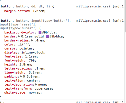
in CSS frameworks dimensions now is set up by rem em units, and also it can be units like 1.25
in Sketch we use pixels, and subpixels are not the best practice.
But how I can make a proportion in margins and paddings when I design an interface
for example 1rem = 16px - and i need to set padding to 1.618rem ?
I know about rems, ems, frameworks, padding, margins, etc., but even after reading what you’ve written two or three times, I still don’t know what you’re asking.
I don’t understand. If you want to set the padding to 1.618 rems, there’s nothing stopping you from doing just that. In the CSS you’ve pasted in, you’ve set the horizontal padding values to 3.0 rems, so why can’t you just change it to 1.618rem?
I have a feeling that’s not what your’e asking, though. Maybe you could rephrase your question.
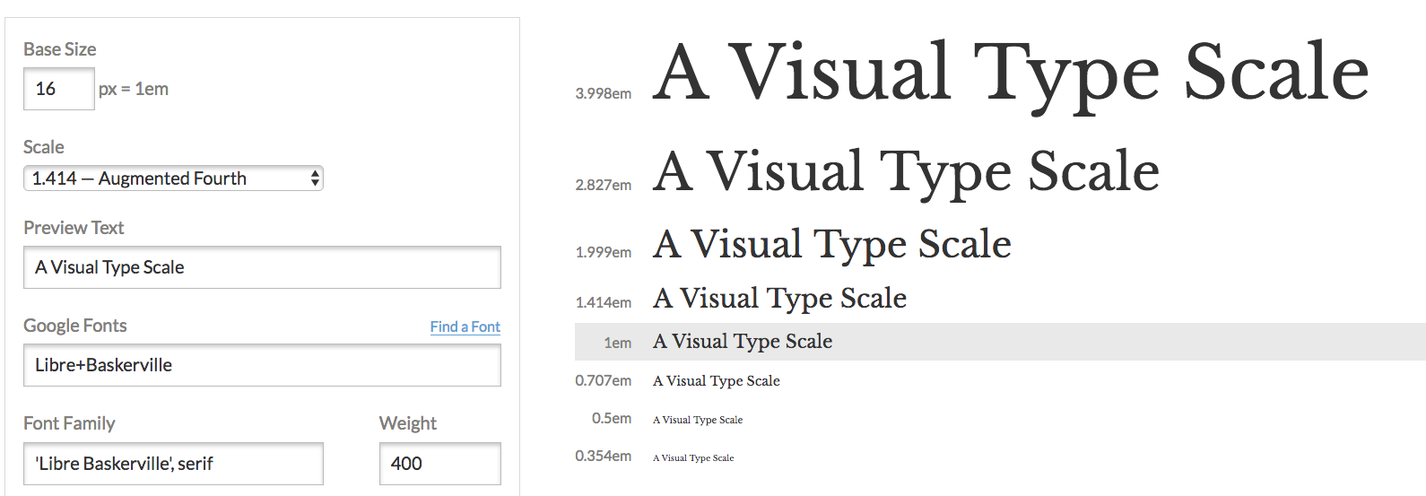
I also wrote a handy calculator for this a few years back https://modular-scale.com/. It calculates a modular scale with ems at the base size and at base 16 (ems based on 16px)