Hello all! I would greatly appreciate some feedback on my current Logo. I originally created this brand as a “Tween Natural Shampoo Line”, but it evolved into an Organic Skincare Line for an older age group. I love my products and feel they are some of the best on the market, however I cant seem to compete with the “slick” brands on the market. Should I evolve my brand image since my line has evolved?
Without doing a thorough review that would include all of your products, your marketing materials, discussing your marketing plan, looking at how and where your products are sold, and looking at the competition, it will be tough to say definitively why you’re having a hard time competing with the so called “slick” brands. With what you’ve presented here, it would be far too tough to pin your problems simply on the logo or packaging design.
My overall impression is that the logo and packaging are nice. This surprises me to some degree as I’m usually not a big fan of substituting illustrations for type like you’ve done with the T. In this case, it’s pretty easy to read. The illustration also gives you plenty to work with as additional branding elements.
If all else is equal, and you’re loosing sales to other brands that have a more polished / salon / minimal look, then it might be time for an overhaul.
Bottom line, I’d strongly suggest you put your marketing hat on and try to figure out if a brand redesign or refresh will solve your problems. If so, go for it. But I wouldn’t necessarily recommend a change unless it’s warranted.
Hope that helps.
2 Likes
I agree with Steve.
The problem is a whole lot more nuanced than just a younger vs older audience.
However, here are some superficial observations based only on what you’ve written and shown…
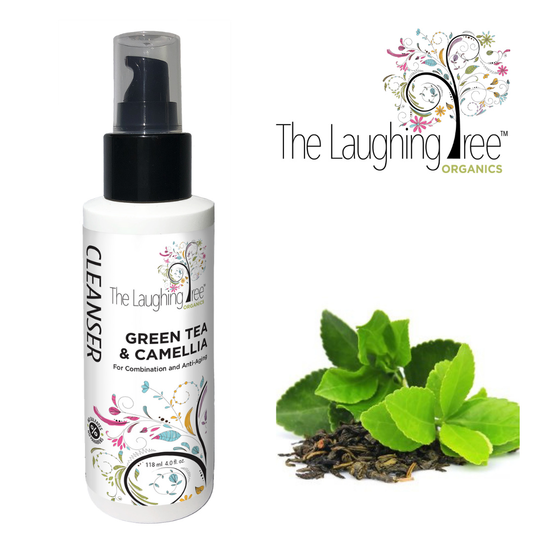
I don’t exactly know what to make of this product. What is a “cleanser?” Is it soap? Is it shampoo? Is it a body wash? Is it for washing dirty hands or cleaning one’s face? Is it perfumed or non-scented? It says, “For combination and anti-aging.” What is “combination?”
I see an odd mixture of somewhat masculine typography mixed with feminine paisley-like designs. I see the packaging trying to be light, airy and sensitive, yet it’s an antiseptically white bottle with harsh contrasts against the black type and cap. Is it appealing to the bargain conscious crowd or is it a higher-end product? I can’t tell. You say “organic,” but white and black does not suggest organic anything. The brand name is apparently The Laughing Tree, so I’m assuming it’s supposed to be fun. The whimsical tree is fun, but all that attempt at fun seems superimposed into a design that’s decidedly serious.
I don’t know if this is older, younger, fun, serious, organic, antiseptic, cheap, expensive, really cool or a Walmart product. There are hints in the packaging that suggest all of those things and they tend to cancel each other out.
1 Like
Thank you Steve for your feedback. This is helpful and encourages me to do a little more work on my end. I have to imagine it is in part the design as I have only received wonderful feedback on the performance of the products. Im just not clear on the market for these products as they dont fit with most salon brands, as you mentioned that have a polished look. There are of course other markets for these products but many are difficult to penetrate. Its hard to say whether an overhaul would be worth the investment. I appreciate your feedback.
Interesting observations. Thank you so much! ![]() Originally I had a softer look for my packaging that included light green pumps. I went with the black to give it some contrast on the shelves and offer a somewhat more “sophisticated” look because I only had whimsical to work with. Maybe Im trying to be too many things to too many people. The brand is a mid-level priced brand that has been placed in Wholefoods, Hannafords and many small “Boutique” shops. I wouldnt say its a Walmart brand, but if Target came calling I wouldnt decline!!
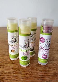
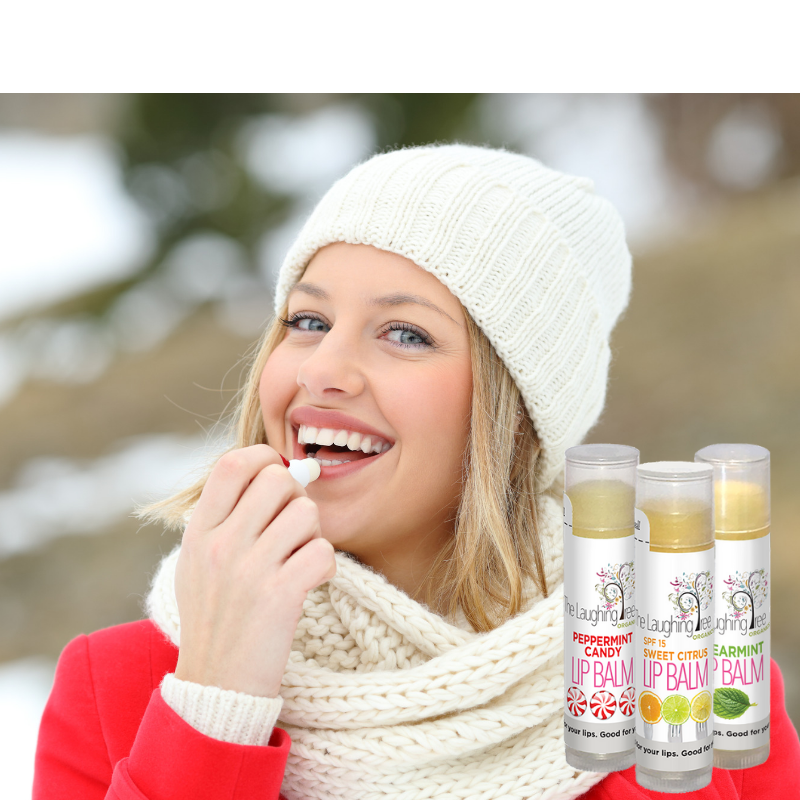
Originally I had a softer look for my packaging that included light green pumps. I went with the black to give it some contrast on the shelves and offer a somewhat more “sophisticated” look because I only had whimsical to work with. Maybe Im trying to be too many things to too many people. The brand is a mid-level priced brand that has been placed in Wholefoods, Hannafords and many small “Boutique” shops. I wouldnt say its a Walmart brand, but if Target came calling I wouldnt decline!! ![]() My Lip Balms are my most popular item, but I chaned the packaging on them to try to fit into more salons. Before and after packaging.
My Lip Balms are my most popular item, but I chaned the packaging on them to try to fit into more salons. Before and after packaging.
Again, an off-the-top-of-my-head opinion arrived at without the benefit of knowing more about your product and your customers…
Your earlier packaging, to me, seems more targeted at at younger, fun-loving demographic, which I think is what you’ve said.
However, if you found your customer base to be a somewhat older demographic, I’m not at all sure this older crowd isn’t also drawn to the younger, more youthful look your products allude to — maybe less frivolous and a bit more sophisticated, but it can still be fun. I’m inclined to think your newer packaging isn’t hitting the sweet spot where sophistication and seriousness intersect with fun, spontaneous and youthful.
1 Like
I think the logo itself is overbearing. It looks like the first images to populate on a google search. That said, I like the pattern and colours of the tree/leaves. I especially think it works in your initial product example at the bottom right of the product label. but is clashes horribly with the logo on the top.
I would suggest looking at or considering keeping the illustrative tree as a design/brand element, but making the logo straight text.
None of what your brand is says “older/mature” it definitely speaks to youth–young to mid-teen.
I think you have a good foundation/structure for the brand, but depending on your growth/stagnation, evolving the brand to something a little more mature may help in targeting the older audience you seek.
If you’re really serious about this brand, or it is your main source of income. It may be beneficial to hire a brand/design consultant to help in identifying your strengths and weaknesses, and propose solutions. This forum has great people and advice to help with surface questions. But without pulling your business apart, there isn’t much anyone can do to help you sell more products based on the appearance of your labels.
2 Likes
I think so. ![]()
I think this is a good idea. It looks to me like you’re trying to reach every possible market. In my opinion, you need to define your market more tightly, and then make design decisions based on that.
1 Like
I agree with Steve_O’s points. This is just one aspect of your brand and it doesn’t present the full story.
Natural and organic products is an industry I am very interested in and support, so I am very familiar with it. Your packaging has really nice design elements. The logo T has too much going on, too many details that get lost at smaller sizes. The tree makes for a nice design element, as you have it in the top pic of the product though. Also, “Organics” is rather small in comparison to the rest of the text. Again, when made smaller, “organics” will not be as noticeable or as legible.
You definitely have to get clear on your market first. That drives all brand decisions. Your brand is your reputation in your market, in your industry, how your audience perceives your company and your products. It’s much more than the visual aspect, such as a logo or color palette.
Like Sparrow said, it may be worth it to hire a brand expert to help you figure that out.
1 Like