Alright so since i’m not too sure how to translate some of the words used in english it will maybe be easier to help me if you are a french speaker.
It’s for a school work and i’m not sure of the unit used and how to set them up to ship my work when i’m done, my resolution must be 300ppp (not sure if it’s points or picas) and the minimum “corps” (in french, that you would literally translate to “body” in english) must be 6pt (must be point but wouldn’t 6 be super small???).
My confusion is also coming from the fact that all my lessons are in french mostly with french words used while I’m using all my softwares in english since it’s easier to find ressources online and overall more fitted to find a wider range of jobs in my opinion.
Also it’s for a packaging so I used the outlines my school gave me for my design (I have to deliver one with the outlines and one without), so maybe i’ll have to resize it to fit what’s needed?
And maybe change the color mode to CMYK but i’m not sure where to do that on Illustrator.
Best thing to do would be to ask your teacher for clarification, but I can try to shed some light for you.
In the U.S., the generally accepted default target resolution is 300 pixels per inch at finished size.
Could be the minimum size for “body copy” is 6 points. For clarification, this would be copy or words that are not headlines. Think of a magazine article, you have the headline and then body copy. This is not out of the realm of reality. Though, depending on the packaging and the amount of content, this could be a challenge.
I do quite a bit of packaging work and prefer to use Adobe Illustrator. What I’ll do is have the outlines on one layer and then put the artwork on a second layer beneath the layer with the outlines. This allows me to easily show or hide the outlines. This is how I’d recommend you proceed with this.
Go to the File menu and look for Document Color Mode towards the bottom of the menu.
Thanks this helped me a lot!
I have a few more questions that I can’t ask to my teacher since this work will probably be graded, but I’m once again not sure of the english name of those.
This is regarding the outlines, I clipped the background color of the packaging to what we call the “fond perdu” so the safety line for when it’s printed (hope what I’m saying makes sense), can my color stop right at this line so it makes a perfect form or does it have to go above it a bit more (it already goes above the folding lines and the ones for the text/art)? Do I have to show this outline only on my other document or no outlines at all?
If you understood what I’m talking about could you also tell me the usual name of those in english? would help me a lot in the future.
There are several different items you are referring to (I believe):
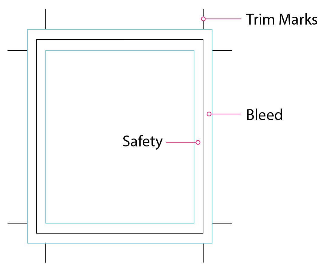
Outline / Cut Line / Dieline (Die Line) / Die Cut – This is the finished size of the package.
Bleed – The artwork should extend beyond the finished size of the package (typically you’re talking about a background color / texture / photo). This area is referred to as the bleed in English and is typically 1/8 of an inch or 0.125".
Safety – This is an area that is inside the die line that should not include text or critical elements. The reason behind this is that if there is a shifting of the card stock during the cutting process, what is in the safety could be cut off.
If you want, you could include the safety lines on a separate layer so you can turn them on and off independently of the die cut lines.
In English, fond perdu, as it relates to printing, is called the bleed.
When sheets of paper are printed at a commercial printer, they’re usually printed on larger sheets of paper, then trimmed to the correct final size. When these sheets of paper are trimmed, the trim is never exactly precise. In most standard printing, the trim might be inaccurate by up to 3 millimeters in either direction.
In many printed pieces, the ink extends to the edge of the paper — a background color, for example. Since the trim is rarely exactly precise, designers must extend the area that’s printed around 3 millimeters further than where the paper will be trimmed. This area is called the bleed or the fond perdu in French.
This extra printed area compensates for the trim not being accurate. For example, if the sheet of paper moves a tiny bit while it’s being trimmed, the bleed provides some wiggle room for that inaccurate trim to be made. Without the bleed, a trim that was even a millimeter off would leave a white, non-printed edge on the trimmed paper.
Since the trim can vary up to 3 millimeters in either direction, designers must also be sure not to place important items, such as text, close to the edge of where the trim will be made. This space is called the “safety” or “safety area.”
The trim marks indicate where the paper should be trimmed. They should always be black. The safety line, the trim line, and the bleed line do not print. You simply need to lay out your artwork in a way that includes these areas.
It seems Steve and I were answering at the same time. Steve used the words die line and die cut. I used the word trim. They mean slightly different things, but to answer your question, they refer to the same process of trimming the larger sheet of printed paper to the final size.