I’ve never worked with SVG files before and hope someone here has more experience and could help me unlock my brain.
I’d like to have a svg file on a website scale with its container (I included it there as a background-image) and at a certain breakpoint some parts of the graphic should be hidden. Furthermore there should bi a minimum width, so the graphic won’t get too tiny on mobile screens.
Here’s what I’ve achieved so far:
I have exportet the graphic from Adobe Illustrator as a responsive svg
then I have tried to declutter the file a little bit and separated the part that should be hidden at the breakpoint by adding an additional group-container (<g></g>)
after that I added a media-query to the file and set the second group to ‘display: none’
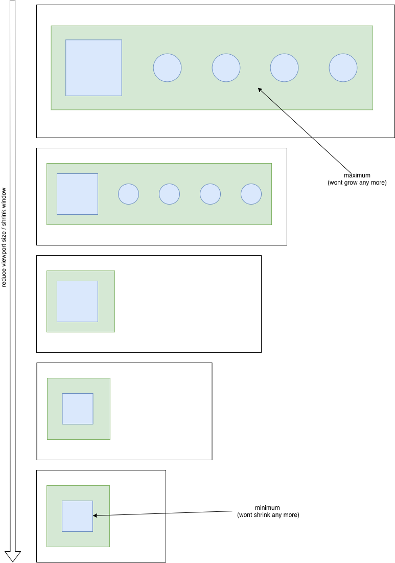
The problem I have now: I really don’t know how I can set a minimum width for the pathgroup that is still visible. So when I decrease the size of the browser-windows the graphic just gets smaller and smaller.
How could I prevent this? And if there are multiple ways: what would be considered best practise?
Thanks for replying. I’m sorry i didn’t answer sooner.
I set up an example. Although here it seems to work by setting a min-width and a max-width.
So it’s possible that the problem is somewhere in my flexbox-layout and not inside the svg at all.
It think I need to experiment a little bit more. But just in case:
And the main problem, I have now, is: setting a minimum width directly inside the svg doesn’t work for me. And if I set a minimum width for the “wrapper” div (the div containing the svg as background), the div will stop shrinking, but it also will be pushed out of my layout.
I have a hard time explaining it, but what I’d actually like to achieve: the space where the second pathgroup (#smallc in the example) was should completely vanish without allocating any more space to it. This way the other pathgroup (#bigc) would have more space and wouldn’t shrink as much. And of course I’d like to stop the div containing the image from being pushed out of the layout.