Please Review my Designs… Which one is best?
If you don’t like anything plz tell me to change it.
1 Like
They both look nice, but legibility is a huge problem. The second one is difficult to read. The red type that weaves in and out of the black Friday headline is, to me, completely illegible. I’ve been trying to figure out what it says, and I can’t decipher it.
This is an awkward comment, but the first thing that came to mind when I saw your headline is Black Lives Matter. Black Friday is a well-known term for the day after Thanksgiving Day in the U.S., but in this particular incredibly weird year, I just don’t know what kind of mental connections people might make.
2 Likes
First of all, who is offering the sale? Is it a place called Black Friday?
The left one has some squiggly red thingie on top. Can’t read it. On the right “70%” is lost in the red coat on the woman.
The pale shape on the top left corner of the left version is disrupting on the eye.
I’d have to say neither one serves any purpose at all. I would go back to the drawing board.
2 Likes
Oh @Just-B, you beat me by mere seconds.
1 Like
Thank you so much for your great suggestion. I’ll change these font color
Thank you so much, you are red color is lost in red coat. I’ll change it . Thanx
Both the designs are made with great concepts. but it is a little messy and difficult to read.
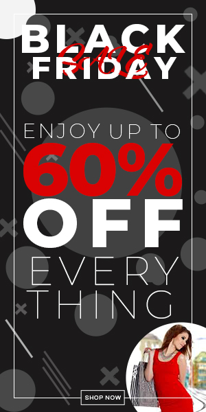
Image 1:
There is something in red color in the heading that is obviously neither visible nor comprehensive right now. Remove that girl’s image from the bottom as well as it makes your design so messy and extravagant in terms of objects.
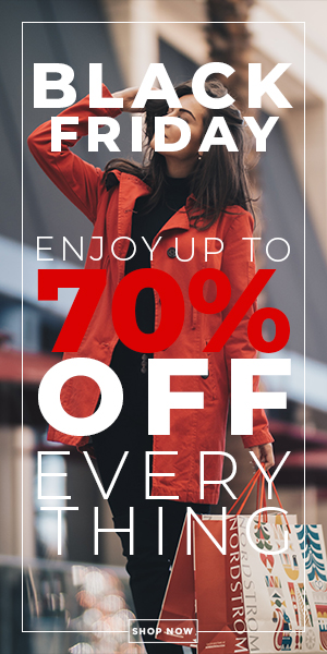
Image 2:
70% has the same background color due to the red coat of that girl in the image. At the end, the alphabet “G” in the word “Thing” is not visible due to the color of bag in the background.
I would suggest you to recall color theory before designing anything ahead.
Alternatively, you could try knocking the image back a bit. Put a black box over the image (but below the text, naturally) and give it an opacity of say 65% (multiplied). You will have to play around with the opacity value to suit. I am talking about the right hand version, which could be nice with a few tweaks.
I’d, perhaps, look at changing the red text to the same as the coat, rather than the, blappy, obvious 100-100 red. That way, even once the image is knocked back, the text will relate more to the image and not sit separatly from it. All adds to a sense of harmony, which helps people feel more comfortable, warm and fuzzy.
Look at the colours in the image. They are not primary and the company’s brand is elegant / sophisticated, rather than primary / fun.
That said, if their brand generally uses 100-100 for sale promos, then stick with that, otherwise an attempt to create harmony will do the exact opposite and it will stick out like a sore thumb if used in conjunction with other Nordstrom promotion. All depends if this is a live piece or a student project. Even if the latter, showing attention to detail in brand consistency (and noting the fact you’ve done so in your Crit) is always a solid and sensible approach.
For me! the version on the left is less successful. The pic appears as though an afterthought. It doesn’t sit so well with Nordstrom branding, to my mind. Also, as Eriskay says, that red script ‘SALE’ in the header really doesn’t work. I had to look positively for a few seconds to try and decipher what it said.
As an aside, personally, I despise Black Friday. Partly because I’m a grumpy old sod and partly, as it has become a thing this side of the pond in recent years and I loathe seeing the feeding-frenzy over cheap TVs. Seems to really expose the ugly underbelly of humanity. But that’s a whole different soapbox rant for another time and place.
Finally, the SHOP NOW button could do with being a little more obvious.
Anyway, overall, nice job.
These are way too busy, chaotic and illegible for my eye. Rework these to simplify and reduce the visual clutter. Who are these for? I have a hard time believing Nordstrom would okay this with the type running over the model’s face.
1 Like
What SteveO said.
Is this really for Nordstrom? If not, you have a trademark violation in your image.
I’m not the demographic. Saw woman+shopping bag and ignored the whole thing as too chaotic.
2 Likes
I prefer 2 and the legibility is a problem, but I would add that you should never obscure the face of the principal model in the picture. Whatever you are selling, the face is a major point of empathic connection with the viewer.
“Which one is best?”?
In a lot of cases one can only pick the least bad.
Despite the clutter, the illegible typography and the type awkwardly running over the model’s face, there’s still something I like about them. I might also mention the lack of a store name (other than the shopping bag) that gives any indication of who is having these sales or the context of where these ads will appear —maybe a website ad, but I don’t know.
So aside from all those fatal, deal-killing mistakes, like I said, there’s still something striking about the ads that, at first glance, I liked and still like. It was only after that first glance that the problems became readily apparent. Maybe if all the problems were addressed in a way that didn’t destroy that first-glance appeal, they could work.
both look good but it’s hard to read any typography
In my opinion, both the designs are made with great concepts. but it is a little messy and difficult to read.
Hi Rajput_Sami,
You have poured great effort in both the designs. Always remember, what message we want to deliver through this flyer, poster or banner must be prominent. In the first design, black theme is visible but text is somewhat messy, while in the other design again text is not that visible and readable.
I would suggest, it’s a big poster, there is sufficient space. Take the picture to one side and the text to the other. Give more visibility and readability to text.
Just do a little effort more and it will become a perfect flyer.
Hope it will help.
Thanks