I wanted your review on this logo, this logo is for a vegan delivery service, they sell snacks mral kits and also have a cafe. Would be grateful if yall could take a look at it.
What is your level of education and experience?
I am a beginner self taught graphic designer, currently in 12th grade
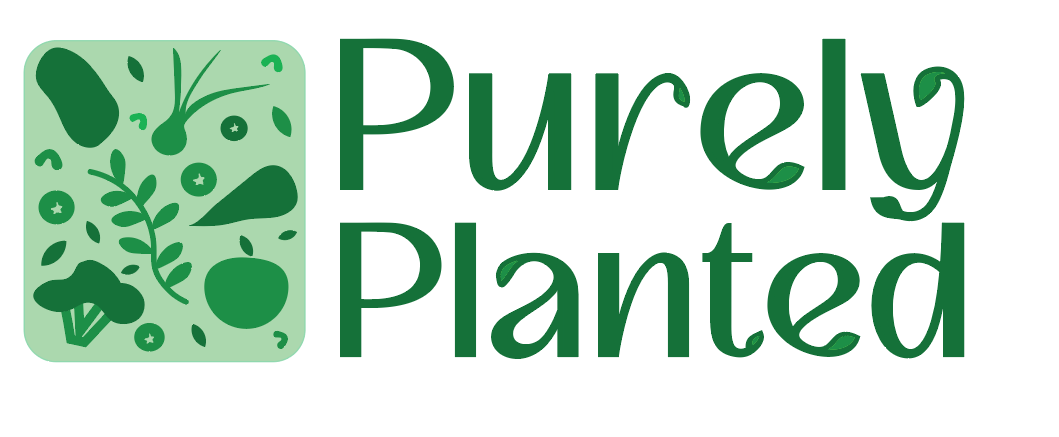
The leafy details on some letters but not others make the text feel unbalanced almost like an afterthought. A good example is the “y,” where both ends are shaped like leaves, but only one is a different colour, which adds to the inconsistency.
The tiny leaf accents in the letters are so subtle that they don’t really stand out. Instead of adding to the message, they clutter the typography.
Overall, the logo gives off more of an “organic farm” vibe rather than a vegan delivery service that offers snacks, meal kits, and a café. The icon, with scattered raw veggies, makes me think of fresh produce rather than prepared food or convenience. At first glance, I thought this was for a farm supplying produce to grocery stores.
The logo should communicate veganism, convenience, and modern food service more clearly. Maybe refining the icon and incorporating a delivery or food container element would help shift the focus toward prepared meals rather than just fresh ingredients.
Right now, it’s a nice organic-looking logo, but it’s missing the mark for a vegan food service and cafe.
Not all logos need bells and whistles - check out Purpple Carrot, Hello Fresh etc.
Simple is better.