It is ridiculous, but I run into this sort of thing all the time. Years ago, clients never wanted to handle the printing — they didn’t have a clue how to go about it.
With the advent of corner quick-print shops and online gang printers, most smaller clients feel as though they can save money by arranging the printing themselves. Proofs, press checks, making sure the printer is the right one for the job, asking for aqueous flood coatings to prevent fingerprints, etc., are things they don’t know they don’t know about.
I always try to explain to clients the advantages of me working directly with the printer, but at least half still want to handle it themselves. I always make sure to get an emailed response from them absolving me of responsibility for any problems that might occur due to them making the printing arrangements.
I always add a nuisance fee to the job that differs from client to client depending on whether or not they strike me as amateurs, nitpickers, do-it-yourselfers, or micromanagers.
Of course, I don’t tell them that I’ve added it, but when I give them a quote at the beginning of the job, I’ll just add 10–30 percent onto the quote to account for the time-wasting hassles that I’ve come to expect. If they turn out to be good, easy-to-work-with clients, I’ll lower the price on the next job.
Yah - I mean, she loves me and immediately signed me on for projects for the rest of the year after completing my first one. I was referred to her by another client. And I think one of the reasons why she does like me as much is because I am very meticulous and ask a ton of questions or provide advice through every step of the process up to print - mostly things she hasn’t thought of. I get the feeling she hasn’t even had this much communication with a designer wanting to be involved with the printer.
I think the bigger problem is that she is not very organized and that she has to go through a board to approve everything - this is a nonprofit. Plus, I feel like she’s constantly taking off from work for vacations , etc.
When I start offering freelancing services outside of word of mouth, I’m going to make it a point in my contract that if the client has a preferred printer that I need to be in contact with them to ensure the best production of deliverables. She will eventually connect me with this one - it’s just taking forever for her to get around to it.
I mean, she 100% will connect me with the printer. She agreed to it months ago. She just takes forever to get around to it. Sometimes, I feel that I prioritize my freelance work more than she prioritizes her job as I feel like she’s always taking off from work.
She does overwhelm me with her lack of organization but she’s open and willing to work with me and my requests. Recently, I gave her an email template to use to request projects and she started referring to it immediately…not perfectly, but hey - can’t win 'em all.
I feel like I am molding her as a client as we build our relationship. It was really rough in the beginning but I get the impression that there was just sheer ignorance on why she was making my job so difficult. By the next couple of projects, I feel like we will have a good system down and this will be a good learning experience for me working with future clients.
True, at least your client is willing to use the reference sheet. I just emailed a client yesterday about a logo design and branding. Laid everything out and received a decent response and then today they added on, “maybe I should add a caricature of myself to the logo too” and I facepalmed.
So I am back at this and finally connected with the printer - or more accurately, the print shop’s designer. I also found out this designer was designing for this company prior to me taking over the projects so I’m hoping I didn’t ruffle any feathers there.
I asked about leaving the file in RGB and letting the printer adjust as they saw fit to match the colors as closely as possible and he said it would be converted to CMYK anyway and he would rather I did it on my end. He was already aware of the brand colors and confirmed the colors are going to change significantly and there was nothing that could be done. He also said that since I am the designer for this project that he is going to print however I send the files not wanting to have to make any adjustments.
So I am reaching out here again to see if that sounds right and if I should throw in the towel that there is nothing else that I can do. The designer said CMYK digital printing, no Pantones. I already relayed his response to my client. Also - there isn’t enough time for a proof.
Have I done my due diligence here as the designer?
You’ve done your due diligence, but if this is printed digitally (which it almost certainly is), I doubt the printer is using a machine restricted to only the standard 4 process colors.
In addition, he’s either neglecting to tell you about the Pantone lookup tables their printing machines use to approximate Pantone colors or they’re simply not set up for good color matching.
Either way, considering what you’ve been told, I’d probably be looking for another printer if your client insists on good color matching.
Yes, he confirmed it was printed digitally. I brought up pantones, but he said it did not apply here and left it at that.
I did look up other printers nearby but I’m losing too much time to finish the designs since so much of what I requested was not provided until the last minute. Wish I had more time - thanks for validating!
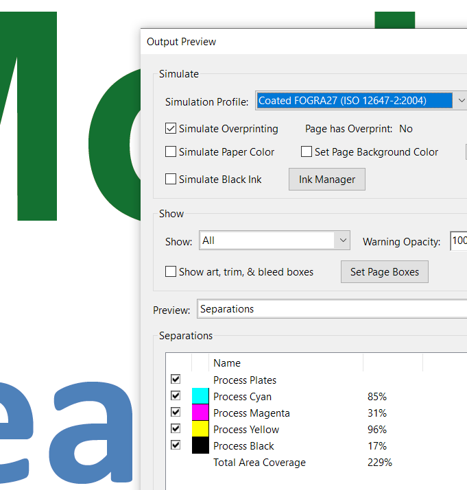
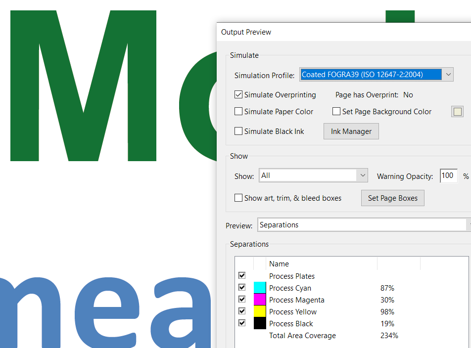
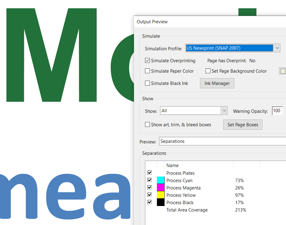
What happens here is you convert to CMYK to any color profile assigning cmyk values. Then it goes through their machine under a different profile and converts those cmyk values again.
At this stage ask them for a .joboptiobs file that will have their preferred pdf settings. You can then load that into Adobe and use that setting when output the PDF.
Is that something he should have given me automatically when I told him the reason for the call was to make sure I am saving the file in the best format possible to ensure color accuracy in the print job?
I went through a list of questions with him about my concerns and emphasizing the brand colors and that I wanted to make sure I was setting this file up for success for his team to seamlessly print.
My client did ask me a couple of times if I had a printer in mind that I could suggest. I’m a little nervous shopping for one now with little time and living on the other side of the country. But if I could pull it off…
Possibly - it’s something that could have been suggested.
Put it this way - once you convert the Pantone to CMYK - you are converting to that CMYK colour space for a specific output intent. Whether it’s WEB (print - not websites), litho, digital, coated, uncoated, etc. etc.
That conversion is absolute - it’s converting the Pantone number to that specific Output Intent - so in your case maybe it’s digital flyers on coated stock and also for a large format printer for banners using a glossy paper.
If you convert to CMYK you have 1 set of values for both sets of different outputs.
This cannot be.
If you leave it fully Pantone with RGB images, CMYK images etc. then the output intent is going to be different given the output device.
Where say in Litho print you have an ink tolerance of 200% on a particular type of paper. But on the digital output the ink limit is 350%.
This is where the printer steps in and does the best conversion and best colour control from their side.
As they have all the ‘raw’ colour data and can adjust accordingly on output from their devices.
You wouldn’t necessarily have the same CMYK values for digital print run on a 120gsm stock (whatever # stock that is in the US) - compared to outputting on 250gsm Gloss digital printer.
The colours need to shift slightly depending on the output device and the stock of paper and needs to be calibrated and output matching in the print shop.
That being said - you’ve relayed your concerns over matching brand colours.
Reference these colours in emails to them that you need this blue to match this pantone etc.
The same image prints with different values depending on the output profile and the output intent.
If this was a pantone reference - that pantone colour would be in the different RIPs in the Look Up Tables and would convert to the best approximation CMYK for their output.
Once you do the conversion your end - you lose that ability that the printer might have in their output RIPs.
Problem is - the printer has no colour reference now (for the bottom swatch).
However, if they have the top swatch - they can clearly see it’s Pantone Colour reference.
And I’ve been switching through profiles and you see the CMYK swatch alter in colour and the Pantone Colour stays the same.
I would have preferred to leave the file in RGB and assign all the brand colors used as Pantones, etc. Maybe this designer/printer is planting his feet. He did make a couple comments that felt a little bit like - well, if you’re going to design then you need to do the entire process and I’m just going to print - sort of vibe.
When asked if he would like me to save the files to a google drive with all assets and layers just in case he wanted to adjust anything in particular, he quickly dismissed the idea saying that he wouldn’t expect or want to touch the file at all after I sent it. Maybe a bad sign.
After I finish designing, I might reach out to some printers that are local to them and see what advice they can offer. I’m just getting a feeling there isn’t going to be much collaboration here.
Thank you for all of the other detailed explanation. I’m going to go over it a few times since it a lot of jargon I’m not familiar with.
Not a bad sign.
Typical handover is a print ready PDF.
But I’d expect the printer to be able to handle it.
Given that they want you to do the conversion with no control over what CMYK profile etc. then I would be wary.
Yah, I almost get a feeling it’s a little bit like a resilience to work with me on this since I may have unwittingly taken this project from him. I didn’t know my client’s printer had a designer designing the files for her before and that’s who they set me up to speak with. But the client decided to move forward with this printer based on time and they are accepting in the shift in colors now.
I’m rereading your other advice again which is sinking in a little better now. Do you think I should save the file in CMYK mode, but use actual Pantones for all the brand colors (leave all imported images such as the award winner profiles as RGB) and then anything else that is vector in the file should be in CMYK? I might be a slow learner here. The print stuff makes my brain mush as I start overthinking just about everything. I’ll also send a reference file in addition to the PDF.