RGB, CMYK, Pantone - retaining color during print?

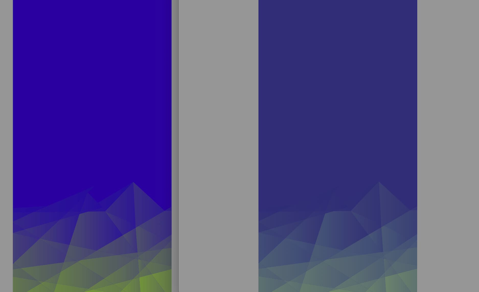
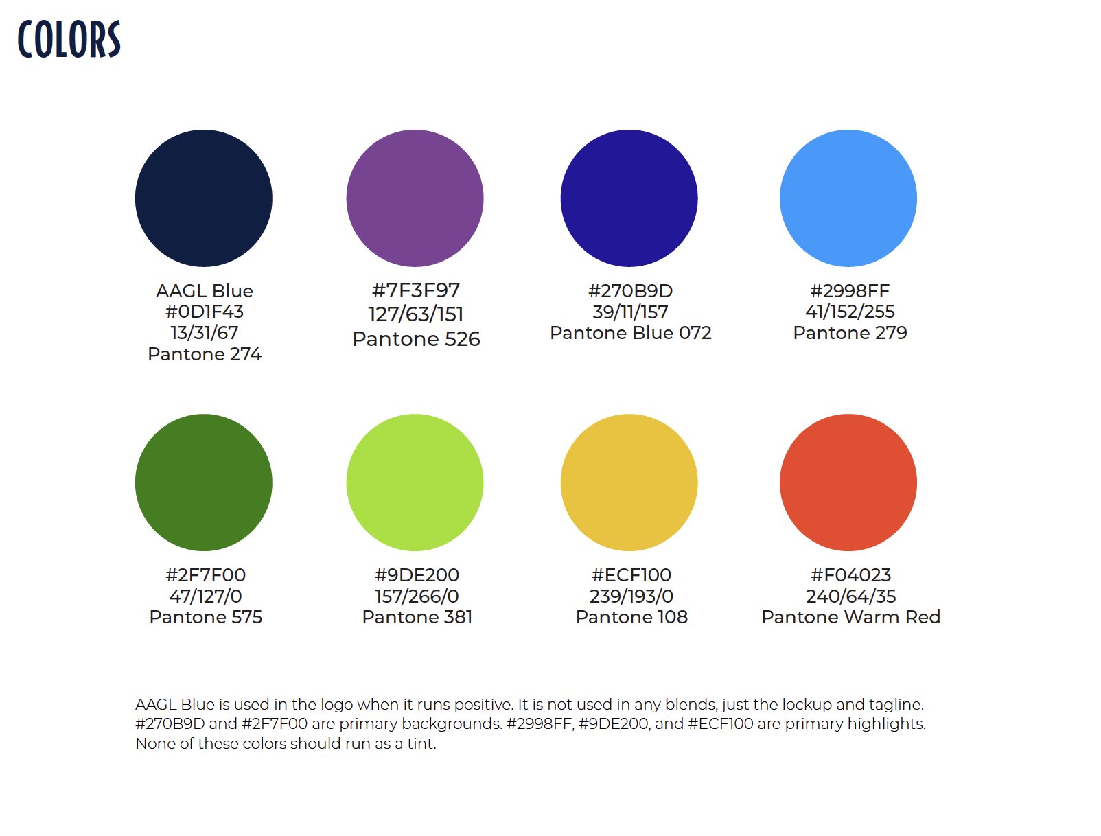
I’m creating a series of banners that have a strict branding guidelines for an event. As you can see the background of the banner is so much brighter as a RGB file than when it is converted to CMYK for print. This is to be expected but I made sure my client was aware of this; they do want to match the RGB colors as closely as possible and instructed to use 072C as the Pantone color for the blue. I also suggested Pantones as a better option to more closely match the brand colors and banner template. I am designing this file in Illustrator and all parts of it are vector (except for an images I need to add into the file which will obviously stay CMYK).

I also need to make sure the printer they are using is capable of creating Pantones and if my client is ok with the increase in cost.

I don’t have as much experience in printing Pantones; only basic knowledge - so here are just a few questions I have if anyone has advice:

  1. If the printer can’t afford Pantones, is there any way to fiddle with the colors in CMYK to retain some of the brightness? I read a color burn might help but I’m assuming that causes unpredictable results when printing.

  2. If using the Pantones, the files should still be set in CMYK, right? I ask because the brightness of the Pantone goes right back to that dull conversion and I’m worried that’s how it will print.

  3. Now that my file is in CMYK, I feel like I don’t have an accurate view of how my screen is displaying the true values of the Pantones vs the CMYK because the entire file looks dull. This worries me when I start to add elements that will be CMYK onto the Pantone background as I have no idea what the final result in print will actually look like. Am I right in thinking this?

  4. I don’t know much about Pantones but 072C means on coated paper, right? I have no idea what the stock for retractable banners are and if it is typically coated. Is this another problem I will run into?

Find a printer that prints spot colours. It’s not about affording. Some simply don’t do it.

And it could be a heck of a lot cheaper than cmyk.
Cmyk is 4 plates at 100 quid a pop. Or more

You might only need two plates.

If the printer doesn’t print pantone then they will adjust on press to the closest approximation they can reach.

You do absolutely nothing. Except talk to them and allay your concerns.

Personally Id send a pdf with no colour conversions and pantone colours in tact.

The printers RIP will have LUTs know as Lookup Tables that will do the Pantone to CMYK for their setup.

Absolutely do nothing except set it up the way you intend to print it and with most flexibility.

Don’t convert colour profiles, leave images RGB etc.

Only exception if it’s absolutely necessary to match a certain cmyk.

You need to find out who the printers are and work with them request cour samples and do all that stuff.
You or the client.

1 Like

Yes, I told my client that some printers cannot do spot colors already and I need to find that out first. And I have requested that my client connect me with the printer multiple times so that I can relay my concerns and discuss with them the best way for me to set up the file. She’s just a little scattered and has yet to get around to it for even other project’s I’ve completed.

But I did not know that spot can be cheaper in some instances so I’ll make a mental note of that. And if leaving in RGB is the best way to go - than that just made my life sooooooooo much better. :heart:

Thank you!!

Looking on the screen - yes it will get duller on screen.

You won’t print 072C on banners - as this will be digitally printed.

So this would be CMYK - but you can leave it 072C and the printers can match it to 072C

Actually - when you send the whole suite to them you can request colour matching to ensure that all the suite have a consistent look.

The worst thing is - and happened to an owner of a print company where I was working.
His print was down so he sent out a set of stationery - one to be printed in Pantone and the other in CMYK - to two different print places cos he was short on time.

They came back different shades - unsurprisingly.

So you really do need to work tightly with printers.

If you’re using the same printers get print samples.

If you’re using multiple printers then get print samples done locally that you’re happy with the colour.
Then send the sample prints to printers to match.

1 Like

Some… not always.
It comes down to amount being printed - technology - and things like.
Naturally there’s a breaking point where litho becomes cheaper than digital and vice versa.

1 Like

I’m not entirely sure from your post that you know what Pantone colors are, so let me explain.

You mentioned banners, so I’m assuming you’ll be printing them digitally rather than with a traditional printing press. Even so, as background, let me first explain how Pantone colors are used in non-digital printing.

The Pantone Matching System is a color matching system that helps ensure color accuracy and also contains colors that CMYK can’t reproduce. On a traditional printing press. Special inks are mixed to match Pantone colors according to Pantone’s formulas.

For example, if you were printing a brochure in color, but needed to precisely match a bright Pantone blue, the printer would print the job using five different inks: cyan, magenta, yellow, black, and the specially mixed Pantone ink.

However, if you’re printing the banners digitally, a special Pantone ink won’t be used. Instead, Pantone (the company) supplies lookup tables for different digital printing devices that tell those devices how best to recreate the Pantone color using the inks in the digital printer.

Digital printing isn’t usually confined only to CMYK. Digital presses uses CMYK inks, but in addition, they’re usually configured to also use additional inks to expand the color gamut (the possible colors that can be printed.)

If you specify a Pantone color for digital printing, the lookup tables supplied by Pantone provide a formula for the digital press to use to best simulate the Pantone color using the wider gamut that’s made possible by the additional inks the digital printing devices have.

In digital printing, it’s often best not to convert the RGB colors to CMYK. This enables the printing devices to best use its CMYK and additional inks to better match the RGB colors that would not be possible using only straight CMYK. In addition, if you specify a Pantone color, in digital printing, the lookup tables will convert that Pantone color to the closest match possible on that particular printing device using the ink colors that it has available.

In other words, it might be best to send an RGB file to the digital printer. Or it might be best to specify an actual Pantone color for the digital printer to match as best as it can.

What you probably need to do is explain the problem to the printing company. They can best advise you on how to prepare your artwork for their particular digital printing machines.

1 Like

Just to make sure I’m doing this right, I am going to leave the file in RGB and changes the brand colors to spot colors. I’ll communicate with the printer directly on allowing them to convert as they see fit to most closely match the file. Is that right?

I will ask the printer when I am finally connected if they have spot color capabilities and what suggestions they can also offer and take it from there.

Get a proof. Kinda goes without saying but some people try to save money by not doing it.
Pennywise, pound foolish.

Pantone Blue 072 is a “hot” color. Depending on what the printer has for an inkset, you may not get as vibrant a match as that chip would imply. Ranks up there with Reflex Blue. Either of those almost require a Violet head, which most printers won’t have.

Keep your Pantones coated if you are in the US. Most of the lookups cross reference the media as a coated color here, even if the media is matte. Banners come in glossy and matte finishes on retractable units. Personally, I always opt for the matte. Sleeker look, easier to read.

The lookup tables that Just B mentioned are machine and MEDIA specific. Machine + Media + Correct color profile in a good rip software can get amazing results from the right print vendor. And sometimes even then, some colors have to be tweeked by eye, so a Pantone always garners an extra charge.

1 Like

I do know what Pantones are. I understand that it mixed following a Pantone formula and then added as a separate ink addition to CMYK. I’ve watched videos on the process years ago.

I am designing retractable banners. My client says they use a local printer but I have no idea who that is. I’ve asked multiple times to be connected even with a recent completed project but she has yet to connect me. She will when she’s ready and then I can ask questions and relay my concerns.

But now I realize why I sound confused to you regarding Pantones - it’s the digital versus non-digital printing that throws me off. I just always assume that the majority of quality and local printers use a traditional printing press and to ALWAYS convert to CMYK with the option to add Pantones for accuracy like brand colors. But I guess digital printing has its purpose. Maybe smaller items that are printed in bulk would use traditional press whereas larger single items like a 33" x 80" banner would be better off using digital printing? Is that a correct way of thinking? I know there are also printers that offer no digital printing or offer no traditional press printing.

I have an Epson P600 Photography printer at home that uses 9 cartridges to achieve a wider gamut of colors so I’m thinking this is what you mean by digital printing using additional inks to expand the color gamut?

If I’m on the right track here, then yes - all of this is starting to make A LOT more sense.

I will be leaving the file format in RGB as per the advice in this thread while switching the brand colors such as the background and fractal blend to Pantone swatches.

I would prefer this method, as well. But I believe all three of us (me as the designer, my client, and the printer) are scattered across the US in three different states. Not sure a photo will yield a reliable proof with the way different screens are calibrated and lighting when the photo is taken? I believe my client is more concerned with retaining as much of the brightness as possible from the RGB version. If the colors are slightly off, I don’t think they’ll notice or care but of course I’ll run it by her.

Thanks for the info - all very useful that I plan to dig up and read about next.

Usually, yes.

Burning printing plates and starting up an offset printing press is expensive, but once the job is running, the press can print hundreds or thousands of copies in a short time, so the more copies that are printed, the lower the cost per unit becomes.

If you’re only printing a handful of the same thing, however, it’s cheaper to print with digital printing.

Digital printing has gotten very good over the past few years, so don’t think of it as inferior to offset. In many instances, it’s superior — the wider color gamut being an example.

Your 33" X 80" banner would definitely be printed digitally. Not only would it be cheaper to print a banner or two using digital printing, 33" x 80" is just too large for an offset printing press.

Yes, exactly. Because of those extra inks, your Epson photo printer will be better able to simulate the RGB gamut than a straight CMYK-only printer.

1 Like

I feel a little less dumb, now. :joy: Thank you!

Only you as the designer needs to see the proof. If you’re doing a bunch of one-offs, getting minis will assure you (or not) that the color will be close. That’s what the client relies on you for. :slight_smile:

Ok, you make a fair point. I will ask the printer if they are able to send me some sort of proof via email prior to printing to ensure the color is close enough to what the client wants. The last printer that I had trouble with refused to send images of a proof or stock samples - super annoying.

You should get printed proofs.

1 Like

I meant a printed proof that the printer can send me a photo of via email. The printer is across the country from me as far as I know. And there isn’t enough time to receive any sort of printed proofs in the mail based of the deadline I don’t think. Plus I don’t think my client is going to want to cover that. I’ll see what solutions the printer can come up with when I am finally connected with them.

No. A physical printed proof.

Think about it.
Perhaps their lights are halogen, or fluorescent, or LED or whatever and they cast a Yellow Hue. Then the photo is taken in poor lighting conditions, on a digital camera, like maybe a low end phone camera, or a cheap digital camera.
That camera instantly processes the image through filters and converts the colours to a colour profile.
That colour profile with low lighting, converted to perhaps sRGB, and downsampled to JPEG and sent to you - which you open on an uncalibrated colour monitor to view the photograph of a printed sample - perhaps you print it out on your low end or mid range digital printer - which could internally convert the colour profile or adjust the levels internally.

It’s insane.

You need the physical printed proof.
You need the printers to agree to match to the pantone colours you have specified.

If you have used specific CMYK colours - you can find an approximation of these in the Pantone book - and ask the printers to get as close that Pantone reference (AS THERE IS A CMYK version - so you can reference that)

Find the CMYK variant and say this CMYK reference in the Pantone book is very close to this PANTONE colour - I would like this colour.

Open the dialog with the printers.

Try and get it printed all in the same place.

If you can’t.
You need to send printed samples to all the print vendors to match.

Otherwise you are at nothing.

1 Like

I know all of this.

I mentioned it above that a photo of a printed proof is unreliable due to calibration and lighting. But I can guarantee a printed proof is not going to happen. I’ve been asking my client to please connect me with their printer for months and still have not been connected. And the deadlines for these banner designs are in 5 days. This client, in particular, doesn’t give me everything I need as early as I ask. So what you’re suggesting would require me asking my client again to connect me with the printer when I already asked twice this week and it’s already Friday. I also don’t have the designs done as the board and meeting planner just changed them again today. So I have nothing to send. Then I have to give the printer time to print a proof and them mail it to me when I am half way across the county. Do you see where I am going with this? I just don’t think a printed proof is going to happen. If I can be connected with the printer soon, I will ask. And I will certainly ask for future projects but for this client, getting anything I need is like pulling teeth right up to the last minute.

Also…Knowing my client, the color matching is not as important as retaining some brightness is. Maybe that’s the same thing in a way… i don’t know. Of course they want it to be close but it doesn’t have to be spot on. These banners will be used once and then tossed.

Anyway, I think it’s important to educate your clients but also know when to stand down and to not overwhelm them as I’ve had to already chase mine for weeks for assets, logos, and other elements to even start this project. And I’ve already explained the printing concerns which cannot be adequately addressed until I am in communication with the printer directly. So I feel at this point, it’s ok to take a step back. The client is informed on all angles.

I only mentioned a photo of a printed proof because it kept coming up as necessary part of the process in this thread and I just don’t think a printed version is feasible this late in the game.

But it is very useful information I’ll be using moving forward and in general. :grin:

Well then you’ll need a caveat to the client that the printer is responsible for colour reproduction.

You really cannot assume that risk - that risk should be with the printer.

1 Like

I think its quite ridiculous that you haven’t been allowed to be in contact with the printer. Have you considered redoing your contract with this client? or update your pricing to accommodate the headache it seems your going through?

Clients are defiantly a difficult step in the design process. It seems yours is as informed as they are going to get. If the client cared about color brightness it would only make sense to connect the designer to the print shop. UNLESS the client is using an online webservice and has nobody to talk too?

1 Like