High-quality professional designs
300 dpi CMYK color scheme
PNG, JPEG, PDF
High resolution
Print-ready files
Fast and Reliable Communication
Fast Delivery within 24 hours
Easy Editable
Source file.
Unlimited Revisions (until satisfied)
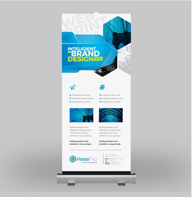
Considering the number of spelling and grammar errors, I wouldn’t hire you based on this piece.
If you print these things, I’d get a better representative sample, and something other than a rendering.
You have spelling errors.
You have errors in your sentence structure.
If you are a designer, these are errors that mean you can’t do your job.
If you are a printer, and this is the best example of your work, that also means you can’t do your job.
I have experience designing trade show displays and banners. I can tell you the most important thing to keep in mind is that a trade show banner is like a billboard, not a brochure.
At a trade show or conference there is typically hundreds of people if not thousands. There are also many exhibitors that you are trying to stand out among. When people are walking the show, being bombarded with displays and give aways, your display should be one that is memorable and should entice the attendees to come to your booth.
This example you’ve posted has too much text. No one is going to read all of that text as they are walking by your booth. Another thing, it is standard at many trade shows that the companies exhibiting have several of their employees man their booths. This means you have people standing in front of these banners at all times making it even more difficult to read all of those lines of text (especially the information at the bottom of the banner).
I think you need to go back to the drawing board on this one. Try not to be so wordy. Use larger imagery and simplify your message. Remember, think billboard!
Clients use these things in a number of different ways.
Sure they might do an aisle-side thing within a tradeshow booth that is “billboard” but I’ve also seen rollups use as wayfinding standing out in mid lobby, as breakout boards outside seminar rooms, as menu boards for food trucks, as feature lists in auto show rooms… the possibilities are endless. While this design could be used as a corporate lobby or waiting room display, it would make anyone who read it laugh or roll their eyes and wonder about the place they are visiting. I get there may be a language barrier here. All the more reason to employ a copy-writer and proofreader versed in the language being displayed.
Many years ago when I was a younger designer with less experience, I got dinged on a trade show display. I designed the display, it looked great, the client loved it, we had it printed, and then I got feedback. Some of the design elements were too close to the floor. They were either hard to read, as the person had to look down, or they got covered up when samples or tables were placed in the booth. Now, when working on any sort of environmental project, I always create a separate layer that has foot markers so I can easily see exactly how far design elements are off the floor and what design elements are at eye level. In addition to this, I will put the outline of a person off to the side to help gauge scale.
When doing any type of 3D exhibit or display it’s always a good idea to put a person-silhouette in the drawing to give a concept of scale, a concept that seems to be non-existent to those creating a number of trade-show booth photoshop mockups…
examples:
Good point, I wasn’t thinking of these banners being used for anything outside of a trade show.
I still think it is good to be aware of the text placement towards the bottom of the banner. I don’t see many people wanting to look all the way down to read the information, and that information could easily be covered up by having something placed in front of the banner.
Don’t always assume that they are going to be on the ground either.
Comfortable eye level is considered to be between 48" and 60" off the ground (that is the ADA standard)
If the pullup is on a picnic table, kneewall (or more correctly, a ponywall) or other elevated surface, you do need to consider that.
The bottom of the banner may actually be where the important stuff goes!
It’s all about application and getting all of the specs and details up front.
Some pull up banners like this have poles that hold them up. There might be four 20" poles, for example. I have one client that uses this style of banner and they want to be able to use the banner on a table top (with only two poles) or on the floor (with all four poles). If that’s the case, you really don’t want any critical content on the bottom half of the banner.
As I noted in a post above, the possibilities for these things are endless. They are effective if you use them appropriately and design the content appropriately.
However, they are transient solutions. They may be fine for a tradeshow and to some limited extent as a temporary informational display in a waiting room or show room or as a relatively durable but disposable/changeable menu board of some kind, but if being used as part of a permanent decor, nothing screams “CHEAP” like these rollup things. If the application is part of a decor fitout for an office or venue like a sit-down restaurant, you may want something a little more elegant.
There are a few DOs and DON’Ts in creating a banner. The appearance looks ok but you might need to check your spelling. Using the correct banner size would be of great help.