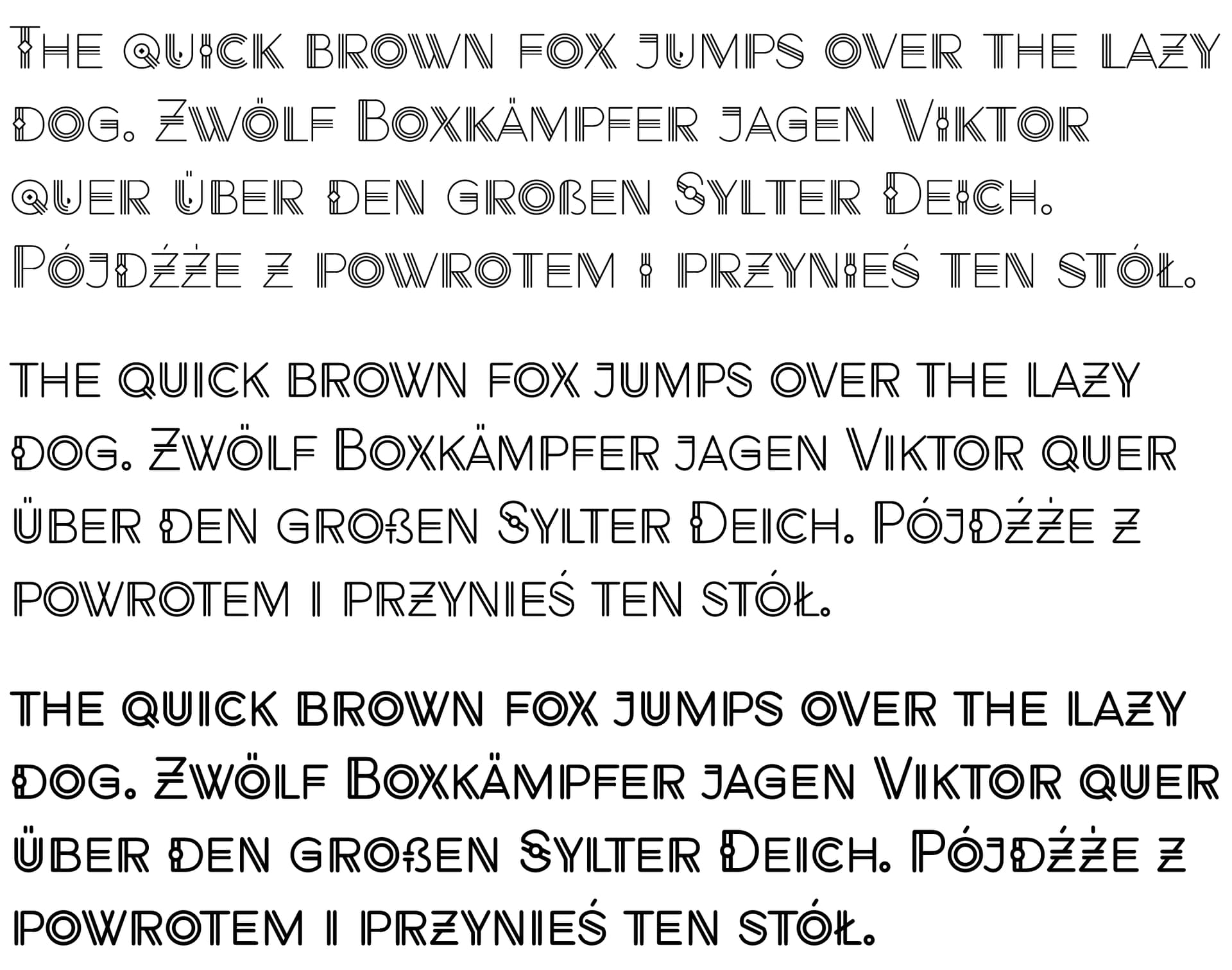
Can I please get some critical comments on this typeface that I’m naming Sanpitch? I’ve worked on it off and on for several years. It’s a novelty display typeface but contains all Western and Central European characters, making it a more serious endeavor than most novelty faces.
I still need to design a bold version, but the extra-light, light, and regular fonts are there. In addition, I haven’t gotten around to tackling the kerning pairs yet. It’s not meant to be seen at test sizes, so clicking it to enlarge it will show it at a display size that I designed it to be used.
I am not a type designer, so take my comments with a grain of salt.
The light and regular have good family continuity, but I was surprised to see some of the differences between the extra-light and the other two. Mostly the use of three strokes vs. two strokes and the shape of the accents (diamonds on the extra-light and circles on the light and regular).
That said, I don’t see mixing multiple weights of this typeface together; so the differences between the weights might be a non-issue.
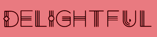
On the light and regular samples, is that a capital T in “the”?
In terms of overall design and usability, I think it has a pretty narrow application, but I do think there is an application. For example, I design a magazine for one of my clients aimed at teaching financial literacy to high school and college students. I could see using this as a headline in the magazine. I actually think it would work quite nice in that application. I’d say it would work well in a number of youth-oriented applications.
Thanks, Steve. Yes, you’ve identified some of the traits that (to me) make the fonts and the type family interesting and that I struggled with. This is why it’s been an off-and-on project for six or seven years.
For example, traditional lowercase letters didn’t work, so I put the project aside for a couple of years until I finally decided to use uppercase variations (essentially small caps) as the lowercase.
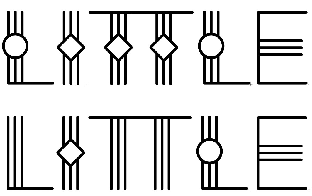
I’ve made no effort to make the individual glyphs the same from one weight to the next. Instead, I’ve concentrated on making them consistent within the immediate context in which they exist. For example, certain letter pairs look terrible together, so I’ve used an OpenType script within each font that substitutes a variation of one of the letters to create a better-looking pair. For example, the sequence of letters in the word LITTLE looks awkward, so the script automatically applies contextual substitutions.
As you mentioned, this is a special case face that few people will ever need, but for that one in ten thousand projects, it might be perfect as a movie title, a print ad headline, or a book title.
The font weights are a little nontraditional in that I wasn’t as concerned with the overall weights as I was with the thicknesses of the strokes within each glyph. It’s definitely not a text face — just a special-purpose headline typeface. For example, the movie Black Panther used this typeface.
My 2-penneths worth. Overall, I think it is fun, interesting, though, as has been said, with limited use. The thing that jumps out at me is the ‘colour’ across the font is a little uneven when you compare glyphs like the C, O, Q and U, etc with, say, the R, D and J. The latter have greater contrast, which makes the others look to heavy in comparison. It is most noticeable on the lightest weight (although the u is fine on this, but appears to heavy on the next two weights), but the issue does affect them all to varying degrees. As I say, it is more the general feel. The weighty glyphs have the same visual effect, almost (but inversed), as rivers in justified text.
Maybe it just takes the same kind of quirky details on glyphs like the O. Note quite sure how. Maybe like the u on the lightweight,yu can just stop inner lines
Just a thought. Overall, I like it, just obsessing!
Very fun typeface and I can immediately imagine its use cases. I’ll mirror what others have said in that the difference between weights is a little jarring. If I liked the diamond accents at one weight, I would be disappointed not to have them at others. Very bold weights are understandable, but I would expect light, extra light and medium to be very similar.
Yeah, I suspect the nonconventional weight differences will be a stumbling block.
It’s an experimental type family whose variations fit within usual weight classifications in only the roughest sense. Each variation is a related typeface designed for that specific variation with only stylistic similarities to the other variations. Since weights are standard fare for fonts, I used those weight categories to keep all the variations bundled together in software font menus rather than separating them into separate typefaces.
It’s an unusual approach, but it’s not a type family where the different variations are intended to be simply bolder or lighter versions of the adjacent weights. Each variation is a separate entity designed specifically to accommodate the limitations and possibilities of the stroke widths and numbers used in that variation.
I don’t anticipate people using the variations in the usual way weights are used within a family — for example, a sentence in which an important word is bolded for emphasis. There’s nothing keeping them from doing that, but it won’t always work well.
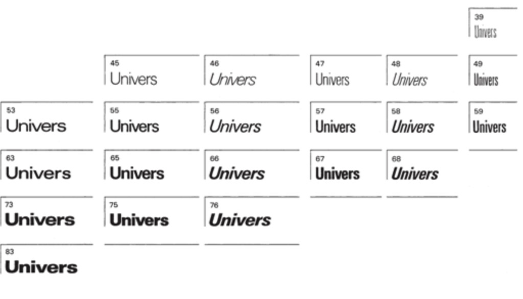
If I had my druthers for this type family, I wouldn’t use the terms light, regular, etc., and would, instead, use the terms Sanpitch 1, Sanpitch 2, and Sanpitch 3 to denote the variations. However, application font menus and CSS (in website design) use weight names and numbers (for CSS) as the terminology, so I’m sort of stuck with that convention, even though it isn’t entirely appropriate for the family.
In pre-digital days, the type family Univers didn’t use weight and italic names for the names of individual fonts within the typeface family — Univers used numbers to denote the font variations, and those numbers were determined by where each font variation fell on a grid. Digital type nomenclature put an end to that being a practical way to name font variations within a family, but I’d decided to ignore conventions for Sanpitch.
Yes, the color is uneven — especially in the lightest variation. I need to work on that, but I doubt there’s a way to completely resolve the issue. It’s a problem that vexes all fonts built around tight adherence to basic geometric shapes — for example, Futura and Avant Garde have less-than-ideal color for the same reason. Luckily, I have a little more latitude than those typefaces, so thanks for the reminder about something I need to address a bit better.
Hi. This is a Students observation here but here goes. The overall look of the lighter weight set is very different to the mid and bold versions. It looks as if the lighter weight is the effect you wanted especially the aperture of some letters. the double stems have an effect on the kerning also, the size of the apertures balances the contrast in space nicely when in light weight but is lost in the other versions.
I think its a stand alone in light weight and will be applicable to creatives.
Thanks for mentioning that. I agree. Read my reply to @joeyovenstone, which explains what I was trying to achieve with font variations that don’t correspond to traditional notions of font weights.
That’s what I’m counting on. It’s not a typical type family where each variation necessarily matches the others, as is almost always the case in other fonts — the glyphs differ considerably between the three variations.
I hope this won’t confuse most people, but I suspect it will to an extent. However, as you said, most people (I hope) will pick one or the other variations (weights) and use that for the word or short sentence where that font variation would be appropriate.
The variety of weights is a nice touch, and it’s great to see it supports a wide range of characters. Once you tackle the kerning, it’ll likely enhance readability even more. I’m looking forward to seeing the bold version!