Hi there
recently I’ve started doing some hand drawings and scanning them in to vectorize. They keep seeming to turn out … not good? pixelly, when zoomed in. Maybe thats just how it will look when you zoom in close enough, but I just feel like it could be higher quality. I’m going to try to put screenshots at the bottom, this is my first post so please bear with me.
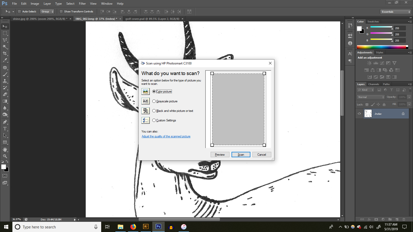
I have an HP photosmart c3100 and I’m using photoshop to import/scan it at 600dpi
The images automatically open in photoshop as a bitmap and I’m wondering if that is the problem.
Do I need a different/better scanner for better quality, different settings, or is this just what I’m going to get no matter what? Thoughts?
thanks!!
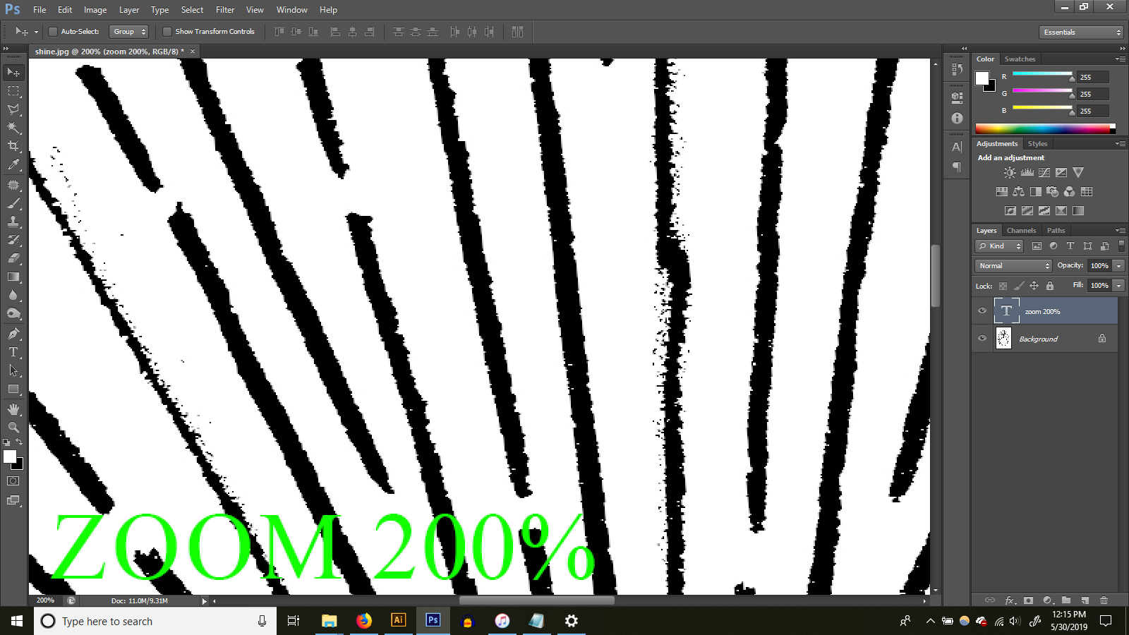
When you scan in something that’s been drawn on paper and enlarge it, you’ll see the irregularities of hand-drawn art. They’re not a bad thing if that’s what you want, but if you want smooth, tight, even, vector artwork, you can’t really start out with an analog drawing that doesn’t have those qualities to begin with.
If you are intent on this, though, use a hard-surface, non-absorbent coated paper and draw with India ink or some other kind of ink that won’t leave a rough edge between it and the paper. This will reduce the irregularities of where the ink meets with and soaks into the paper.
As for your scan opening in Photoshop, that’s because it’s raster (bitmapped) artwork. If you want to convert it to vector art, you’ll need to do so in a separate process using something like Adobe Illustrator. That is unless you have a scanner (like I’ve never encountered) that will scan analog art and automatically convert it to vector art.
As for the process of converting raster art to vector. it usually doesn’t process satisfactory results. Vector artwork is composed of lines and fills and the points that define them. It just doesn’t lend itself to more complex artwork, like painterly effects or irregular edges. The results always look awkward — especially when enlarged.
And just to be a bit pedantic about things, there’s no such thing as a dpi in a raster file. Dots Per Inch (DPI) describes the number of halftone dots on a printed page (or their toner or inkjet equivalents). Pixels Per Inch (PPI) is the correct term for, well, the number of pixels per inch in a Photoshop (or any raster) file. They’re very different things.
I do want it to look hand drawn, the irregularities are fine. I guess I’m just wondering if the quality when I zoom in is normal because I’m zooming in, or if I need a better scanner?
I’m using micron pens on strathmore layout bond.
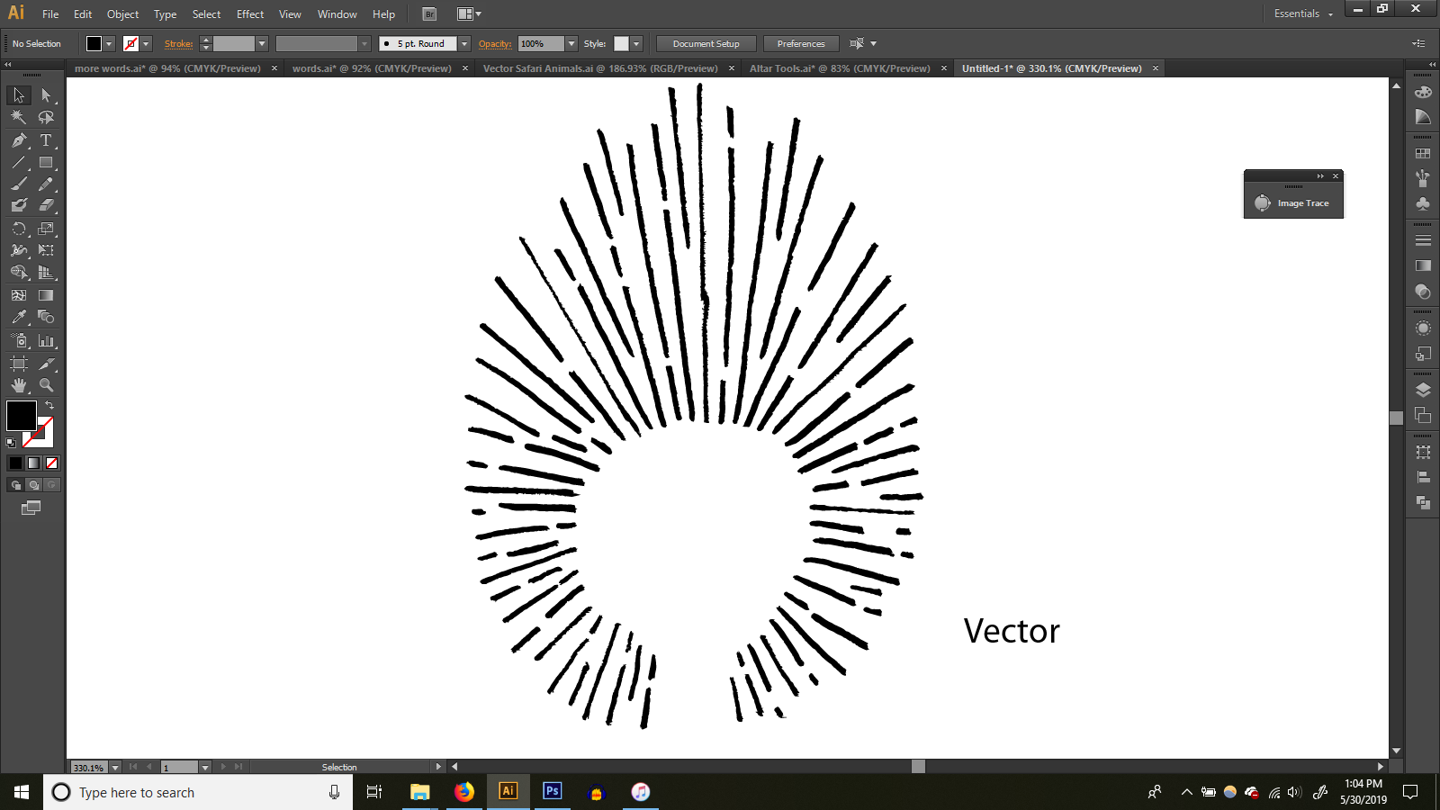
I am vectorizing it in illustrator, but I guess the question is more about the scanning.
(the reason I use DPI is because that’s actually what it says in the dialog box … go figure. But thank you for the reminder on the difference)
Basically, I am making vectors to sell on places like getty images and I want to make sure I am doing my best to create quality content.
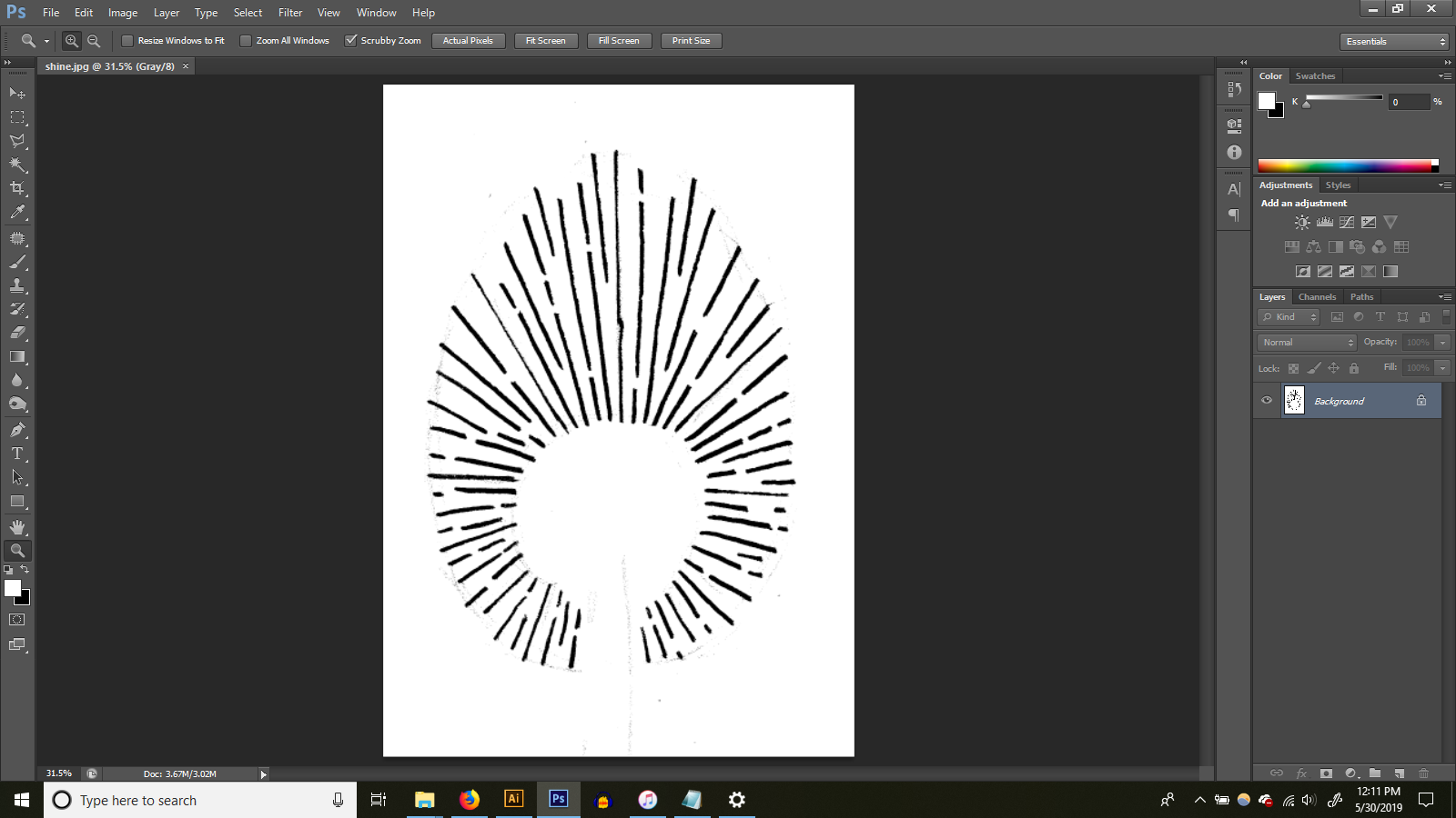
Below is the final result of the vectorized image not zoomed in. If I’m going for a hand drawn look, do I need to worry that if you zoom in more than this, that it gets a little choppy? or that is just the nature of the beast?
thanks!!
Your scan appears to be B&W (no grayscale). Did you scan it with that kind of contrast or did you subsequently eliminate all the grays? Of course you need that kind of contrast to convert it to vector (unless you want all those grays in the vector file).
Layout bond is not a coated paper and it has a bit of tooth. The ink from you Micron pen is soaking into the paper and spreading out irregularly as it does. This isn’t something that’s noticed at first glance, but get a loop or a magnifying glass and you’ll see it on the paper.
Like I mentioned, reducing this effect would require a harder, coated paper. Chromecoat comes to mind, which might be difficult to find. Back in the days of paste-up and mechanicals, Chromecoat was the go-to paper for fine details since a good technical pen (equivalent of the Micron pen) would produce a very smooth, even line on it. The paper had no tooth and was coated with a very thin layer of clay of some kind to produce an absolutely smooth, non-absorbant surface free from any irregularities. You might try Googling “chromecoat” or “clay coated paper.”
Even under the best circumstances, vectorizing hand-drawn lines will produce that “choppy” look since the algorithms that produce the conversion basically trace the raster file and eliminate detail. If the conversion followed every little irregularity of the scan, the vector file would contain tens of thousands of anchor points, which would be unwieldy, slow and crash RIPs. That look you describe is a by-product of this vector optimization. Enlarge the file and those optimization artifacts become more prominent. Enlarge the file enough, and they become downright distracting.
Ok so it’s sounding like maybe it’s not a huge deal that when you zoom in it’s not super pretty, and that is what I should expect when scanning in a hand drawn item.
I actually like working with the micron on layout bond and I’m not going for really smooth because, hey, it’s hand drawn. But I’d be willing to try different paper to see how it reacts.
Personally, I think it looks fine from a reasonable “distance”. (not zoomed really close) and this example was particularly choppy.
Thank you so much for talking about this with me!
Bitmap format does horrible things to line art. The jaggies you are getting is because the pixels are either black or white with no bit depth.
Try telling your scanner to save as .tif or .psd using a high contrast pass if necessary. I have a Canoscan and will set it at as slow as I can stand (somewhere in the 3000s) as a regular contrast pass, then do some work to the image in photoshop to bring out the contrast.
An alternative is to go old fashioned, and set up a camera stand with lights and get a decent SLR to put on it. A lot of the art I get “scanned” now is actually done by a pro with a scan-back on a really good SLR. Stitching software is so sophisticated now, we can get some really large image files that way.
You can also smooth the edges in Photoshop using the sponge tool, eraser, or paint with an adjustment layer mask.
Choose Select (menu) - Color range - click on the white area to create a basic selection. Invert selection - Make an adjustment mask layer - duplicate it - lightly smooth edges on one and use a very slight Gaussian blur on the other.
That will fill in the jaggies with some midtowns (greys) without changing the effect you want.
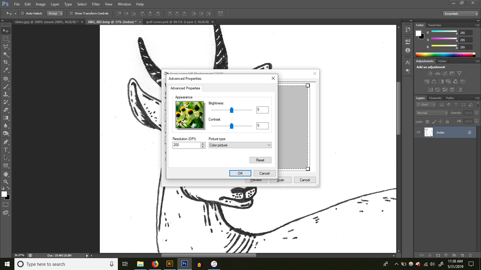
Would that I could! I’m going to show you the dialog box … I don’t think I can change how it saves?
Nice, I will have to try that out. Does that work on color scans also? or just black and white/greyscale?
See if Hamrick Software’s Vuescan has a driver for your scanner.
Vuescan has an awesome interface.
It’s free software and they make a lot of obsolete scanners operable again by offering driver updates for current OS-es.
(I’m not affiliated with them. I just use their stuff.)
Ok I just downlaoded this, I’m not familiar with bits per pixel. How is this used? thanks!!
Ok I tried the vuescan, and it left a watermark saying that I had to buy it. Guess it’s not free .. unless there’s a way around the watermark?
I’m using an older version of Adobe CS, so there may be some cooler way to do this, but here’s how I handle hand-drawn line art… whether I eventually convert it to vector or not.
- Scan as grayscale @ 600dpi.
- Open in photoshop.
- With the level slider (command - L) move “highlight” slider to the right to eliminate the lightest, unwanted marks and tracings. Then move “shadow” slider to the left to darken the remaining art. (It doesn’t take much for either of these).
- Under “image” menu hit “auto-tone” once.
- Then convert to bitmap mode with “50% threshold”.
- Convert back to grayscale.
6a) (optional) Reduce dpi to 300 if desired.
- Under “filter” menu, open “noise”. Hit “despeckle” once. Hit “dust & scratches” with 1 or 2 pixels selected.
All the above provides a relatively smooth, clean line (and, yes, if you zoom in close enough any hand drawn line will look a little jaggy).
When converting to vector in Illustrator there are lots of options under the “live trace” menu that will further help you control the way anchor points are distributed (and thus control jaggies further).
Hope that’s helpful.