Hello,
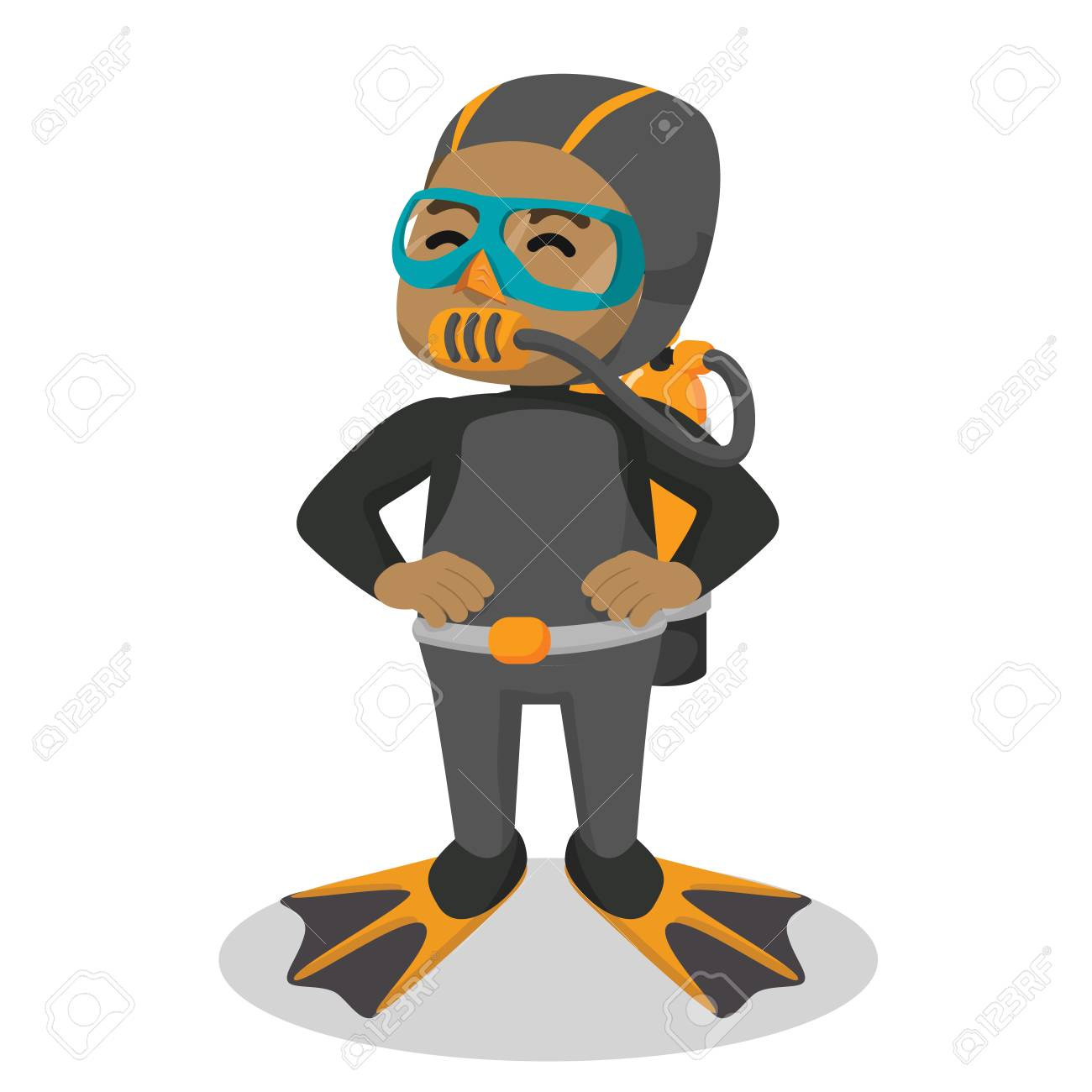
I’ve been working on my first logo assignment for school and would like some feedback on two of my designs. The client is a kid’s scuba diving school and the audience to appeal to is parents who want to enroll their kids. I have received some feedback from my professor that the lines are too thin and will disappear, but I would like to hear some other feedback on the rest of the designs please.
I originally sketched out a bunch of “cute” designs but then thought something a bit more professional would probably be better since I’m not trying to convince the kids but rather their parents that they can trust the business with their safety. If that’s not a good way to think about it, please let me know!
The second one looks too much like a tech company, mostly because of the font.
I like the first one, pretty good for a school assignment. Play around with the font and font sizes, there’s still room for improvement. What are you trying to achieve with the line? Is there a way you can have the same result without the line by changing something else?
Thanks for the feedback. When you say the line, do you mean the line separating the text, or the lines on the fin and tail of the fish? The line between the text I added to give a bit of separation as I felt without it the text looked “short and squat” in comparison to the fish. Perhaps that could be improved with different fonts and font size as you suggested.
While you are trying to convince parents, at the end of the day, IMO you want it to be more friendly and less technical. I would be more curious to see the “cute” options you came up with. These lack some personality. While I think the top option has some friendliness to it, the font and overall design is a little too cut and dried.
Its not the same as a scuba school for kids and their parents. But in my area we have two pretty large swimming schools for kids which also are trying to appeal to parents, but showcase the fact that its for kids. Those are Emler Swim School and Aqua Tots. In fact if you search swim school logos on google you see a lot of little mascots and such.
I’m not a fan of the second idea. The idea might have seemed promising, but that square G just does not want to become the body of a fish.
The first logo is better. However, the thin lines in the fish’s caudal fins, like your professor said, risk filling in at smaller sizes. On the smaller of the two fish, the lines are already beginning to do so. The lines on the pectoral fins, however, are fine since they can’t fill in.
Aside from the lines, the biggest problem I have with the first logo is the lack of compositional relationship between the fish and the words; they come across as two separate things that just happen to be sitting next to each other without a harmonious visual relationship. For that matter, they might even conflict with each other. They both have similar visual weights, which prevents a clear hierarchical relationship. The fish are swimming directly into the words, which is awkward and puts an abrupt halt to the forward motion of the fish. The uppercase is a little bit stiff and formal in relationship to the fish. The thick black line is superfluous and visually intrusive, and it’s not quite centered between the two lines of type. Try to use the same kind of compositional sensitivity you used when positioning the two fish together and extend that kind of thinking to the entire composition, which includes, both the fish and the typography.
Even with all that said, I still like the fish themselves and I think you’re moving in the right direction with it.
Thanks for the examples, CraigB. I think I’m going to go back to the drawing board completely as I agree my work is too technical and not fun or unique.
I happen to love logo 2, just not for this project. I would consider saving it for a more corporate application.
What the others mentioned in regards to logo 1 is right on the money. The fish dominate the typography. One of your sketches had a simple fish with goggles on. I like it. Perhaps small, nested above some stylish type.
I really like the first design. It projects an image of the child being well protected and safe. The design joins the name and the logo together. As it is a children’s scuba diving school, perhaps colour in the smaller fish would appeal to the children and would help to alleviate the problem regarding the thin lines.
Hey guys,
I’m back and thanks again for everyone that takes time to give feedback, it’s much appreciated. I went back to sketching and made some revisions. Below are the two designs I decided to explore further this time. I haven’t moved onto color scheme yet since I wanted to get the design to a point I was satisfied before diving into that. Let me know what you think: https://imgur.com/fENuFm2 https://imgur.com/B2YYDA5
Hi Brandy. As a Mum, Nanna and potential customer, I like Top R out of your more ‘cute’ options as you have labelled them. It gives me the warm and fuzzies and brings a smile to my face. However other than the text advising it is scuba, I wouldn’t necessarily be aware that is what it is. May I suggest adding a mask or snorkel to any of your designs so it is more immediately recognisable as scuba rather than a general swimming school? Cheers