Hey there… I’m a design student seeking feedback on my surrealistic verses realistic montage in photoshop. I have blended 11 images into one for my latest assessment & would love some input. Any feedback would be greatly appreciated, thanks!
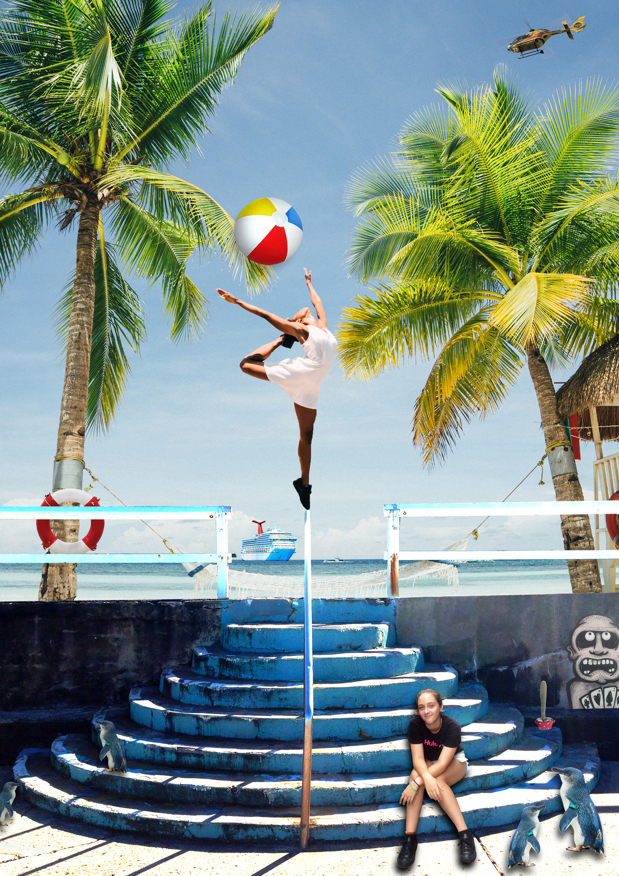
Hi, I am Web Design & Developer - it’s looking cool but the ball,ping wins & women on steers are looking like added, make some more effective which to be real look. Hit follow some YouTube tutorials those who are professional.
1 Like
Thank you for your feedback. I will have a look at some more tutorials to integrate them into the design better.
What is the point of the exercise and what is your visual goal? It definitely has a surrealistic look in that the different elements look pasted in and not part of the natural scene? Is that what you’re going for? If you want the different elements to appear to be part of the natural scene with the surreal aspect coming from things being together that shouldn’t be together, it needs some work. If the latter is what you’re going for, the biggest problem is light and shadows. For example, the scene is generally backlit (the wall is in shadow, and the hand rail down the center of the stairs is casting a strong shadow coming towards the viewer). But you have are elements that are lit from the front and from the top in the scene. Is this a problem? Well, that’s up to you to decide. This is your vision, so it comes down to the look you’re trying to achieve.
Thanks for your feedback Steve_O. Being a total novice, I think that I have a lot to learn about lighting & shadows. I would like the design to be more cohesive so that the elements look as thought they work together better. Would you suggest working on the lighting/shadows on the stairs to allow the subjects to blend better?
Start with the base photograph and look to see what is lit, what is in shade, and where shadows are being cast. This will tell you where your light is coming from. Also look at the quality of the shadows. Are the edges hard and defined or soft? Then consider the light on each subject that you add to the composition. Does the light on that subject match the light in the base photograph? If so, great. If not, what can you do to alter the subject being added so that it will match. It could be the case where you need to find a new subject to add. Should the subjects you add be casting a shadow? If so, make the quality, angle, and size of the shadows match the shadows in your base photograph. Hope that helps.
Yes, thanks so much. If I break it down like that before I even start a composition, I have a better chance of getting the results I want.
1 Like
The drop shadows directly behind the objects are your biggest problem. You have a lot to learn about shadows and lighting. I suggest working with 3D modeling programs.
This is an ambitious project. The shadows that would be cast onto the staircase would be hard to construct in 2D. If you want them to look real, use a 3D figure modeling program to generate the shape of the shadows on the figures and the scene. Make sure all your lights and shadows are at the same angle. Also make sure that exposure and lighting levels match.
1 Like
When making compositions like this, stay away from drop shadows altogether. The seated girl’s feet and the nearby penguins demonstrate the reason for that quite glaringly. When an object is on a surface, there is no shadow between the object and the surface. If you’re going to add shadow, it must be a cast shadow that originates where the object touches the surface.
2 Likes
I certainly have a whole lot to learn. Thanks so much for you input, I appreciate it. I had a look at a 3D modelling tutorial & will practice on a simple composite to get my skill levels up.
Thanks for giving me your feedback. I could see that the drop shadows were just not right, with the shadow between the foot & the ground, but I just didn’t really know what to do to fix it. I’ve been looking at 3D modelling so will explore it more to learn about cast shadows.
When I was in college, the professor in one of my drawing classes assigned us to get a white egg, sit it on a white piece of paper and draw nothing but the egg and the shadows as accurately and realistically as possible. We spent, probably, an entire week on this project.
The exercise was intended to force the students to study the complex nature of shadows. One of several interesting things I remember is that even though both objects were white, the spot at which the two objects touched in the shadow was black.
In other words, when something is sitting on a surface and casts a shadow, the shadowed areas immediately adjacent to where they visibly come into contact with each other almost always fades to black. Failure to incorporate this blackness creates the illusion of the the object casting the shadow hovering above the surface instead of resting upon it.
Also, shadows are never just amorphous blobs. Even when the shadows are complex and come from various direct, reflected or ambient light sources they have a logical structure.
2 Likes
Oh wow, that is such a great idea Just-B. Shadows are quite complexed & I will definitely do that exercise so I can grasp the concept better! Thank you for your feedback, very much appreciate your suggestion.
Taking B’s exercise a couple steps further,
Use an adjustable light source such as a flashlight or clip-on light and study shadows thrown with the light at various angles.
One of our advanced drawing exercises in school was to pair up with a classmate and use a clip on light to “see” and draw what various angles of lighting did to a human’s facial shadowing.
It’s one thing to use a 3D program to automatically get the light source where you want it. It’s quite another thing to be able to “see” what is happening. When creating composite images, your eye has to be trained to visualize what will happen with certain lighting.
I agree that I need to train my eye to see shadows. That sounds like a great exercise to expand on my skills. Thanks for your input!