Hi guys, I’m doing a Diploma in Graphic Design, and the course really emphasises the importance of feedback. Saying this I was hoping to get some feedback on my t-shirt design.
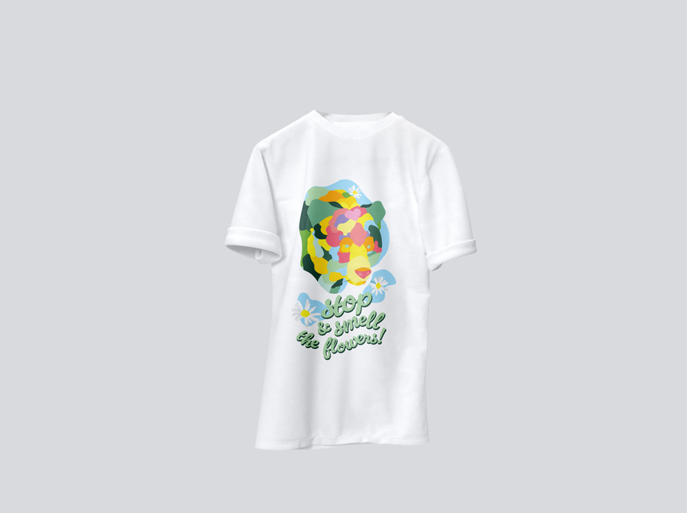
This design would be done as a digital print. I wanted to create something happy and joyful. Design brief below. Any feedback would be much appreciated! Thank you
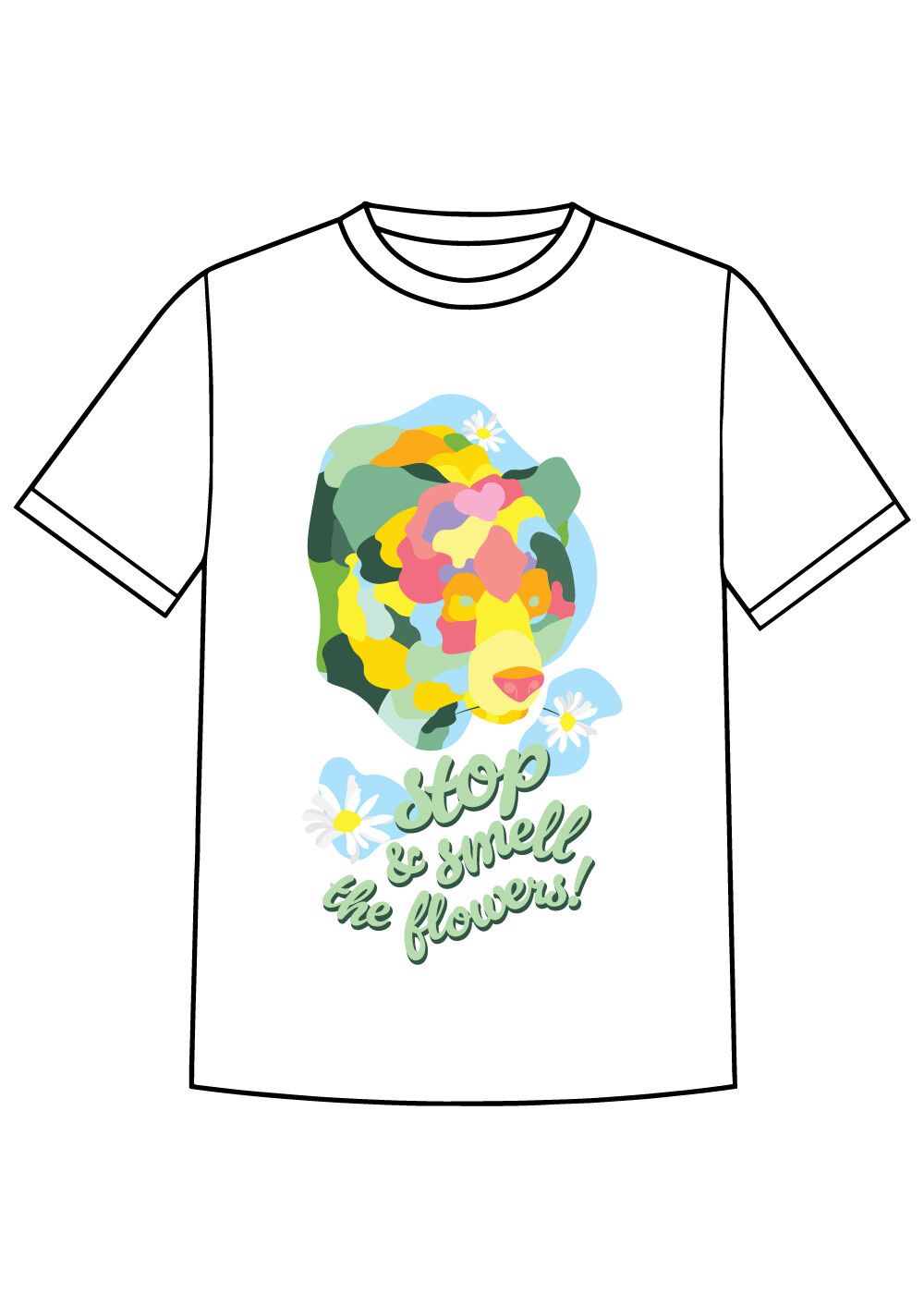
Design Brief :create a t-shirt design that is bright and bubbly, represents a respect for my home country Finland, it’s summer and it’s national animal, bear. I want the t shirt to reflect living in the moment and appreciating what you have.
Tone & Feeling: fun, bright, summery, different, abstract, organic, happy
Design Objective: to improve design thinking process skills, ‘outside the box’ thinking, colour usage, and the knowledge of composition.
Main Target Audience:
Mainly Finnish nationalities abroad, or tourists in Finland
Nice idea with the bear, but it took me few seconds to figure out what it was I would suggest you outline all the colours like you outlined the text - just a thinner line. Also, remove the light blue background to the right and top of the bear as it’s the same colour as inside the bear and therefor slightly confusing. Rather have the top daisy the same as the bottom two, on it’s own little colour background. And somewhere on the tshirt it should have the word ‘Finland’ as it is the primary communication purpose! Enjoy the experimenting!
If I were you, I’d do a bit of research into printing on shirts.
If you want this silk screened, you have far too many colors and some very tight traps.
If you want this direct printed, well… that’s okay, but look for a reputable place. My recent experience of the past 3 years has been that direct printed shirts tend to fall off in the wash, and if I can’t wash it, it is useless to me and to the purpose of the graphic.
With either process, you usually have a limited space in which to place your design (and it’ll usually be centered unless you specifically and adamantly tell them you want it placed off of center.)
I did a web search for standard t-shirt image sizes. I have never used this company but their explanation for all the why’s is pretty good. Logo Placement Guide: Top 8 T-Shirt Print Locations
Yes, you can silkscreen in 4-color. But that brings in the whole issue of linescreen and how gross you can stand it. And again, you’d have to go to a more “factory” resource for that where quantity likely matters. Around here, quite honestly, the only 4-color silk screeners do packaging, not t-shirts.
In addition, if this is intended as a shirt to sell to tourists in Finland and to represent Finland, I don’t think it suggests Finland in ways that would communicate to anyone outside of Finland that it has anything to do with Finland. I understand that Finland has bears, but so do dozens of other countries.
In addition, the typography is in (difficult-to-read) English and doesn’t say anything whatsoever about Finland. If I, as a tourist, went to Finland and bought a t-shirt, I would want that shirt to communicate to everyone back home that I likely picked up the shirt in Finland. This shirt does not communicate that.
It took me a little more than a few seconds to see it was a bear, especially after reading some of the responses. Then I realized it involved stretching my imagination, which is not a good sign. I’ll admit that if I stretch my imagination, almost anything can be conjured up.
This is the kind of situation up with which I will not put.
I mentioned direct to garment will work. As long as the vendor does it right. My last 3 years experience with various online print-on-demand sites has been 50-50 whether on not the ink stays on the shirt. They replace them, but it’s a hassle. Except in one instance they told me I shouldn’t machine wash and dry. I was like If I wanted to practice my survival laundering skills in the creek out back, I’d use something a little less spendy.
I hadn’t heard of ‘simulated process’ before. Took a little looking to find an explanation not shrouded in sales-speak. Even though better than 4-color process, you still may have to make concessions to the detriment of your art.
I guess what I really mean by all this is a designer should research output options before designing to make sure their art sustains the least amount of change depending on process, budget and time.
Like you say, “Think finishing before beginning.”
And think how many extra credit points the OP could get if they spelled this out in a printed slug on their submitted piece.
Thank you everyone! I really appreciate you taking time to give me some constructive feedback. I will note all of this and keep working on my piece. My intentions were to go with digital print, and that’s why I was comfortable to place multiple colours. I will have a look at other printing options as well to study and learn!
I print shirts on the daily - comments about the positioning and color are valid.
However, artistic interpretation of the bear is subjective, some people might like it, some people might not - it gives off an almost impressionist feeling that I enjoy. However, I would replace the blue background behind the bear with a darker color.
As for print method - digital printing would work well with this, however, like print driver mentioned, DTG isn’t always the most reliable print method, especially if you want nice solid bold colors like you have in this design.
A good alternative option however, that is still digital printing, is actually DTF (direct to film). This print method is growing in popularity, can be done with the same equipment used for DTG plus a few extra steps, and creates a much more durable, long lasting, solid color print that I really enjoy using.
A quick google search showed me that the official language of Finland is Finnish and Swedish - while I’m sure English is known in Finland, it might be a nice touch to add some of the native language into the design.
I could be as tolerant of the bear in that style myself, but here’s the thing: For me, the snout and nose were pretty easy to spot, and the involuntary impulse in my consciousness could have been “animal,” but it wasn’t, it was “dog”. Registering the word “smell” in the periphery only reinforced the canine notion. It wasn’t until several too-long seconds later that perception of the bear-head shape started to form, and then I had to “manually” complete it by seeking out the ears. Too much work; should be less; could be better.
The only thing is the t-shirt could be from anywhere and necessarily from Finland.
There are production issues to be sorted out - but that’s fine - usual with garment printing.
Lily of the valley is the national flower of Finland.
National animal is Bear - so that tracks.
I’ve specified DTF printing on several client t-shirt projects, and I’ve been very happy with the results.
The printing looks a bit more artificial than screen printing or DTG, but that’s just something to get used to. The vivid colors are great.
The few shirts I’ve kept have held up surprisingly well. I’ve noticed a little flaking off around the edges after lots of washing that I suspect will get worse over time, but much the same is true of screen printing. It seems much more durable than DTG.
I don’t know how the results would handle small details, but I generally stay away from picky little details on t-shirts anyway.