I’m new to Graphics Design Forum and am excited to be a part of this awesome community. I own a software development company and lead the Graphics team in addition to other roles.
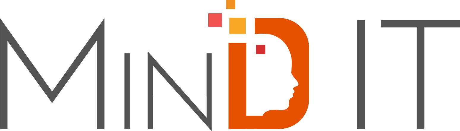
We’ve recently re-designed our brand logo and am looking for some critical feedback for the same.
The new logo is an improvement over the old, but I think it could use a few more rounds of refinement. Having the “in” in small caps gives the whole thing a disjointed feel. I’d definitely look at changing those to upper case. I’d also consider ditching the silhouette in the D and just doing something with MIND IT and the colored blocks.
Right, my instant-read muscle doesn’t see the ‘D’ fast enough to prevent me from seeing the first word as Min. This would lead me to suggest additional typeface experimentation in search of one that promotes better integration with and of the stylized D.
Personally, I like the silhouette “d” graphic, although i wouldn’t mind seeing it without the face within.
I just don’t think it works with the rest of the typesetting. The Futura-esk typeface is painful to look at. The kearning is very random, and the varying character thickness coupled with that peculiar small cap ‘N’ creates a messy look.
You’re definitely on track to a logo design that’s current with today’s trends. And it most definitely has potential with some necessary tweaking.
Thanks for your genuine feedback. I would still like to keep the silhouette in D as that brings in some personality to the logo. But we have simplified the character height, weight to give it a cleaner look.
Earlier we had used an altogether different D, but have updated it to D from the same font family and size.
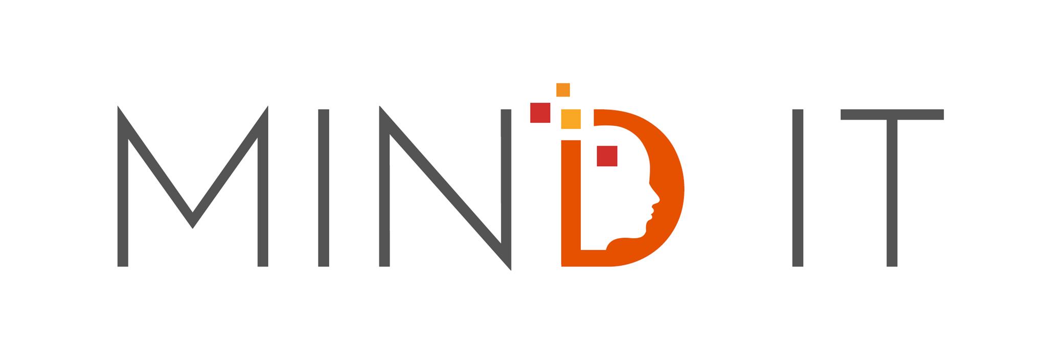
Having the IN in caps (as opposed to small cals) and the new shape for the D are improvements. I still think it reads, at first glance, as MIN rather than MIND. Sit back from the logo a bit and look at it through squinted eyes. You’ll probably see the MIN and IT pop out. Maybe try changing the D to gray or the MIN to orange
This phrase triggered my comment below. Because orange can also be a color of warning (traffic cones), as well as a vibrant color that appeals to children.
Who’s your target market? As in, realistically, who are the majority of customers who should be interested in your services?
Are you (1) designing software, or (2) providing IT services?
And then ask yourself… are you designing a logo to express who you are? Or one that will resonate with said target market? Those are not necessarily the same thing.
This is a problem we have been facing, have tried with smaller alphabets like Mind IT but it still tends to become “it”. Had even tried putting dots in between I and T so it looks like abbreviated but that didn’t work too well.
IMO, the double meaning isn’t a bad thing. I had a similar . . . err . . . the exact same thing with a remote IT service called GetIT. We liked the play on words and were okay with either pronunciation.
I don’t read I T at all. I read “it”. So the easiest way to fix that is to add periods after I and T. I like the redesign though because the old one looks like a psychic reading ad lol. Keep experimenting. You’re on the right track.
I’ll preface this by saying every design decision should be a decision, based on what will work for your target market. There should be reasons. That said…
open analysis.
In my Seattle-based experience, IT and software are two different animals. If you don’t actually do IT, that may be confusing. Should you include it in your logo? Maybe you should say software development instead?
Well, why not? I’m not criticizing, I’m asking the reason why not blue?
What’s the reason you are determined to use orange? You mentioned vitality and enthusiasm, but if I were a corporation looking for software development, those wouldn’t even be on my list. They don’t help my bottom line.
I would care whether your company develops software that works, doesn’t break, has competitive rates, and offers good support.
True example; I recently decided against joining a certain credit union, because their web graphics were orange, yellow and cartoony. Perfect for a children’s preschool, but I want trustworthiness in a financial institution.
How about replacing the orange with green?
This may be not what you want to hear… but I think you should reconsider some of your design decisions. Consider whether they are about your market, or about you.
That’s really a good point, and could play to the company’s advantage if properly exploited in a way that played up the dual meaning instead looking like an unfortunate and unplanned bit of confusion.
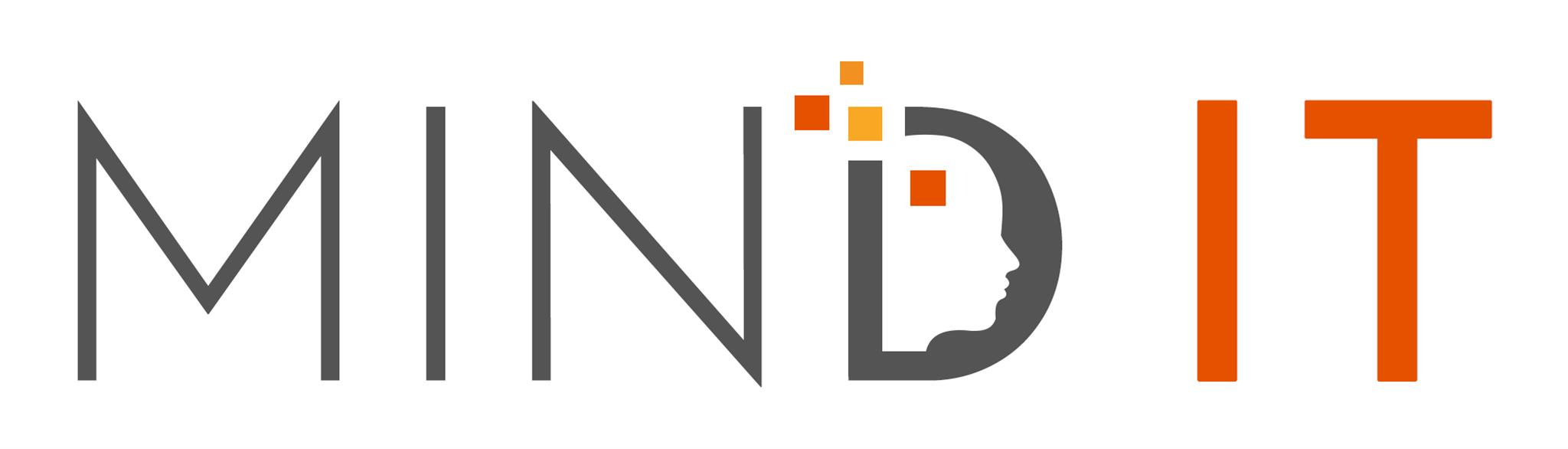
Here’s the next draft - played with color on the left and right.
Blue and green have been used way too often by software companies and I don’t feel like taking the trodden path. Not undermining your opinion, but that’s my way of brightening up..
I have thought about the target customers and this caters to both the young and professional, the corporate and the startup companies we deal with.
We do have a tagline saying “Your Reliable Technical Partner” - or we may consider updating this also.. To me, this helps bring in more clarity.