Self Taught and Employed as "The Media Department"

Hello All,

First post. I’ve been put in the position of handling all media creation and production for a business with a few hundred employees. I’m mostly self taught and do most of my work using various apps on my phone. I’ve paid for subscriptions for stock media and apps, so everything I make is licensed.

With all of that said, I could use a little education. I understand the difference between raster and vector files and their applications. My question is about file conversation. If I design something using a PNG format, is there an easy way to convert it to a full color vector? Can I simply convert to a PDF and then I’m good to go for scaling?

Thanks in advance.

No. For scaling best to create in vector.
And create pngs and other formats from the vectors.

If you’re creating raster images create in large high quality 600 or even 1200 PPI so scaling is not much of an issue.

This is a common misconception, by the way.

PDF is just a wrapper - it can contain a mix of elements, including a mix of vector and raster.

Vectors are infinitely scalable - but have to be created as vector elements.
https://www.adobe.com/creativecloud/file-types/image/comparison/raster-vs-vector.html

Just saving to a different file format doesn’t change the content of that file or how it’s made up.

So for example, you cannot take a Photograph and save it as a .ai or .pdf file and expect to scale it.

The photo would need to be made up of vector elements, which is ridiculous and be a massive file.

A photo is much better as a TIFF or PSD format.
You can save it as a PDF too. So here’s the kicker.

YOU CAN save your Photo in Illustrator as a .ai or a .pdf file.
Or save your file from photoshop as a PDF.

But that PDF is only a wrapper - it contains the Pixel information. And resolution will decrease as the image increases in size - and also the image gains resolution as it decreases in size.

1000 pixels x 1000 pixels @ 72 ppi would be 13.89 inches
It’s simple division 1000/72 = size at that resolution

If you place it 6.944 inches - it’s resolution doubles to 144.
As 6.944 is half of 13.89 inches.

For it to be the mythical 300ppi for printing - it would need to be 3.333^ inches.
Again it’s a simple 1000 pixels divided by 300 = 3.333^ inches

There’s no getting away from the math when scaling raster images. Images made from Pixels.

Why save them as PDF? Only legitimate reason for me to save as a PDF (for raster images) is if you are including Live Text (live text means it remains editable after creating) or including vector elements on top of the Photo.

As a PDF is a wrapper, contains vector and raster elements - you can include live text, vector elements, vector masks on top of an image that will remain raster.

So you could put Live Text on top of a photo and save it as a PNG - and that Live Text is converted to raster - at the same resolution as your image.

But save it as a PDF and retain the Live Text - the text will scale without being affected by the resolution of the image - they remain independent of each other.
Are you doing specifically web design? Cuz yer giving this printer-guy the shivers if you are doing print collateral on your phone…

Thanks for sharing the wisdom. Very helpful.

Mostly web applications, but some print. I’ll have to figure out how to post some of the work.

Are you looking for a critique on that?
Is it a logo?

Sure, why not. It’s an updated version of another’s design.

Smurf laid out plenty you should digest as best you can.

In case it’s not clear, I’d go so far as to distill an answer to your initial question down to, “there really is no raster-to-vector conversion; competent vector output must originate as vectors.” There are some notable exceptions to that, primarily pertaining to hand-drawn artwork, subsequently scanned and traced via one method or another…at the hands of the original artist for the purposes of “digital” output. But back to my original, central point; if vector output is the objective of a design undertaking, a raster editing app is not the appropriate tool in which to begin.

1 Like

Go back to the original version
The old logo is simple, clean and very much to the point. With logo design, “more” is not better.

on yours,
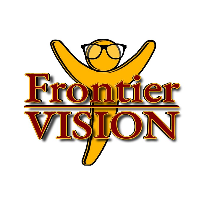
your line art is very wonky at best. If using a stylus on a phone, use a software that has a smoothness setting and get use to drawing with the delay it uses to smooth the line art.

You use a lot of thin lines and small, unnecessary elements that will not scale down to very small versions (think business card sized.) Simplify.

You have a black extrude feature that suggests the text curves out toward the viewer, but it is only barely suggested and as it is, it just adds confusion with extra elements.

The fuzzy drop shadow does not take that forward curve into account and adds an extra layer of confusion, especially where you have gaps between the letters and the shadows like under the top of the F or inside the Os. That’s bad form on drop shadows except in some extreme circumstances.

Not to mention, drop shadows also rely on transparency that can introduce production issues. You can’t embroider your new logo on a hat, shirt, or tote bag for instance. It also limits your silkscreen capabilities.

I can do all kinds of cool signage with the original logo. Screen printed, embroidered, 3D letterforms, backlit, halo-lit, painted, large, small, it’ll look great on any media from business card to the side of a building.

Yours, I can only print on a board and hand you a sign. While I could ‘silkscreen’ it using a direct-to-garment printer, it would have to be on a white or very light colored shirt/hat/whatever, cuz that drop shadow becomes lost. There’s no way you’d want to pay for the 6 screens even without the drop shadow (there are 6 distinct colors in your logo as opposed to 2 in the orginal.)

Well, I know you’ll be honest in giving your opinion and I appreciate that. I can eliminate elements like the drop shadow in less than a minute for printing purposes. What is posted, is for the web. The icon was done by layering. It’s just too flat, as is. It has no visual appeal. I honestly, could use a tablet and more powerful software. However, until I get a bigger budget, I must use what I have.

I’m not a fan of the first version, but it has a greater visual impact than the more elaborate version. In graphic design, less is usually more. Graphic design has more to do with subtraction than addition.

Skip the tablet. You need a computer and professional software — not a bunch of mobile apps aimed at kids and amateurs.

I really hope so. Here goes…

That’s just shocking – sorry. The fact you are even saying this exposes your lack of knowledge and experience – especially in a ‘professional’ capacity. You simply cannot produce professional quality work on a phone.

I am even more dumbfounded that a company of a hundred employees would entrust their corporate communications – be it online, or in print – to an uneducated, self-taught ‘designer’, using free software on a phone.

Do yourself a favour; go and get yourself a proper education and then do a few years’ experience with a proper design studio.

Honestly, please take this as it is intended, rather than a personal attack. It is ‘tough-love’, objective criticism, based on more years than I care to remember of experience. If you want to get anywhere in the industry, you need to know what you are doing. Right now, you simply don’t, based on your post and the work you have shown. The original logo you posted was truly terrible and your ‘improvements’ made it even worse.

Sorry, not nice to hear I am sure, but I hope it helps on some way.

1 Like

Is what it is. Lol… I’m fairly thick skinned, as I’ve been an artist in one sense or another for most of my life. I was given the position due to creativity, resourcefulness, loyalty, and a broad spectrum of experience. I’ve been with the company and helped it to grow. My education is in organizational leadership and marketing. I was in a graphic communications program in high school and learned a little. I took some IT courses in college with a little web development involved. I’m not really a fan of the original, but I’m trying to liven it up a little. I’ll take every bit of advice into consideration. However, I’m sticking with it and will succeed. :grinning:

Bonne Chance