Albertus Medium is tagged as a serif font on several sites - my question is would it be considered semi serif, or something different?
Sure. It would meet the criteria as Semi-Serif.
Does that matter to an algorithm?
Semi-serif. Now there’s a term I haven’t heard before. Is this a typeface category the various font sites have recently created? I suppose it means having little serifs or something along those lines, right?
As DZ suggested, it seems like one of those categorizations that an algorithm decides and if so, it would seem to depends on how the algorithm is written.
http://www.typophile.com/search/node/Semi-serif
Nothing new for us typophiles.
And no, I would not classify Albertus as a Semi-serif. Humanist …maybe.
Somehow I missed the term in graduate school studying type design 30 years ago. I might need to reclassify some of the commercial fonts I’ve designed over the years. No wonder they haven’t been selling as well as I might have liked lately.
For what it’s worth, in the Vox-ATypI classification system, Albertus would likely be regarded as a Calligraphic Glyphic.
Semi-serif is rarely mentioned in any textbook. I think it’s more of a ‘modern’ thingy.
Humanist to me is the gestural pull of a nib. Flaring terminals is a textbook hallmark. So too is a variation in stoke width but that requires ‘talent’ in creating modern digital glyphs. Palatino and Optima being the classic modern examples, along with Gill, Syntax, and Frutiger.
I think you’re probably right.
By the way, don’t confuse serif humanists with sans-serif and modernist humanists. They’re very different things. Then again, as you might remember, I’m not a big fan of classifying and labeling everything. ![]()
Discribophobia.
Apparently … you’re not alone.
I am a big fan of classifying and labelling everything ![]()
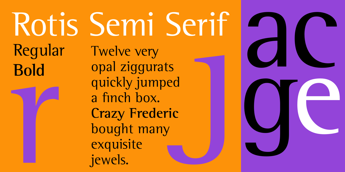
When you say semi serif, I think of Rotis Semi Serif. Not the prettiest font!
Semi-serif was also new to me. By the way, thanks for sharing the link and let me knew this.