- Ordinary
- combine with text
Chose one which is simple.

Is this a car/bus/transport business?
What’s the purpose of the wheels?
A Pope Mobile!
3 Likes
Without knowing what your intent is, the answer is “no idea.” A logo without a company name is really sort of useless, unless you are Nike or Coca-Cola
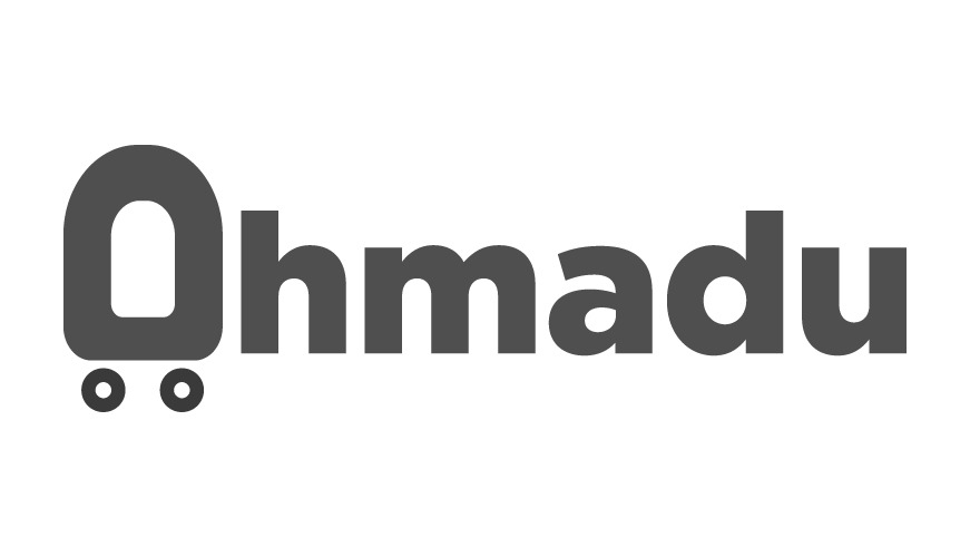
Ahmadu Store Logo design concept
You think so?
That’s why I always design simple, it will be easily to remember
Yes, but you spell Omaha incorrectly.
is the colour in the wheels supposed to be different?
Ahamdu not Omaha
Should I use another color for the wheel?, You can give me a clue
Just wondering if it was intentional or not. The colour is very similar, try it all in one colour or choose a different one to have more contrast.
also the “A” does not read looks more like an “O”
A store that sells what? Things with wheels on them? You haven’t given us any information on what the wheels are all about or why they’re appropriate. All you’ve shown is something you’ve drawn up, but you’ve provided no context or logic regarding why you think it’s an appropriate mark for the store.
I can tell you, though, that if that shape with the wheels on it is supposed to be an A, it doesn’t look anything like an A. It looks more like a misshapen O.
The Wheels stand for Transportation.
Does “Ohmadu” mean Transportation? I’m a little lost here.
I think people missed that Ahmad is your name and Ahmadu is a play off of that, for your store/business.
This logo is pretty bad looking but there are so many successful businesses out there with bad looking logos. You can still utilize the ‘ordinary’ logo with Ahmadu. you don’t need to force the A to be a logo. you can use a good font type and leave Ahmadu in standard font and place the logo next to it or on top. Try playing around with the ‘ordinary’ logo itself, maybe try to encapsulate it in a rounded square or a square shape.