Is there somewhere i can find this diagram in a more “graphic” form?
Where are those number are taken from? is there some standard for that? is it different in Europe and the US?
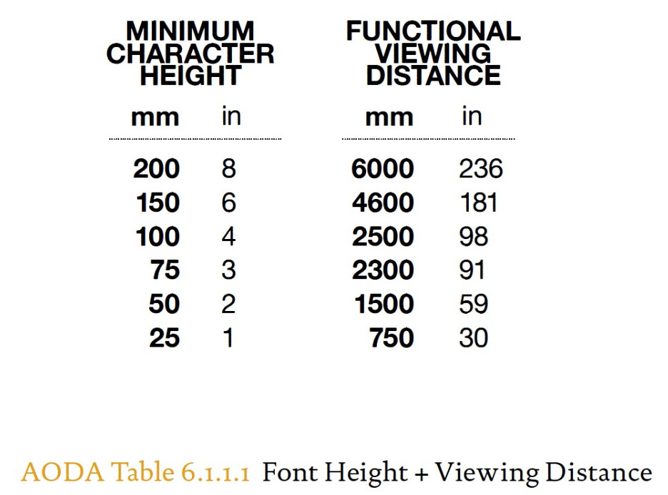
A quick google reveals the answer to your first question;
https://accessibilitycanada.ca
It looks like these values are for maximum readability for the visually impaired. Legislation in Canada.
I’d take that with a grain of salt. 1" letters at 30inches???
8" letters at 20feet?
It all depends on what message you are trying to get across, how many seconds you have to do it, and what typeface you are using. There is no standard, though there are a lot of charts like that out there.
As far as the same in US and EU? Same size, same distance, just different rulers.
Ah, Accessability…that’s a whole different animal. For some reason I was thinking billboards, posters and scenery.
Every country has specific accessibility laws, and some government entities have whole books you have to wade through, not just in cap height, but color contrast and acceptable typefaces, plus a whole slew of non-signage related stuff. Around here, every major city (and a lot of smaller towns) have their own fire codes you have to meet as well.